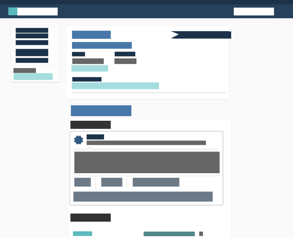
Design at Emissary was strange in 2018. There was no articulated direction. no consistent visual styles, and no thought-out design patterns. Almost every project was ad hoc, and it showed.
At the time and still is, Emissary is a startup of 30 people. 30 people doing their best to figure it out in more or less the same direction, only it ends up being 30 different directions. The team consisted of 5 engineers and 1 product designer.
Now, I believe everyone has good intentions, which is why I wasn’t angry when I saw that colors were different shades, accessibility wasn’t taken into account, and the codebase using Google Material wasn’t updated and included styles in different flavors.
Working this way was obviously difficult. Every release—no matter how simple—would take much longer, and result in new technical debt.
So more styles were added. By the time I joined, there were several shades of colors, 4 kinds of buttons, 6 variations on rounded corners, 6 types of input boxes, and so forth. None of these were clearly related, not in class name and not in style. The typography was all over the place, and some pages barely resembled each other.
Needless to say, this wasn’t going to go away by itself. At this point, the engineering team was in charge of all production front-end code. And so 3 months into my time at Emissary with the appropriate buy-in, I decided to start the conversation.
My Role
I led the design of the design system. I also worked alongside a product manager, a VP of Marketing, a marketing content specialist, and 1 engineer.
Buy-In
Before diving into the creation of the design system, organizational buy-in was required. We wanted to explain why our current design inconsistencies are detrimental to the experience of users and how it negatively affects our design & software development process. We created a product impact statement and business impact statement explaining how the new system would positively impact both areas.
Product Impact: The new design system will unify our cross platform experience structurally (UX) and visually (UI). Structurally, we want to start thinking about how we create reusable modules and components pertaining to the screen display size. Visually, we will create a system of UI patterns that can easily translate from platform to platform. Nailing this system down will allow our users to become familiar with our products no matter what platform they are on.
Business Impact: Creating this new system will reduce design/dev debt, accelerate the design/dev process, and build bridges between our teams working together to bring products to life. We will achieve this by assembling a guide of responsive templates, UI patterns and components which will all be created in the beginning stages of building the system. Implementing this new system will allow our design team to spend less time pushing pixels and more time innovating, researching and solving problems. For development, it will create a smoother building process by being able to leverage the set UI/UX patterns that will be created in the early stages of constructing the system.
Early Decisions
From my experience at Etsy, I worked with an engineer to understand the framework to use which was BEM. This is a CSS framework that follows a model of Blocks (components), Elements (the pieces that make up a component), and Modifiers (the different states of a block or an element). This is critical in thinking of the UI in terms of components and avoid unnecessary nesting.
I drafted a few guiding principles for the Design Systems–what people need to keep in mind when designing or developing. This was reviewed by the VP of Product, Marketing, and Engineering teams.
Component Audit
Once I had a skeleton, I set a few meetings for the Marketing team, myself, and Engineering to go over and audit every component. Before we could build out the style guide, we had to figure out what would go in it.
- What exists now?
- Was it necessary?
- Could we merge it with another component?
- Did it appear often enough to constitute a reusable style?
- Was it even a good pattern?
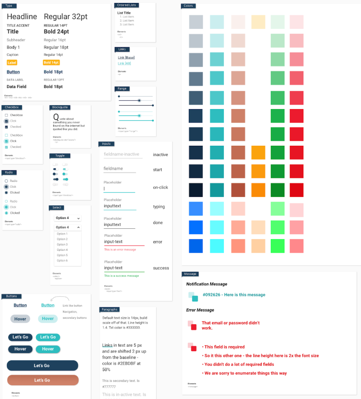
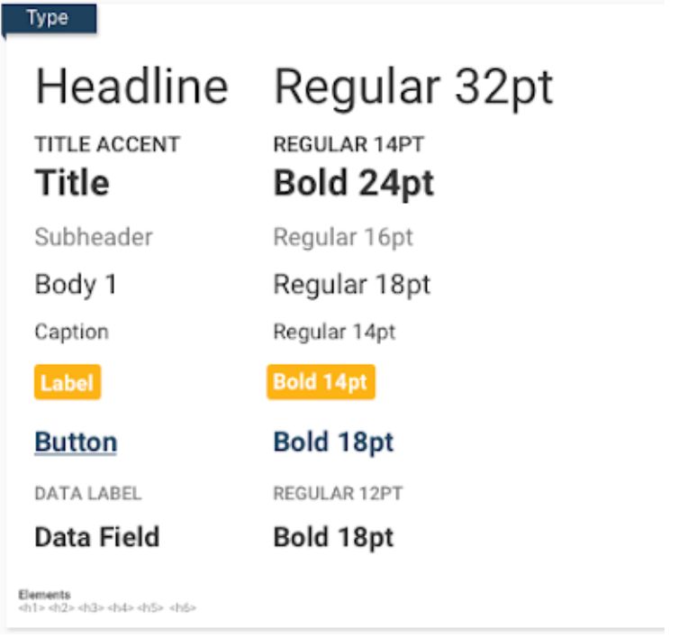
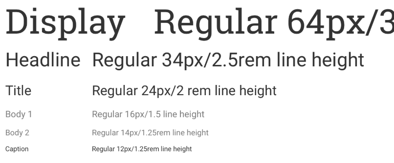
During the inventory of Emissary’s interface, I focused on 4 general themes that make for a consistent user experience: Typography, Iconography, Colors, and Layout.
I used one of the harmonious scales (perfect fifth) using type-scale.com to calculate the scale which was slightly closely to what we actually had in the system.
Colors Matter
Why? Colors have a tremendous effect on the overall perception of a digital product. It is one of the most visibly common elements of any user interface (next to typography). Defining a color palette can make the lives of designers and developers much easier.
When it comes to user interface design, you must be intentional with your use of colors. Used carefully, color can become a helpful way-finding tool to better help a user know where they are and where to go next.
A color palette must be:
- Precise: defines a small number of approved primary colors and a sufficient number of accent colors.
- Theming: Themes provide a consistent look and feel across products, and eliminates guesswork.
- Meaningful: developers and designers should easily refer to particular colors defined in the system. Color names are easily understood and meaningful.
- Accessible: both in terms of how easily people perceive color combos and how easily developers can find and use the palette.
Audit
I listed all the colors defined. As you can see, it shows the full spectrum of the palette (as defined in Sketch and code).

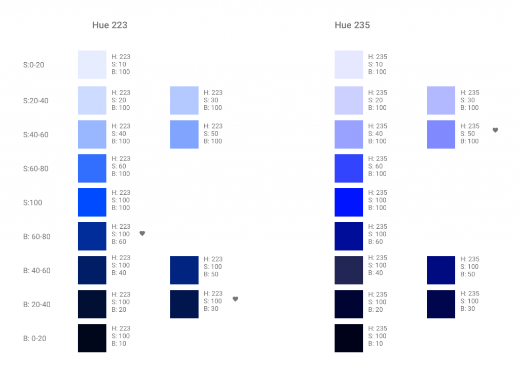
How many colors in each palette? A lot! I will start with an example of a blue palette.
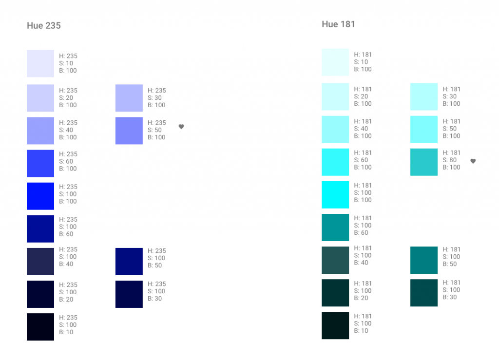
I classified blue as the primary color of action. The blues we were using felt dull and there were 26 blues! I created color palettes for H: 210, 223, 235 by keeping either S or B constant at 100%, and varying the other component by 5–15 points to give me shades and tints respectively.
I just needed 2–1 dark to imply “brand” and 1 other to indicate “action.” I looked at the hue available for the colors, ranging from 199 to 235 as a starting point. With the Marketing team, chose 2 hues so that the overall appearance and brand feeling didn’t feel impacted. H: 223 and H:235.
It is helpful to see full palettes of each shortlisted hue at once, as it gives a sense of the overall feel of each color palette and allows you to better compare with an existing palette.
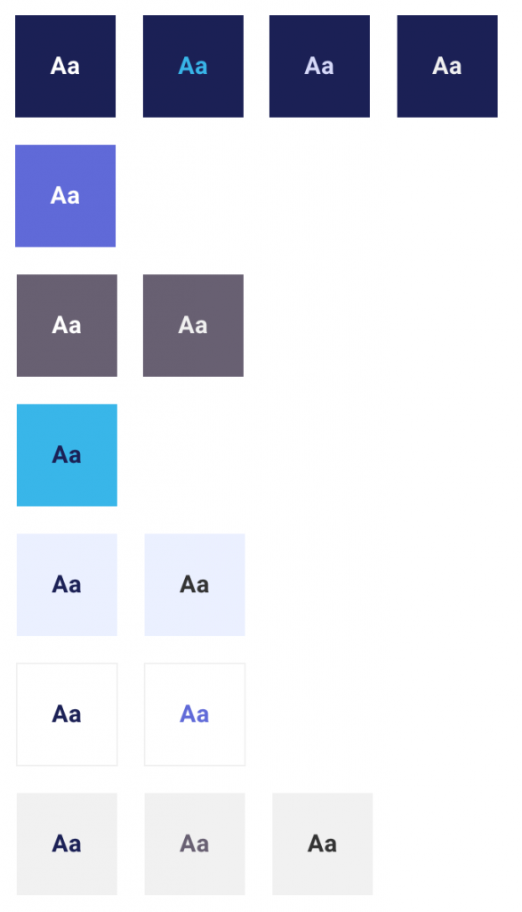
I considered accessibility and shortlist colors to use based on the background and text colors to finalize the decision. They were to meet a contrast ration of 4.5:1 to conform with the standards of Section 508 for body text so everyone can read it. I followed a similar method for other palettes.
What about hover states? Hover states were to be calculated by using CSS preprocessor (SASS or LESS) functions like lighten() or darken(). It does not get included in the design system because it increases the number of visible options and makes it difficult to attach purpose to it.
Documentation
Documentations for each component and principles were written in Google Sheets, Docs, Slides, Confluence, and Invision boards to surface and educate the business on what a design system is and Emissary’s position on it.
Conclusion
About 1 month into the project after discussing with engineers and several email updates, I was informed of 3 items that stalled the project:
- The team was already using 2 React frameworks (Angular and React-toolbox) which meant a leap into a consistent experience was in reach. Unfortunately, both React frameworks were woefully outdated with the current Google Material, bogged down in ad-hoc and custom codes so it would take more time than anticipated to get consistency.
- This project wasn’t on the roadmap, despite initial buy-in from CEO, VP of Engineering, and VP of Product Design. Due to internal politics, it was determined we didn’t have the bandwidth to continue.
- The marketing team’s responsibility shifted to branding. They hired a third-party to explore what the brand could be and use the Design Systems as a foundation for the work.
While components are changing, the work set the foundation for everything design, educated and brought awareness to the company how design makes and impact.