Preqin~8 min read

The form was never the reason fund managers stopped sharing.

Six options were on the table, and the three easiest to build solved a problem nobody had.

  • Role: Product strategy and design
  • Timeline: 3 weeks
  • Team: 1 PM, 1 engineer, head of engineering, me
  • Impact: 5% → 15% retention
  • Platform: Web
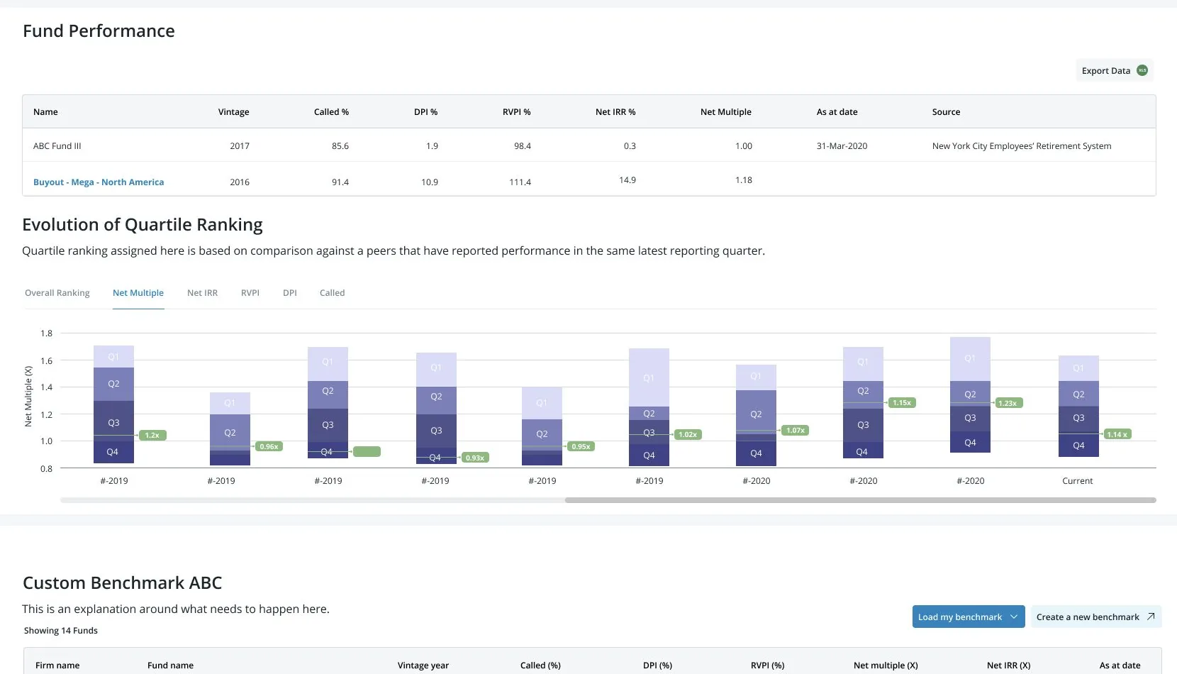
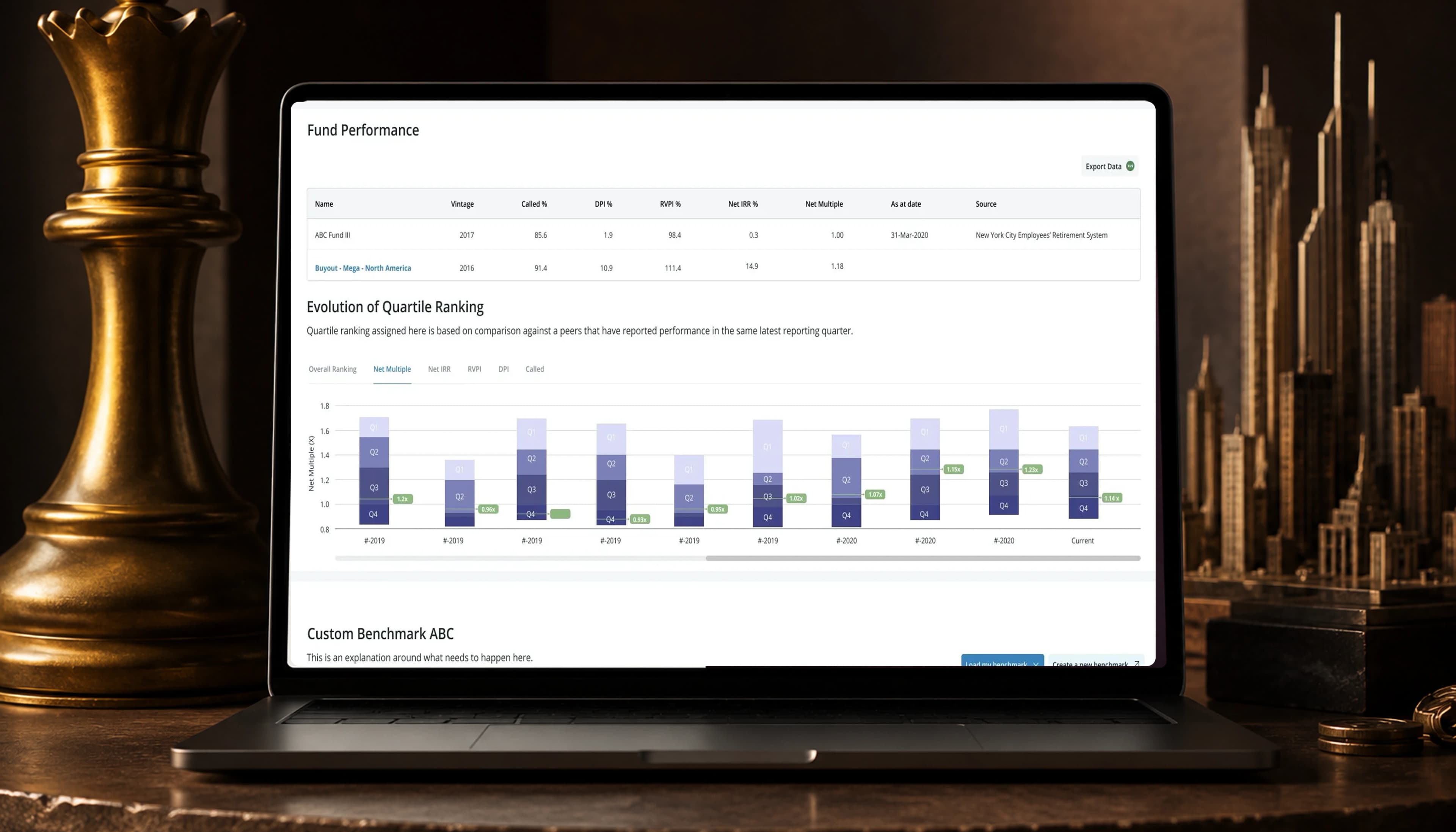
A laptop on a dark desk showing the Fund Performance screen: a table of a fund's vintage, called percentage, DPI, RVPI, net IRR and net multiple, the Evolution of Quartile Ranking chart beneath it, and the start of a custom benchmark panel below that.

Impact

0%

Account retention

up from 5%

0mo

Due diligence

down from 10 months

Both figures held through 2021, when I left Preqin, and each was measured a different way. Retention is retention of accounts, and comes from a two-week test with 20% of traffic diverted to the experiment and the rest left on the existing form, run alongside usability sessions on the same build. Due diligence was not inferred from better coverage: I shadowed partners through a cycle, and the team read deal closure for that same 20% off an internal platform rather than off anyone’s recollection. They are still not equivalent evidence. Retention is a controlled comparison against traffic held back. Diligence is a before-and-after on the experiment cohort with no control arm beside it, so it records that cycles ran shorter for the people who saw this, not that nothing else shortened them. Two weeks is also a short window for a behavior partners repeat quarterly.

The data stopped coming in

Preqin sells access to data that fund managers supply for free, so the product has a supply side and a demand side and only one of them pays. When fund managers stopped contributing performance figures, every subscriber got less back for the same money. That is a renewals problem arriving through a channel nobody was watching.

The obvious diagnosis was friction: submission is tedious, so make it easier. Six options were on the table, and the three easiest to engineer all attacked collection. Research established that collection was the problem nobody had. Partners weren’t withholding numbers because the form was hard. They were withholding numbers they were embarrassed by, and no upload tooling fixes embarrassment.

So the work had to move from collection to exchange, and that reframe was not free: it argued the team off the three cheapest options and onto the three that required deciding what a fund manager gets back for a number that might make them look bad. My first answer to that was a leaderboard. It backfired, and it cost partner trust to find out. The version that worked kept the comparison and removed the identity. Contribution retention went from 5% to 15%, and diligence cycles ran four months instead of ten.

What I owned

I owned

  • Reframing the problem from collection to exchange, and the argument that took the three cheapest options off the table
  • Research with partners at large and mid-market private equity funds
  • Both experiments: the leaderboard that backfired and the quartile ranking that replaced it
  • Keeping the form to what someone could complete in one sitting, despite a push for 32 fields

Decided with others

  • Getting Legal and Sales to the same answer: I brokered it; they made the call
  • The cohort floor beneath anonymization, with the head of engineering

The problem

The platform depended on data that was going stale.

Fund managers weren’t contributing performance figures, reducing the platform’s value for every subscriber who relied on it. Revenue and renewals were exposed.

The obvious diagnosis was friction. Submission was tedious, so make it easier. Research pointed somewhere else.

That last question changed the brief: what does a fund manager get for sharing a number that might embarrass them?

Effort, or exposure

The three cheapest options to build all solved a problem nobody had.

Withholding has two possible causes and they want opposite products. If the cost of contributing is effort, better tooling is the answer and the scraper is the best of the six. If the cost is exposure, tooling makes submission faster for people who were never going to submit, and the honest version of shipping it is that the team gets a completed roadmap item and the data still doesn’t arrive.

Every signal in the research pointed at exposure. “If my numbers aren’t great, I don’t want anyone to know” is not a sentence about a form.

The uncomfortable part is that this argument was expensive to win. Collection was the cheaper build, the more legible commitment, and the one that needed nobody to agree on what a contributor gets back. Moving to exchange meant asking for engineering time against a benefit I could only argue for, and I was about to get the first version of that benefit wrong.

Competition was the obvious lever

I tried a leaderboard. It was wrong.

I considered a public leaderboard, a private benchmark against peers, and no comparison at all. Competition seemed like the obvious lever when people wouldn’t contribute, and I was confident enough to ship a named ranking with prompts to submit benchmark data first. I didn’t think it needed mitigation, although a product asking for trust was about to publish the information partners guarded most closely.

Partners saw exposure rather than motivation: “This doesn’t reflect who we are.” I removed it.

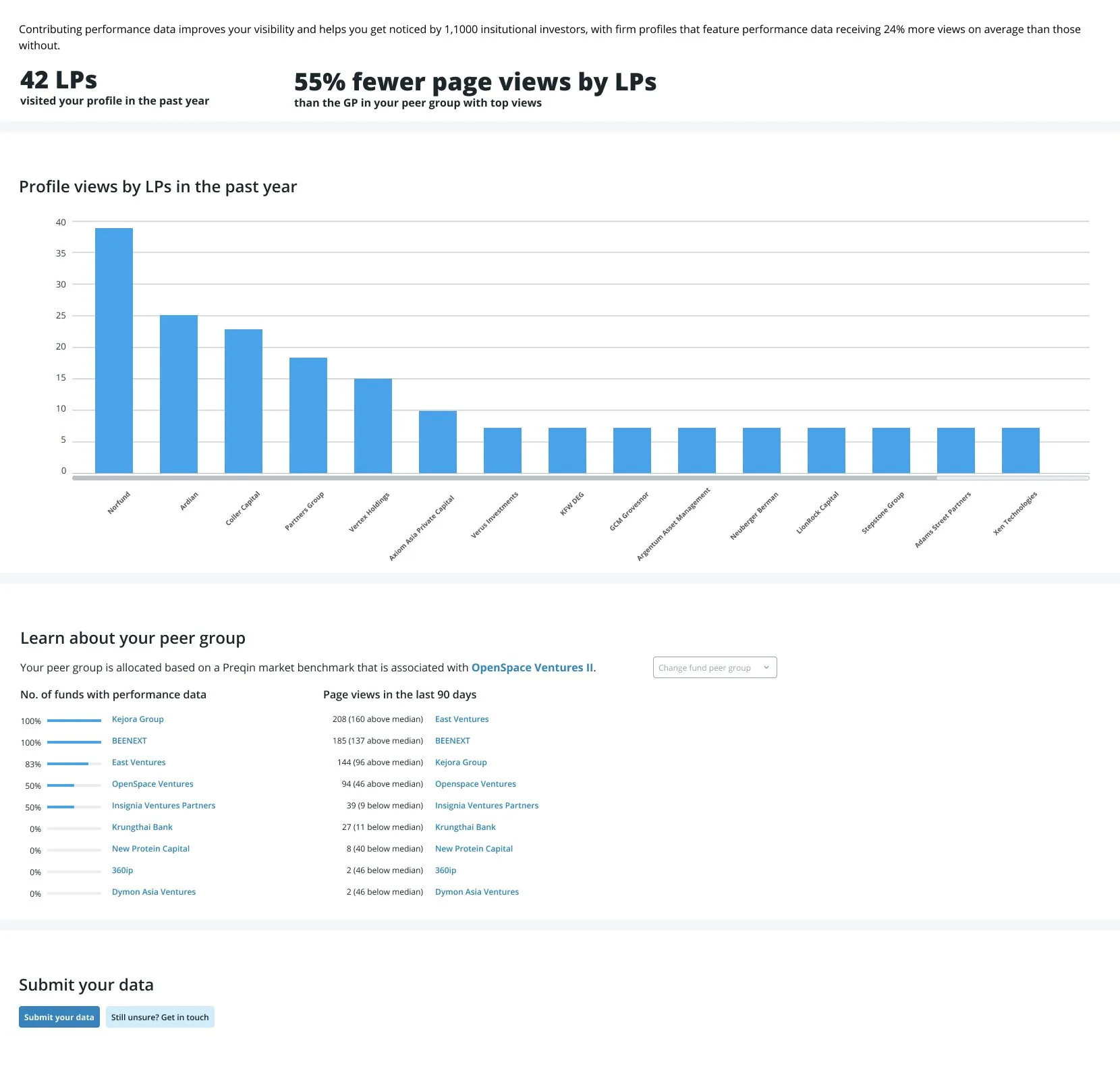
The leaderboard as built. A bar chart titled Profile views by LPs in the past year ranks fifteen named firms from Norfund down to Xen Technologies, above a peer group panel listing named funds by how much performance data each has contributed, and a Submit your data button beneath.
What partners actually saw: their own position, named, beside everyone else's. The prompt to contribute sits at the bottom of the page it undermined.
The Evolution of Quartile Ranking chart: ten stacked columns, one per reporting quarter, each split into first through fourth quartile bands with a marker showing where this fund's net multiple falls against its peers. No peer is named anywhere on the chart.
The screen from the cover, flat and readable. Worth a second look at full size for one reason: there is no name anywhere on it. That is the entire difference between this and the leaderboard two decisions above, and it is the only thing that made the comparison something Legal would sign.
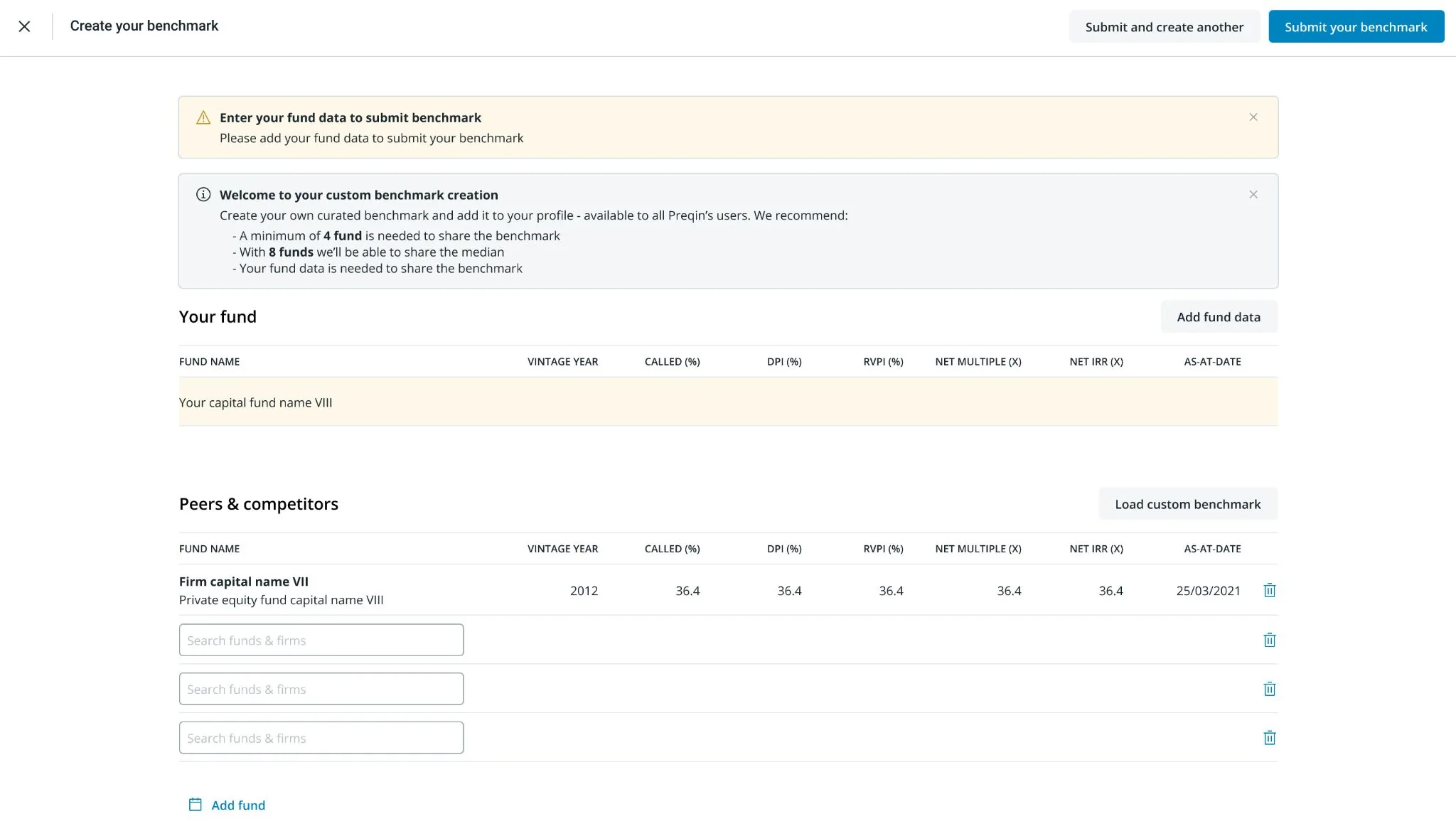
The custom benchmark builder. A panel headed Welcome to your custom benchmark creation states three rules: a minimum of four funds is needed to share the benchmark, with eight funds the median can be shared, and the submitter's own fund data is required. Below it, an empty Your fund row above a Peers and competitors table.
The cohort floor, written into the product rather than left to policy: four funds to share anything, eight before a median. It is the control that makes anonymity hold.

Thirty-two fields, refused

Would anyone finish 32 fields?

Stakeholders had asked for 32 fields. The alternatives were a phased multi-session form or a short inline one. Every field had an internal advocate and a report it supported; the issue was their cumulative cost.

I refused the 32 fields and shipped a short inline form with trust signals beside it, limited to what someone could finish in one sitting. The data model stayed thinner than the business wanted, and the argument returned every quarter. We would watch what people completed and extend the form from evidence rather than requests. We never tested the 32-field version, so this choice rests on reasoning rather than comparison.

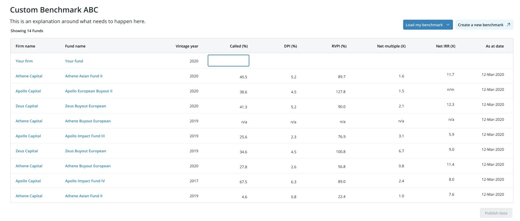
The benchmark table with a single editable cell. The top row reads Your firm and Your fund with one focused, empty Called percentage input; ten named peer funds sit underneath it with their figures already filled in.
What survived the thirty-two: one field, in the row it will be compared against.

The part still running

The durable output is not the inline field. It is the cohort floor: four funds before a benchmark can be shared, eight before a median. That rule is a control written into the product rather than into a policy document, and it is what lets anonymity survive contact with the thing that makes the data useful, which is slicing it finely enough to be relevant. Somebody has to keep deciding where that floor sits as the dataset grows, so it is a governance commitment as much as a feature — and it is the piece most likely to still be load-bearing in the product now.

The second is a policy rather than a screen. The form ships short and gets extended from what people actually complete, not from what an internal advocate can justify. That converts a quarterly argument into an evidence question, which is the only version of that argument anyone can win.

What it did not unlock is a settled answer on the leaderboard, and the note below is about that.

Which cause, before the options

Effort and exposure look identical in the data, and the cheap fix only ever addresses effort.

Both causes produce the same observation — submissions are down — and the roadmap options that follow from them share no overlap at all. One is a tooling problem and one is an incentive problem, and the first is always cheaper to build, easier to scope, and more comfortable to commit to in a planning meeting.

What I do differently since: when a contribution rate falls, I try to establish which of the two it is before any option gets estimated, because the estimates themselves bias the choice. Three of our six options were cheap precisely because they assumed the easier cause, and a cheap option that assumes the wrong cause is not cheap.

The second half of the lesson is in the note, and it is the harder one. Getting the diagnosis right did not stop me getting the first remedy wrong, and the research had already told me why.

The obvious lever made people feel exposed

Competition was the obvious lever, right up until a product asking for trust made its partners visible. I built the leaderboard first because people wouldn’t contribute, and I was confident it would work. It backfired.

The quartile ranking that worked used the same idea without identity. That fix was available before the leaderboard: research had already said, “if my numbers aren’t great, I don’t want anyone to know.” I shipped it anyway.

The retention figure doesn’t separate recovery from damage, so I don’t know what the leaderboard cost. Did the later result overcome the harm, or just cover it up? The number I have can’t tell me.

Sam Cusano