Varex~10 min read

Every ring shared a style. None of it added up to a signature.

What fixed it was describing forces — compression, torsion, shear — rather than naming shapes.

  • Role: Art direction, design system, prompt architecture
  • Timeline: Side project
  • Team: Solo
  • Impact: Not measured yet
An R&D board for the Apex Predator ring: a swept, lattice-filled silver form photographed large on the left, five numbered design principles beside it — commitment, compression, trajectory, precision, psychological asymmetry — six orthographic views across the top right, and a structural-language diagram at the foot tracing load paths through the lattice.
One board, in the format all of them share. The principles are named on the left, the views are standardised, and the diagram at the foot treats every void as a load path rather than as decoration.

The short version

Generating an attractive ring is easy and has been for a while. I wanted to find out whether AI could help build a recognisable design language — something with enough control in it that a designer could tell which variables were actually doing the work.

So I built a generative jewelry exploration system: silhouette, structural behaviour, negative space, material, surface, asymmetry, and emotional character, each as a variable I could move on its own.

The first round worked and then stopped working. Every output converged on the same tall, skeletal, pointed thing. I had accidentally produced a style, which is not the same as a signature, and no amount of rewriting the prompts moved it. What moved it was changing the question from what the ring should look like to what the ring should do.

Nothing here has been made, quoted, or worn. The boards on this page are the whole of the output.

Scope

I owned

  • The design grammar: turning a set of references into rules rather than into a mood board
  • The variable system — shape, behaviour, surface, emotion — and the decision to make it composable rather than one long prompt
  • Diagnosing the convergence, and abandoning a direction I liked rather than trying to improve it
  • The banned-vocabulary list, and the engineering vocabulary that replaced it
  • Three house-signature territories, and the standardised R&D board that made them comparable
  • Every judgement about which outputs were worth keeping

The grammar

Generating a beautiful ring is easy. Generating a recognisable one is the hard part.

A luxury jewelry house is not a supply of attractive objects. It is a set of relationships a customer can recognise across ten years of pieces they have never seen before, and that recognition is the asset. Asking a model for “cool rings” produces attractive objects indefinitely and never produces the second thing: each output is a fresh sample from the same wide distribution, with no memory of the last one. The question worth asking was whether a designer could get control of the search space itself rather than of individual outputs.

So the first job was saying what the style actually was. I studied contemporary jewelry references and translated the recurring characteristics into a grammar rather than copying any individual piece: sculptural sterling silver, architectural negative space, asymmetrical balance, interrupted geometry, structural ribs and folded surfaces, and the tension between an organic curve and a sharp transition. An image can be matched; a rule can be applied to a case it has never seen.

I needed style as a set of rules, not style as a picture.

Shape

  • skeletal
  • fractured
  • folded
  • layered
  • cantilevered
  • interlocking
  • monolithic

Behaviour

  • compression
  • torsion
  • suspension
  • interlock
  • shear
  • expansion

Surface

  • brushed
  • satin
  • forged
  • carved
  • oxidised
  • mirror-polished

Emotion

  • serene
  • threatening
  • mysterious
  • protective
  • predatory
  • ceremonial

Breaking it into axes is what made it composable. I could change the structural behaviour without losing the material language, or change the emotional character without starting the silhouette again. One giant prompt gives you one lever with everything welded to it; four axes give you something you can hold still while you move one thing. At that point the prompt had stopped being an instruction and started being an engine.

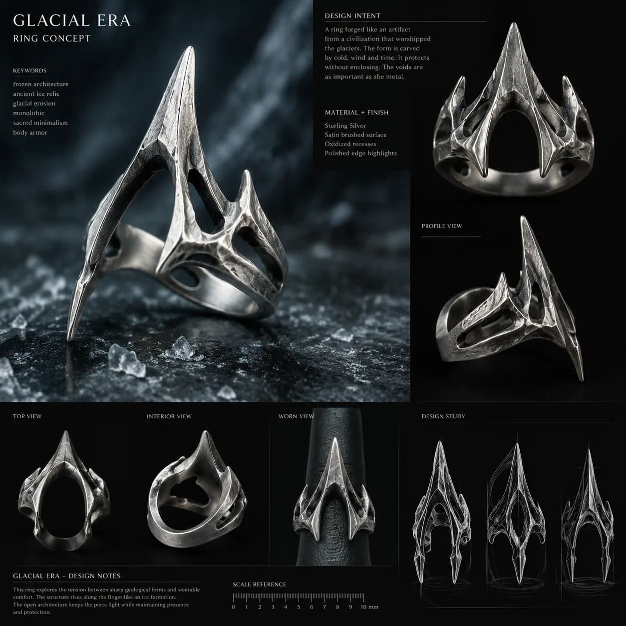
The Glacial Era ring concept board: a tall, sharply pointed silver ring shot against dark ice, with a keyword list, a design-intent paragraph, a material and finish list, and top, interior, profile, and worn views beneath it, plus a millimetre scale reference and three silhouette studies.
One output in the board format: keywords, intent, material, six views, and a scale reference. The format is the part that made anything comparable later.

The first failure was the useful one

Why was every ring the same ring?

I abandoned the first direction outright rather than trying to improve it. The early generations were compelling and they were also converging: tall spear-like silhouettes, skeletal lattices, pointed canopies, over and over, no matter what I changed in the prompt.

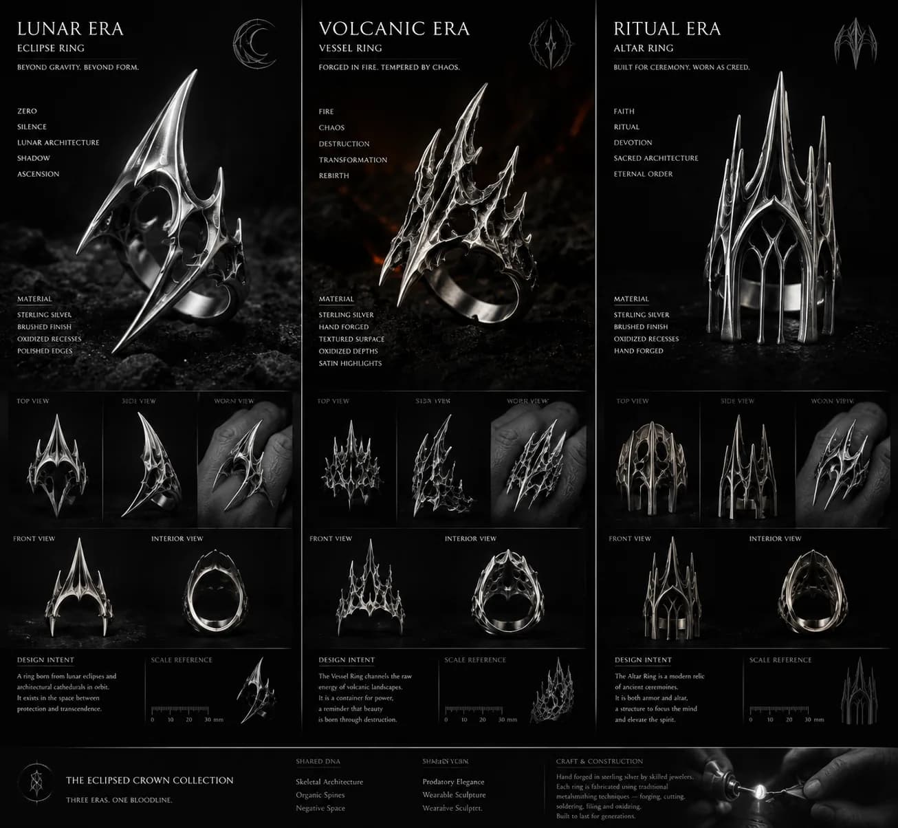
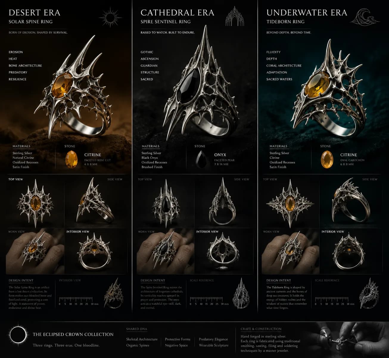
The tell is on this page and it is checkable. Two separate boards are branded The Eclipsed Crown Collection and both claim “three eras, one bloodline” — seven eras between them, each with its own intent paragraph about erosion or ascension or ceremony, all resolving to the same radial spike. A style is what happens when a system has a favourite; a signature is what happens when it has rules. The cheap move here is to ask for another variation, and it does not work, because the convergence was not in the outputs. It was in the question.

A three-panel board titled The Eclipsed Crown Collection, showing the Lunar Era eclipse ring, the Volcanic Era vessel ring, and the Ritual Era altar ring, each with keywords, materials, four views, and a design-intent paragraph. All three are tall, spiked, skeletal silver forms.
Three eras. One bloodline.
A second three-panel board with the same title and layout, showing the Desert Era solar spine ring, the Cathedral Era spire sentinel ring, and the Underwater Era tideborn ring, each set with a citrine or onyx stone. The silhouettes closely resemble those on the first board.
Also three eras, also one bloodline, and a shared-DNA row at the foot listing the six traits they have in common. Seven eras across the two, and one shape.

What should the ring do?

I stopped asking what the ring should look like. A look is a destination and a behaviour is a relationship — compression, torsion, suspension, interlock, shear, expansion — and a relationship can be satisfied by forms nobody has drawn yet.

Along with it I banned a list of words from the vocabulary entirely. Each is a symbol with a picture already attached, and asking for one is asking the model to reach for the most common version of it. What replaced them was engineering language. The cost is that describing a load path is slower and less evocative than saying “claw”, and half the outputs are worse. The half that are not are the ones nothing else was going to produce.

Banned outright

  • spike
  • claw
  • fang
  • talon
  • bone
  • gothic
  • blade
  • horn
  • armor

Used instead

  • compression rib
  • load path
  • tension arc
  • pressure seam
  • acceleration line
  • structural fin
  • directional mass
  • cantilever
  • shear surface
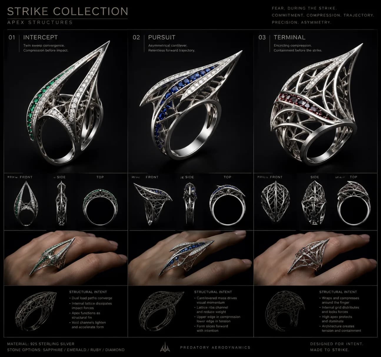
The Strike Collection board: three lattice rings named Intercept, Pursuit, and Terminal, each with front, side, and top views, a worn view, and a structural-intent list describing dual load paths, cantilevered mass, internal lattice that dissipates impact forces, and edges held in compression or tension.
The same three rings described only by what they do. Every annotation names a force — converging load paths, cantilevered mass, upper edge in compression and lower edge in tension — and not one of them names a shape.

Three territories

Dangerous how, exactly?

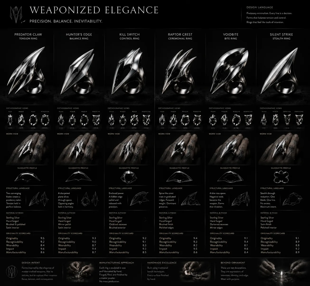
The first territory chased the feeling immediately before impact — commitment, compression, trajectory, precision, asymmetry — without making anything that was literally a weapon. The principle that made it workable was one sentence: make the object feel dangerous because it is certain, not because it is sharp.

That distinction kept it away from the obvious answer. Sharpness is a surface property anyone can add; certainty is a structural one that has to be designed in, and it is the half that survives translation into the engine — certainty can be expressed as a single uninterrupted load path, and sharpness can only be expressed as a point.

A six-column comparison board titled Weaponized Elegance, showing rings named Predator Claw, Hunter's Edge, Kill Switch, Raptor Crest, Voidbite, and Silent Strike. Each column carries the same rows: orthographic views, a worn view, a silhouette profile, a structural-language note, material and finish, and a scorecard.
Six directions in one row, with identical rows underneath so the silhouettes can be read against each other rather than admired one at a time.
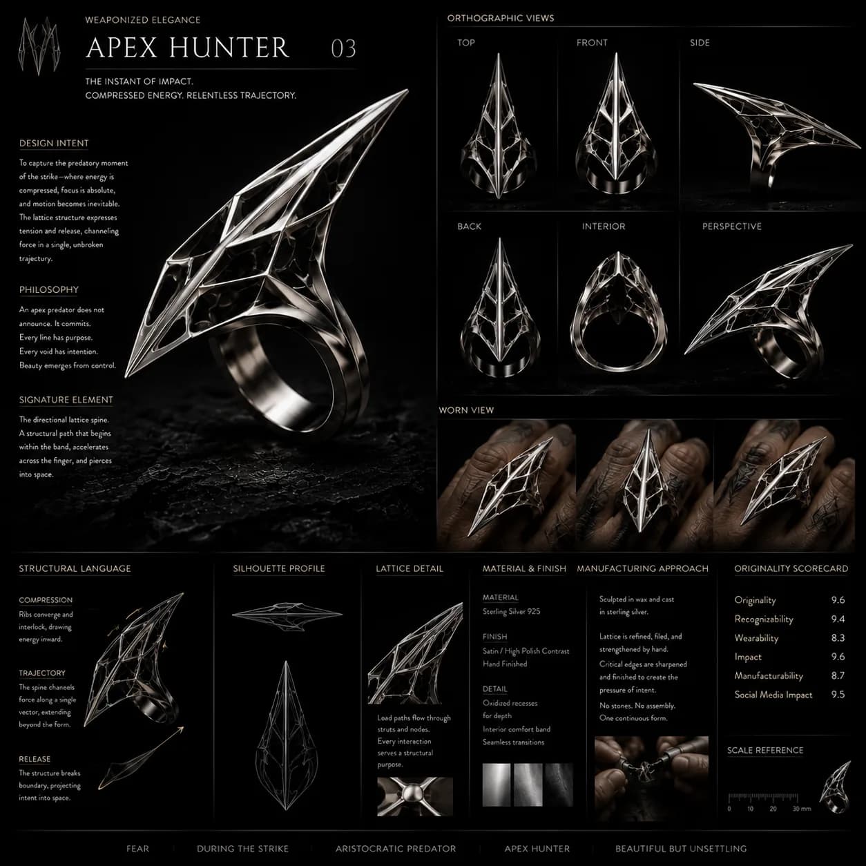
A single-ring board for Apex Hunter 03: a swept lattice form with design intent, philosophy, and signature-element notes on the left, six orthographic views and three worn views on the right, and structural language, silhouette profile, lattice detail, and material notes along the foot.
The one that came out of it. The signature element is named as a structural path — a spine that begins in the band, accelerates across the finger, and leaves the form — rather than as a motif.

How little material can imply a much larger object?

The second territory started from layered open structures, and my first instinct was the wrong one: make it smaller and lighter. Reducing an object gives you a smaller version of the same object. Reframing the problem as an illusion — how little material can create the impression of something far larger — turns the void into the subject.

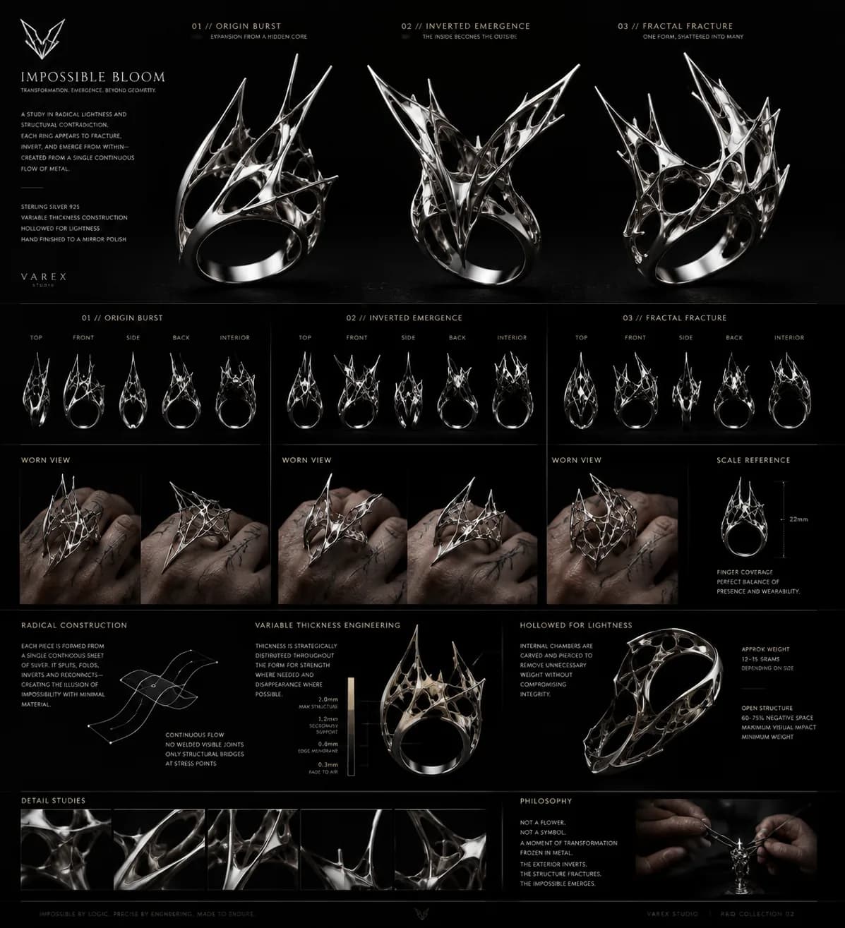
So the direction got a written brief before it got a generation: 20 to 25mm height, variable thickness, 75 to 85% negative space, asymmetrical visual weight, sterling silver, one continuous structural membrane wherever possible, and no floral interpretation at all. The form was allowed to burst or fracture; it was not allowed to resemble a flower.

The Impossible Bloom R&D board: three open, fractured silver rings named Origin Burst, Inverted Emergence, and Fractal Fracture, with five orthographic views each, worn views, a 22mm scale reference, a variable-thickness diagram running from 2.0mm to 0.3mm, a hollowed-for-lightness section, and a philosophy panel reading “not a flower, not a symbol”.
The constraints, reported back on the board itself: a 22mm height, thickness stepping from 2.0mm down to 0.3mm at the edge, and a stated weight of 12 to 15 grams. The negative-space figure it prints is 60 to 75%, against a brief that asked for 75 to 85%.

Decorative complexity costs material and reads as busy. Optical complexity costs almost nothing and reads as impossible: the viewer perceives a structure much larger than the metal actually present. That is the most jewelry-specific finding here — a ring is worn on a hand, so every gram is a wearability problem, and any technique that buys presence without buying weight is buying the thing the category is short of.

Do I like this ring, or does this establish a language?

I standardised the R&D board and compared the three territories through it, instead of judging outputs as they arrived. Every board fixes the same things — scale, material, presentation, the set of views, the technical annotations, and a silhouette comparison — so the only variable left between two boards is the design language itself.

That replaces the question I kept accidentally answering. “Do I like this ring” is a question about me, it is answerable in a second, and it has never once told me whether a language was forming. “Does this establish something recognisable” is slower, harder, and occasionally returns a no about work I liked. The whole point of the format is that rejecting a direction has to be as cheap as generating one.

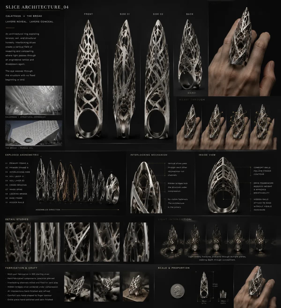
The Slice Architecture 04 board, credited to Calatrava and The Broad, with two architectural reference photographs at the left, four orthographic views of a tall pierced lattice ring, an exploded axonometric naming ten components, an interlocking-mechanism diagram, detail studies, and a scale comparison against a coin.
The third territory, and the only one that pins its references to the board — a Calatrava structure and The Broad’s porous veil, named where anyone can check the translation.
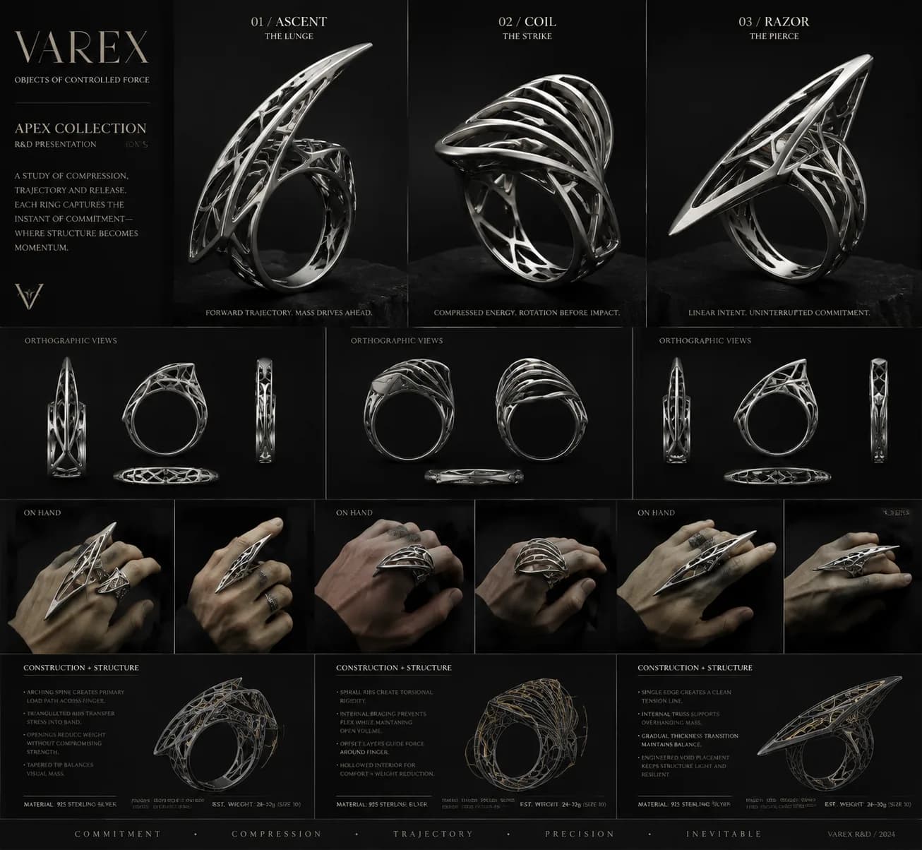
A VAREX Apex Collection R&D presentation board showing three rings named Ascent, Coil, and Razor, each with orthographic views, on-hand photographs, and a construction and structure list describing load paths, torsional rigidity, and thickness transitions.
Three behaviours in one territory — a lunge, a strike, a pierce — kept on the one board so the comparison is between structures rather than between moods.

Where the AI actually sat

AI made visual experimentation cheap: generating directions, exploring layouts, turning principles into prompts, iterating silhouettes, and putting competing visual languages side by side.

The work that mattered was the loop around it. I would spot where the model was converging, work out why it was converging there, change the rules, and generate again. That loop is the design job, and it is not automatable by the thing being corrected — the generator has no opinion about whether its favourite shape is a signature or a rut. The model produced possibilities. The design system decided which possibilities were worth having.

Not prompt to image. Design language, variables, generation, comparison, critique, refinement.

The intended end of this is not an image generator. It is an exploration platform that gives a designer control of the search space: increase the asymmetry, take material out, change the structural behaviour, and see what happens without losing the house language on the way.

That platform does not exist. What exists is the grammar, the variable set, the board format, and twenty boards.

A recognisable language doesn’t come from repeating motifs. It comes from repeating relationships.

AI is very good at variation and, less obviously, very good at exposing the weaknesses in a design system. Give it vague aesthetic instruction and it will find the nearest cliché, reliably and at speed — which is a free diagnostic, because the cliché it lands on is the shape of the gap in your rules.

The way out was not a better prompt. It was a better grammar, and the useful generations were never the ones I had described most vividly. What recurs in a house language is not a motif: it is how mass relates to void, how much material is necessary, where the tension appears, and how an object communicates an emotion without reaching for a literal symbol. The part worth carrying into other creative tools is not replacing the designer’s eye, but handing it a much larger space to look at.

None of this is a ring

Nothing here has been made. No wax has been cut, no bench jeweler has quoted it, nobody in the trade has looked at it, and no piece has been worn by anyone. Every board on this page says otherwise in its own voice — “hand forged”, “silver-soldered under compression”, “est. weight 24 to 32g”, “1.2mm to 1.6mm variable thickness” — and none of that is a manufacturing spec. It is generated text sitting on a generated image, and the same system that drew the picture is the one asserting the ring can be built.

The scorecards are the sharpest version of the problem. Several boards carry an originality scorecard rating themselves between 8.1 and 9.6 on originality, recognisability, wearability, impact and manufacturability, and one of them scores its own social media impact at 9.5. No human graded any of that. If you want the tell that the annotations are machine-written, read them closely: “AESTETIC” on the hero board, “LANGUUGE” on Weaponized Elegance, “CONSTRUCTION & ENGINEERICE” on the Varex board. They pass as industrial design documentation from across a room and stop passing at reading distance. The 22mm and the thickness ladder on Impossible Bloom are in the same category — the brief asked for 75 to 85% negative space and the board reports 60 to 75%, and neither figure was measured off anything, because there is nothing to measure.

What I can’t grade is the part that matters most. The grammar did widen the space, and the second round is the evidence for it: the Strike and Bloom boards reach structures the Eras boards never got near, and describing behaviour rather than symbols is what got them there. But a house language is defined by being recognised by somebody who is not its author, and the only person who has ever judged whether these add up to a signature is me. On a claim about recognisability, that is not a small caveat. It is the whole of what is still unproven.

Sam Cusano