Florida Association of the Deaf~4 min read
A new identity for a 109-year-old Deaf advocacy group, and the board that kept the name legible.
Volunteer brand and website work. Two directions went to the board. They kept my brand language and rejected my logo.
- Role: Identity, design system, and prototype
- Timeline: Volunteer, Sept–Oct 2026
- Team: Solo, reporting to the board
- Impact: Direction adopted, not launched
- Platform: Web
Overview
I volunteered to rebuild the identity and website of a Deaf advocacy group that had gone quiet.
The Florida Association of the Deaf has advocated for Deaf Floridians since 1917. Its audience is Deaf adults across the state, along with DeafBlind and hard-of-hearing people, interpreters, families, and allies. FAD hadn't held an event in more than two years. Four other organizations now work in nearby territory. The brief was an identity that makes someone think “this represents me” and “I want to join.”
Claude built the prototype. Reve and Google Flow made the marketing renders. Nobody was paid.
What I owned
I owned
- Positioning and three rules both directions had to follow
- Logo exploration and two brand directions, Sunrise and Art Deco
- A design system and working prototype, with the directions on one switch
- The board deck, speaker notes, and recommendation
- The final FAD logotype, drawn to the board's decision
Constraints
Deaf-led, culture not disability, and Florida without the palm tree.
FAD's current mark is a circular seal with a Florida silhouette and an ASL hand, the same three moves most Deaf and accessibility organizations make. I set three rules for both directions. Interpreters and allies support and are never the face. Deafness is a language and a community, not a loss. Florida shows up as light and architecture, never as a tourist postcard.
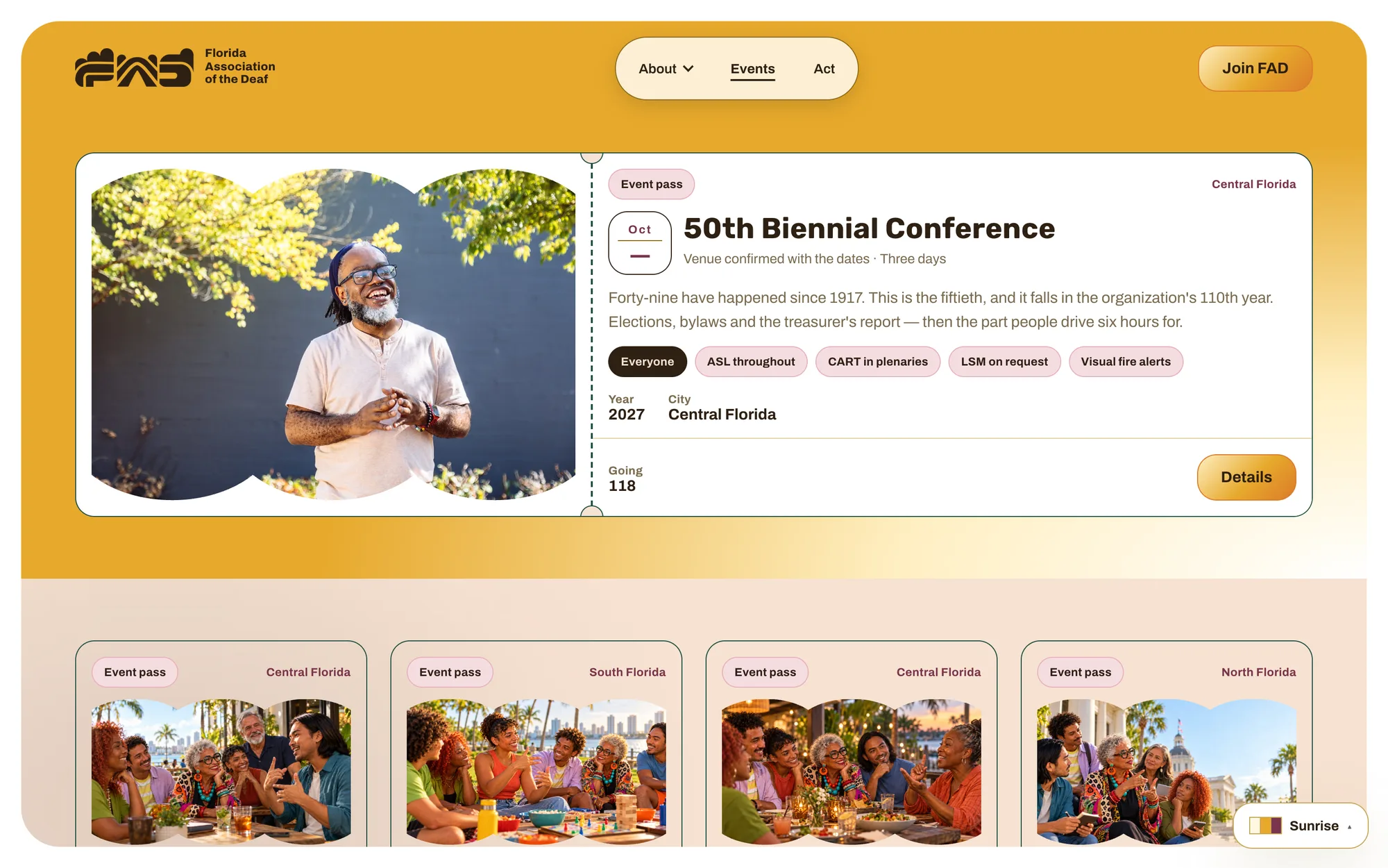
An affiliate survey shaped the product. Six people answered it, and they answered for organizations, not individuals, and they ranked marketing and events first. So the statewide calendar became the center of the site, with membership as what pays for it. Access details are a required field on event submission, because people check them before deciding whether to drive.
Exploration
Most of the hand marks said care, not advocacy.
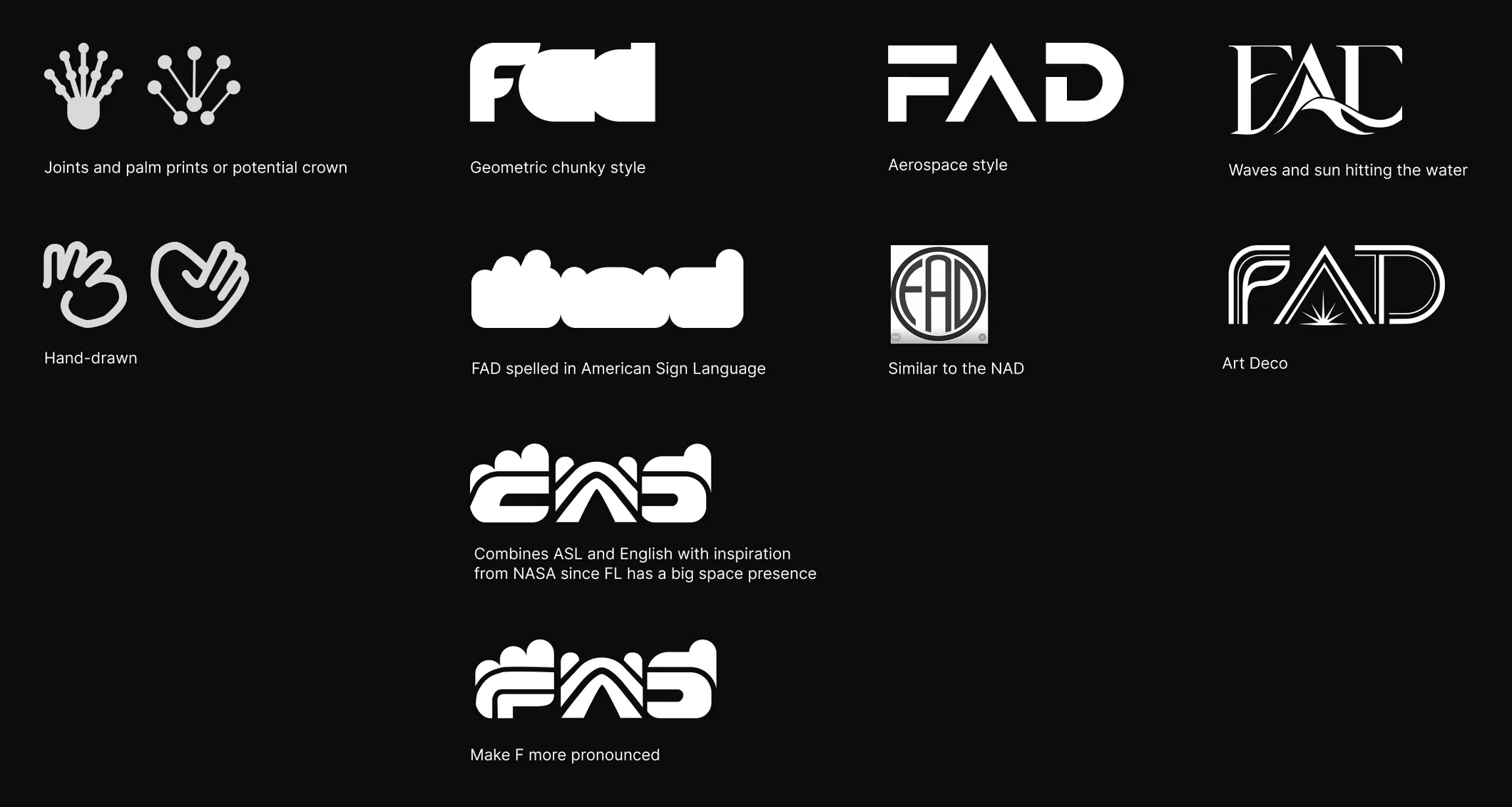
The hand-drawn hand that curls into a heart was the look I wanted, but it pulled toward wellness and support, so I stopped there. The joints-and-palm mark read more like a constellation than a hand. That was interesting, but it didn't say advocacy. The idea I pushed furthest spells FAD in fingerspelled handshapes and English letters at once, compressed and heavy like the NASA logotype, since space is a big part of Florida. It became the Sunrise wordmark.
Decision: two directions
I built two directions on one prototype, so the board could compare them on real pages.
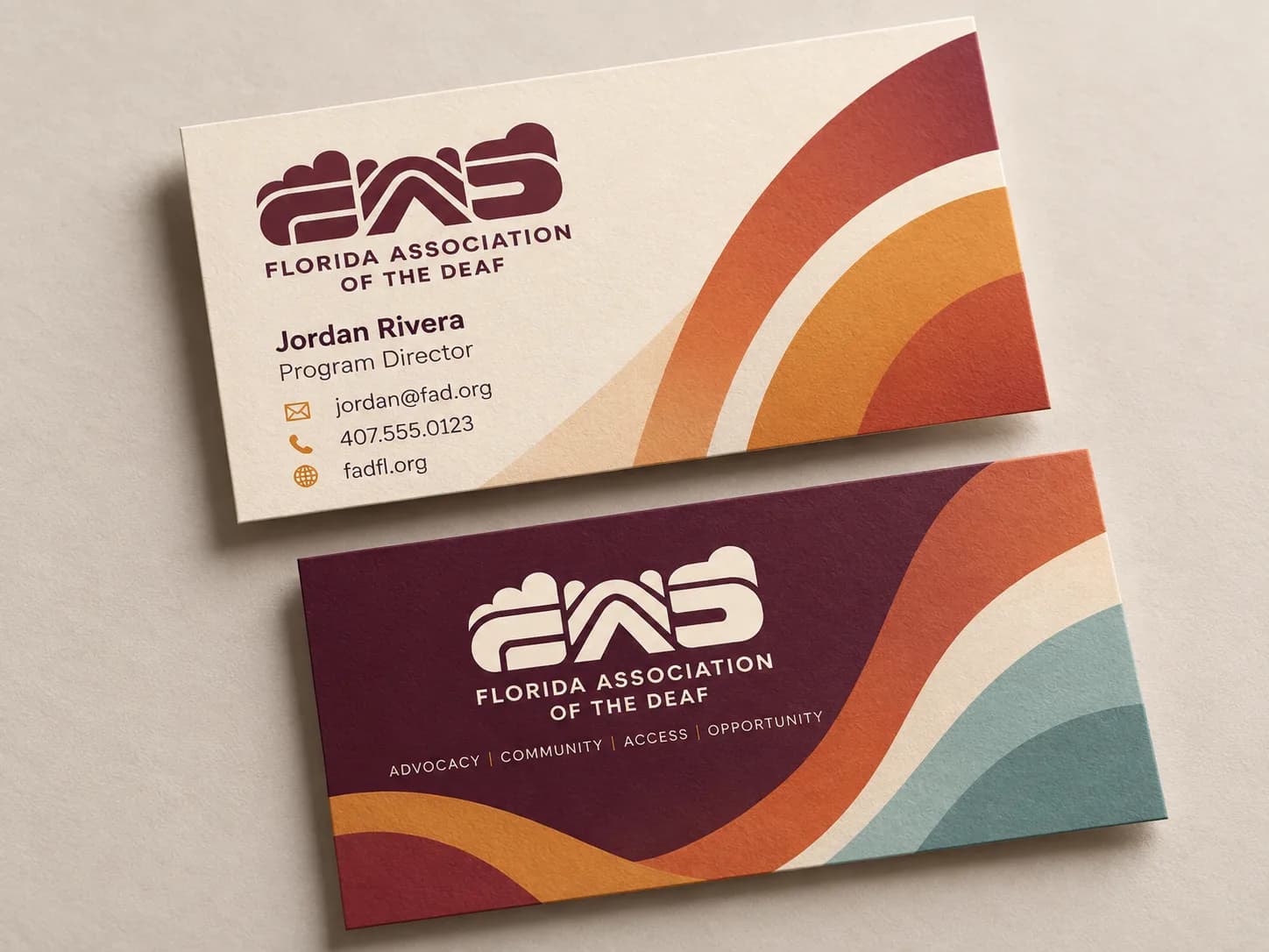
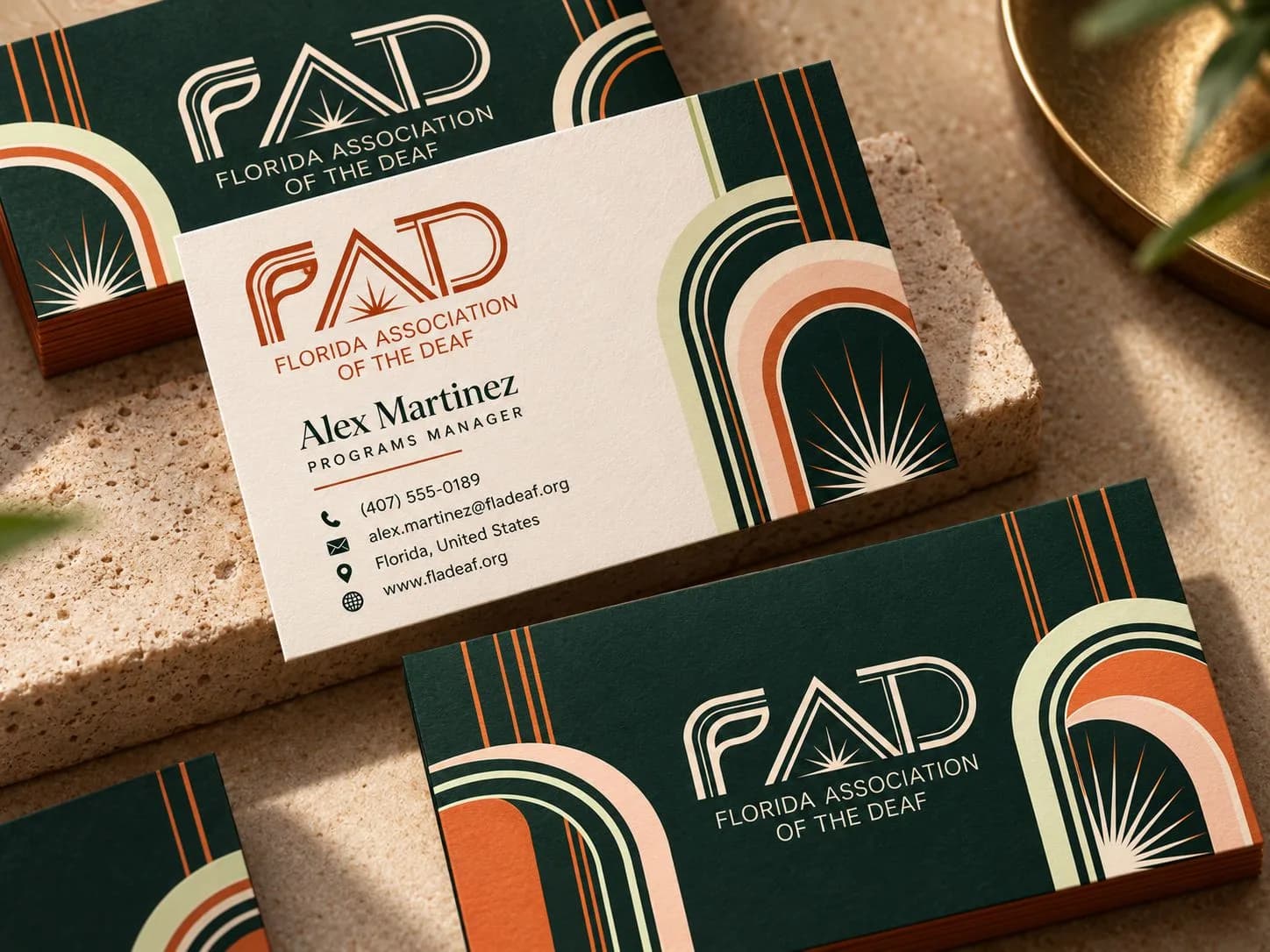
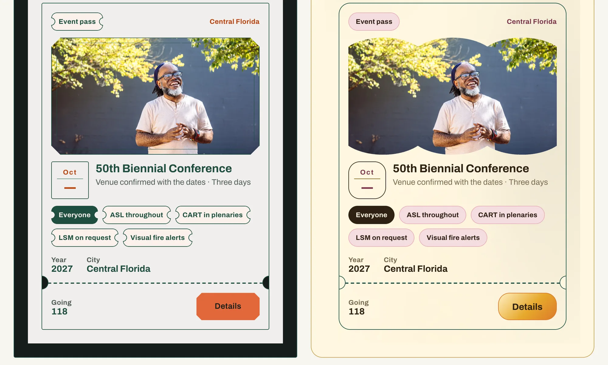
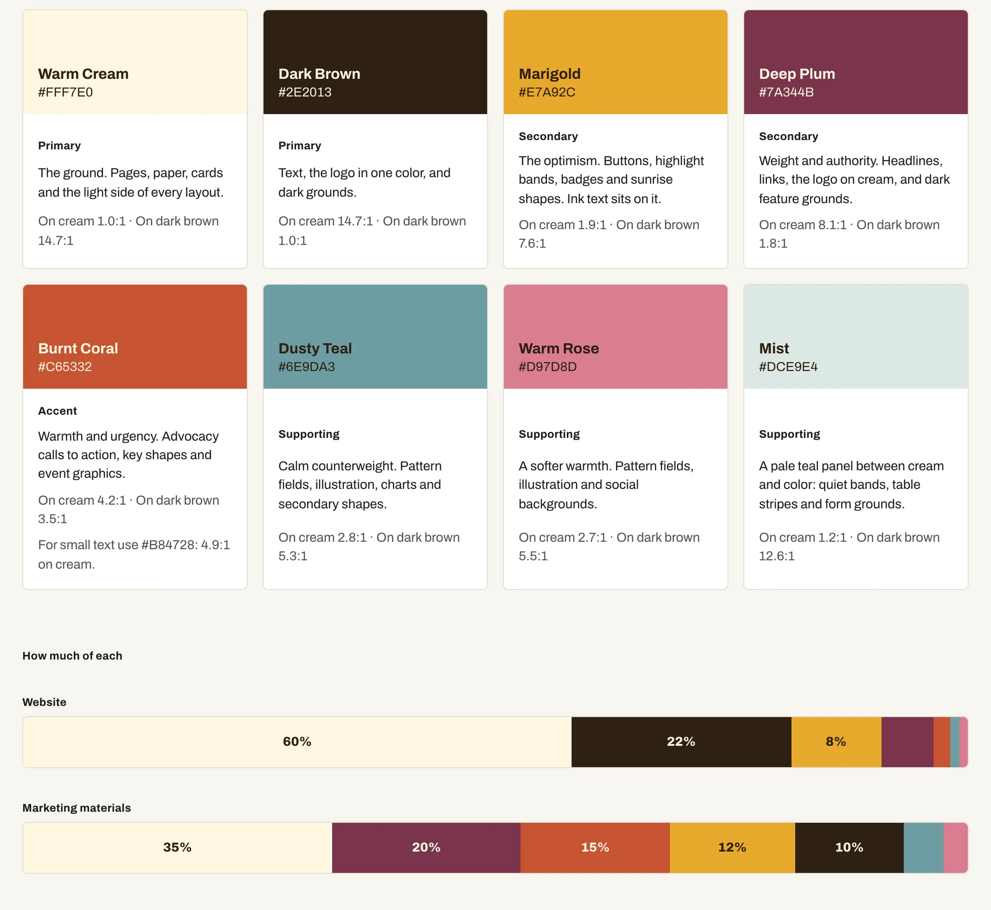
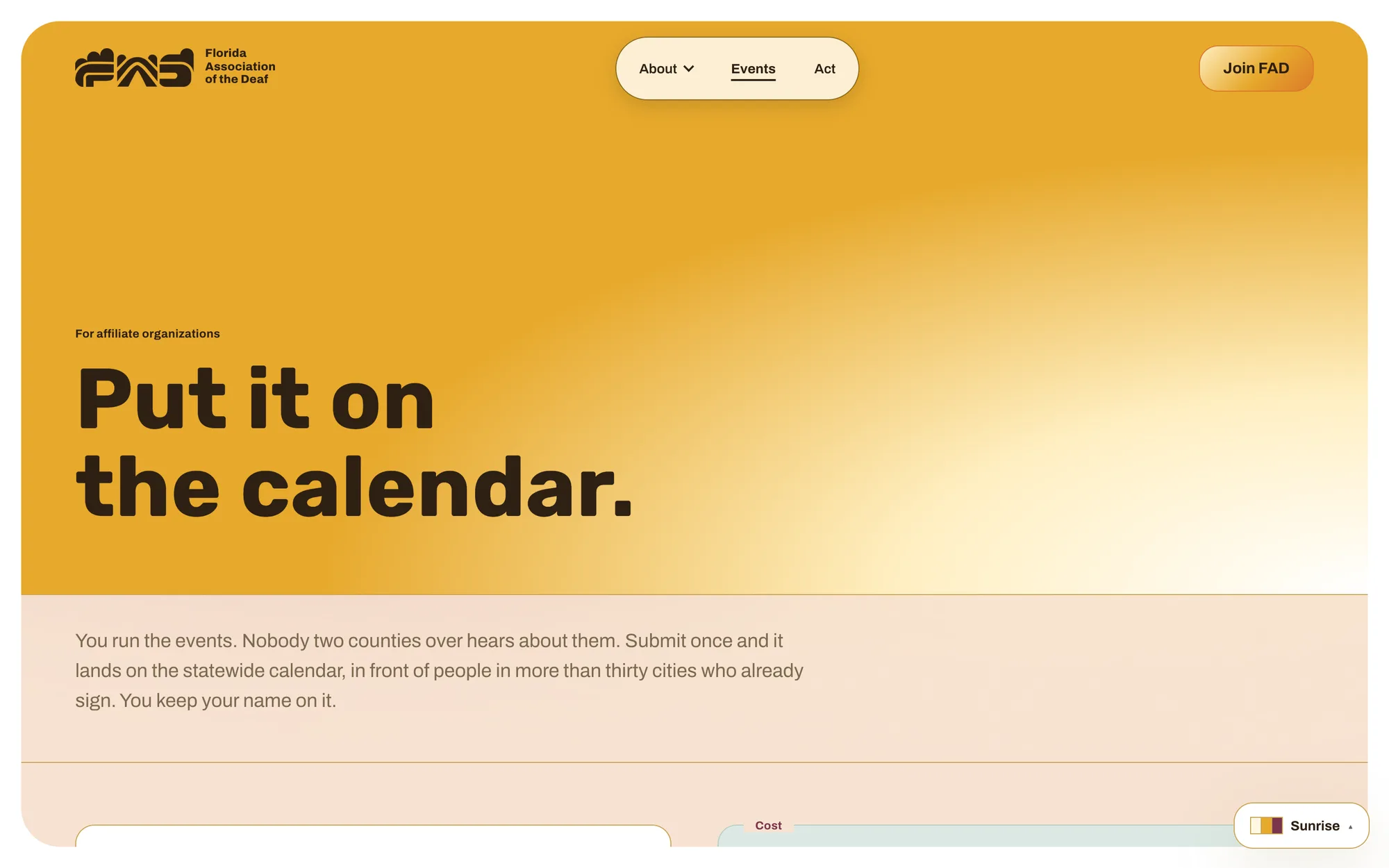
Sunrise is warm: cream, marigold, plum, dusty teal, and a slow arc of light. Art Deco is a deep green room with citrus line work and a sunburst, drawn from Miami's architecture. They are not recolors. Each sets its own display face, corners, and image mask through the same tokens, so no component knows which direction it is in. Contrast is measured live from those tokens against WCAG 2.2 AA.
Decision: Sunrise
I recommended Sunrise.
FAD's members range from someone at a coffee night to a state legislator. Sunrise's warmth reaches that whole range, and nobody else in the landscape is claiming warm and statewide at once. Art Deco reads as an institution. I alternated the order of the directions through the deck and held the recommendation until the board had seen both sites, so the last thing on screen wouldn't decide the vote. The board isn't technical, so I wrote the speaker notes the way I'd say them in the room, with no design jargon.
Results
The board kept the brand language and rejected the mark.
The discussion kept coming back to tradition and recognition. One board member argued that people need to be able to recognize the organization. My answer was that after more than two years without an event, there isn't much recognition left to protect, and a relaunch is the moment to rebuild it.
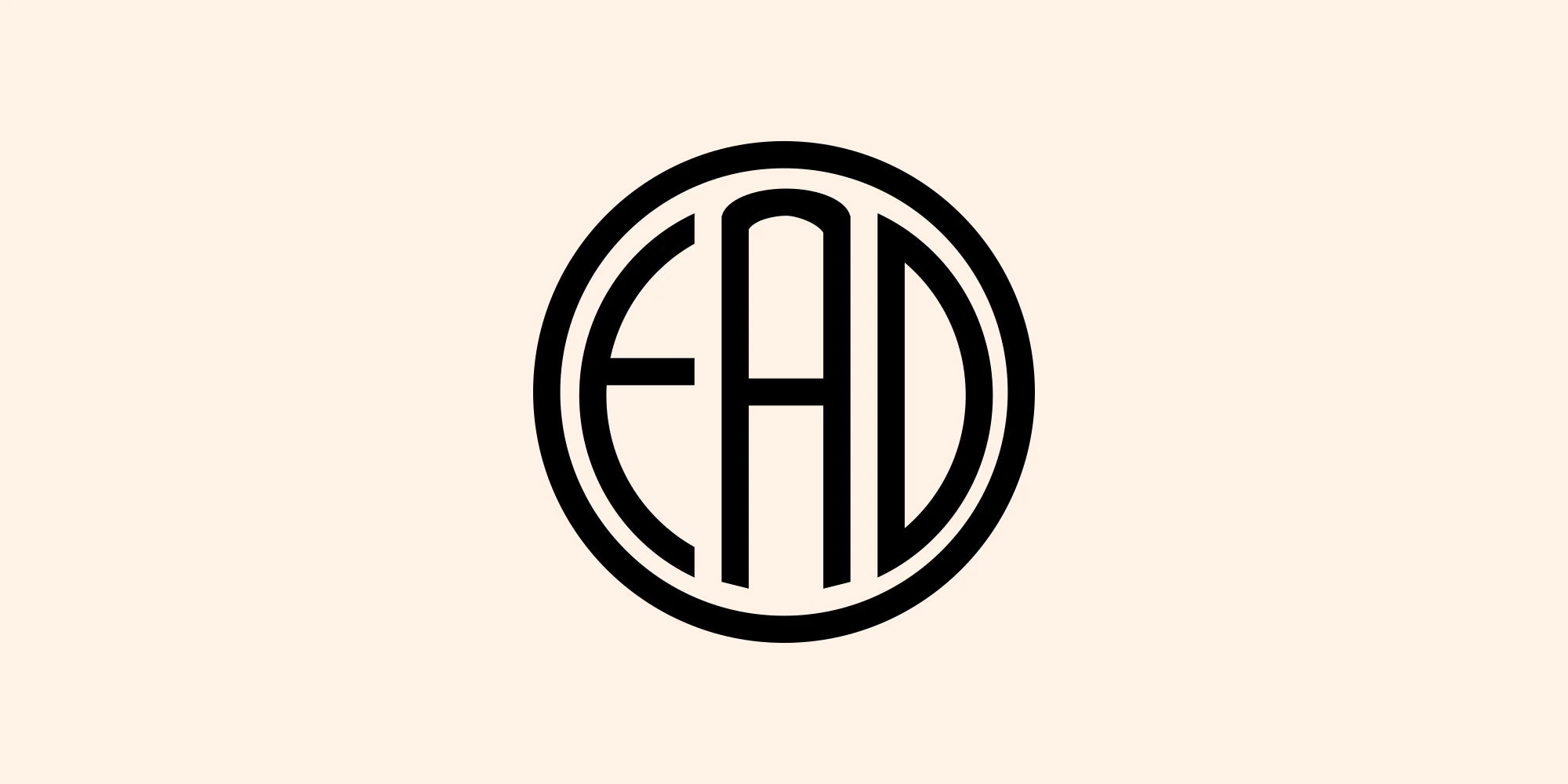
The board chose Sunrise as the brand language and a direct logotype that spells FAD. They felt strongly that the mark doesn't need ASL, because the content can carry it: interpreted events, ASL in the video, and Deaf people in the photographs. It's a fair point, and it's the one my wordmark argued against. I put the culture into the logo. The board would rather put it into everything around the logo.
What hasn't been checked
No Deaf or DeafBlind person has used the site or reacted to either direction outside the board. The rollout plan puts that test before launch and reports it back to the board. The marketing scenes and the people in them are generated. The event photos, apart from the Biennial's, are stand-ins until FAD has its own photography of Deaf people at FAD events, ideally shot with Deaf creative input. The bills and attendance figures in the prototype are sample content. The affiliate survey had six respondents, too few to rank anything with confidence.