Mission Canvas~4 min read
An AI software company whose website looked like every other AI software company.
A marketing site rebuilt for the small-business owners it sells to. Two homepages sit behind one switch, and the founders haven't picked yet.
- Role: Design direction and front-end
- Timeline: Freelance, Oct 2026
- Team: Solo, reviewed by the founders
- Impact: On a review preview, not launched
- Platform: Web
Lighthouse SEO score, mobile
Industry pages with their own search phrase
Lighthouse run on the Construction and FAQ pages of the review preview, October 2026. A score on a page that isn't live yet, not a ranking.
Overview
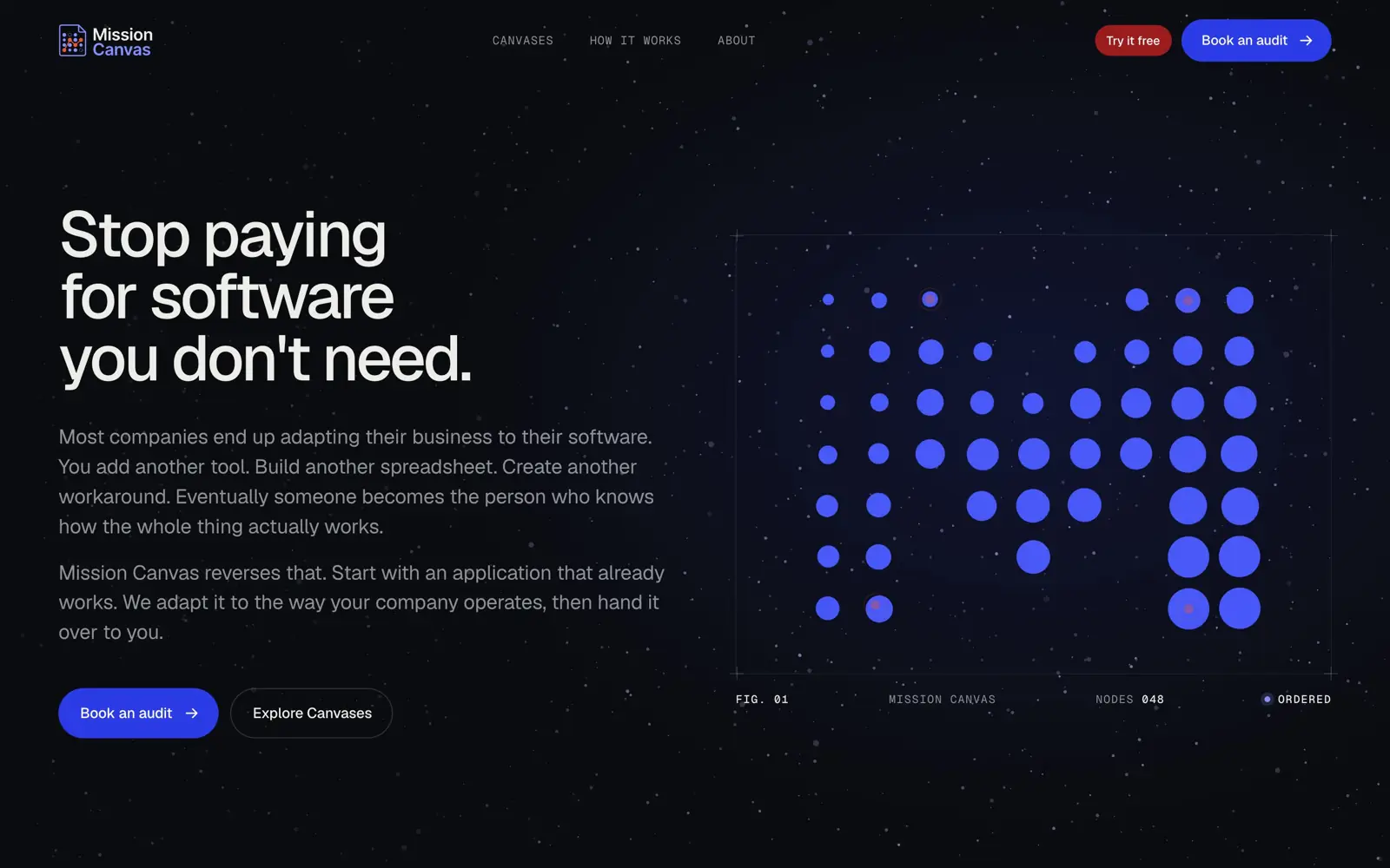
Mission Canvas builds AI software that runs on a small business's own computers. Its website read like a developer tool.
The buyers are owners: a builder, a school administrator, a dispatcher. The live site opened on a starry sky of electric-blue dot figures. The headline was strong, "Stop paying for software you don't need.", but there were no people in it, the product appeared only as dots, and the dark space look is the one most AI software already wears.
The founders, Mical and Jason, hired me to redesign it. I built it in Astro with Claude Code, and every change went to a private preview that search engines ignore, so they always reviewed the real site.
What I owned
I owned
- The direction for both homepages and the rules they had to follow
- Front-end build and the review preview it publishes to
- The copy switch that lets the founders compare two voices in place
- The booking form and its calendar overlay
- Search titles, structured data, and the plain-text files AI assistants read
With Mical and Jason
- The copy itself: Jason wrote the original, a brand brief rewrote it
- The choice between the two homepages, still open
First pass
The first redesign was warmer and hid its own point.
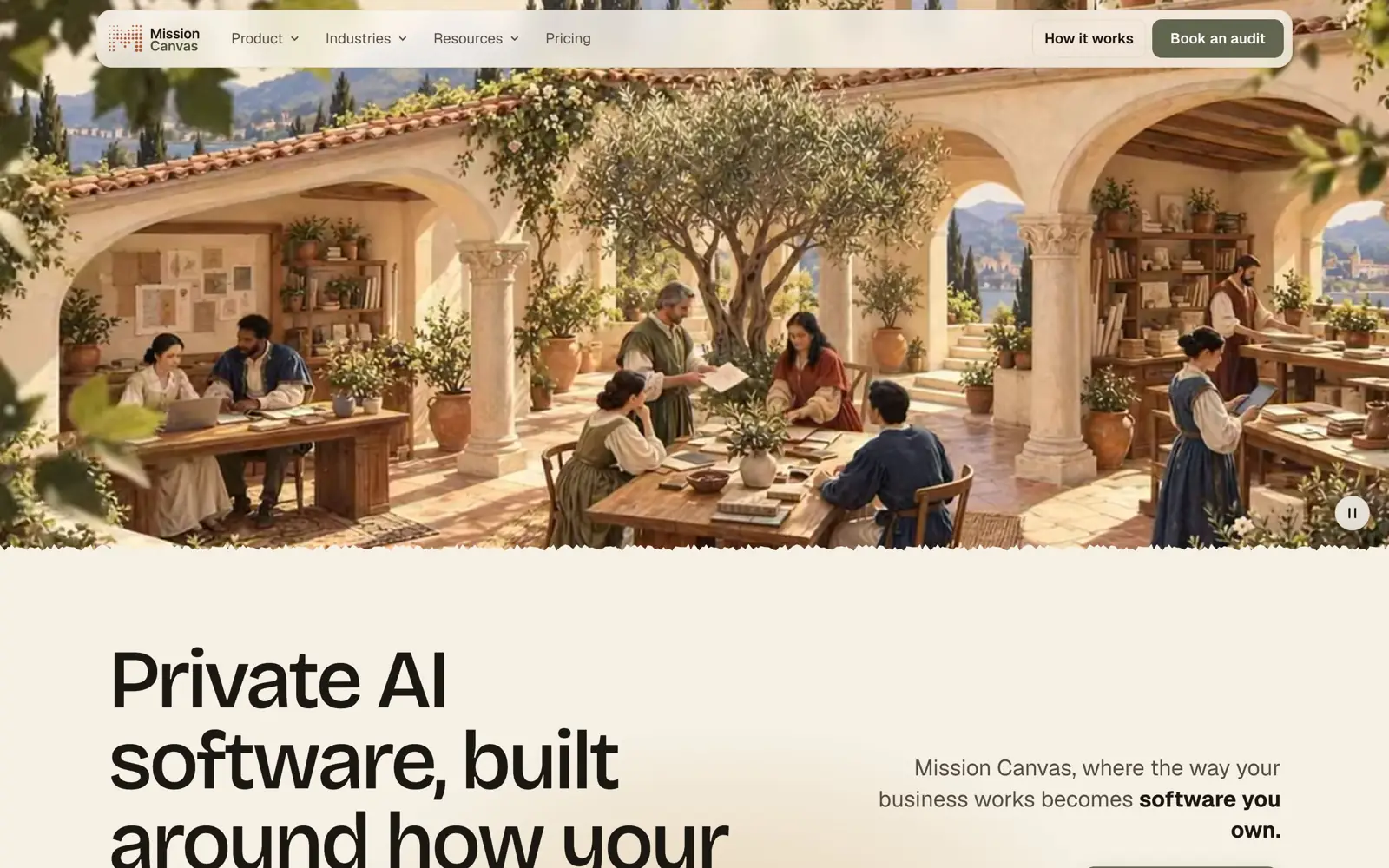
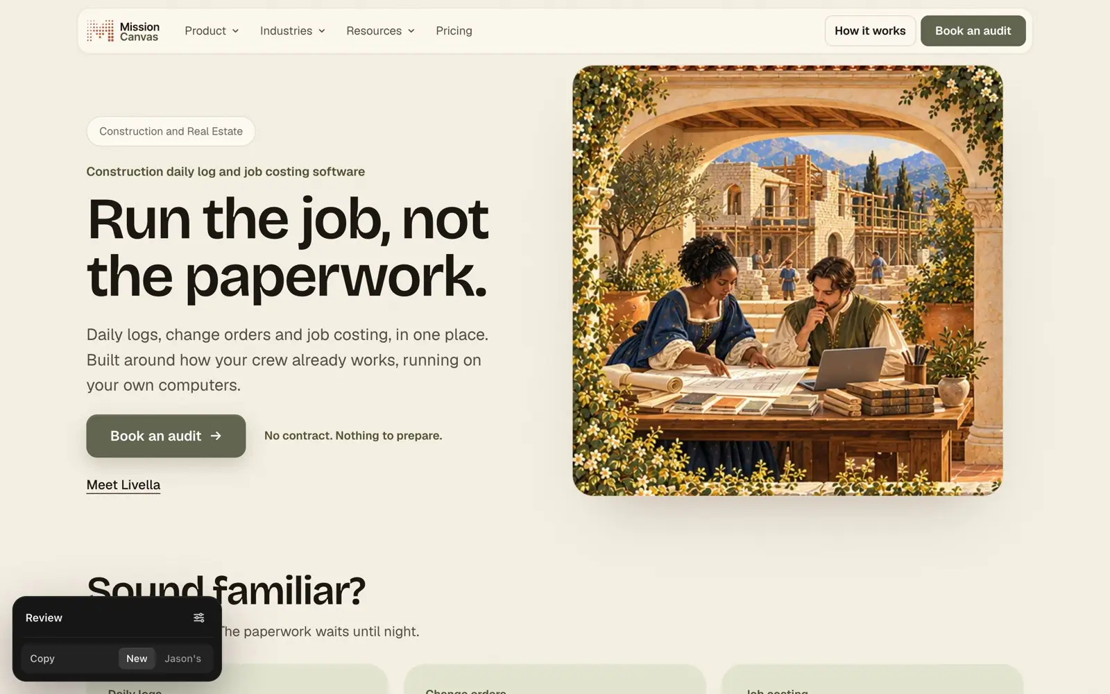
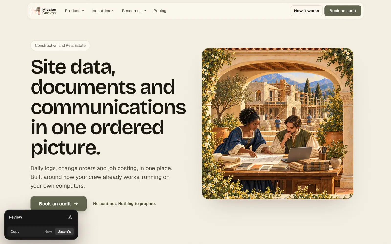
Daybreak traded the night sky for parchment and olive, and opened on a courtyard painting I made with ChatGPT: people in Renaissance dress at desks under stone arches. On a 1440 × 840 laptop it filled the whole screen, so the headline and the one button that mattered, Book an audit, started below it.
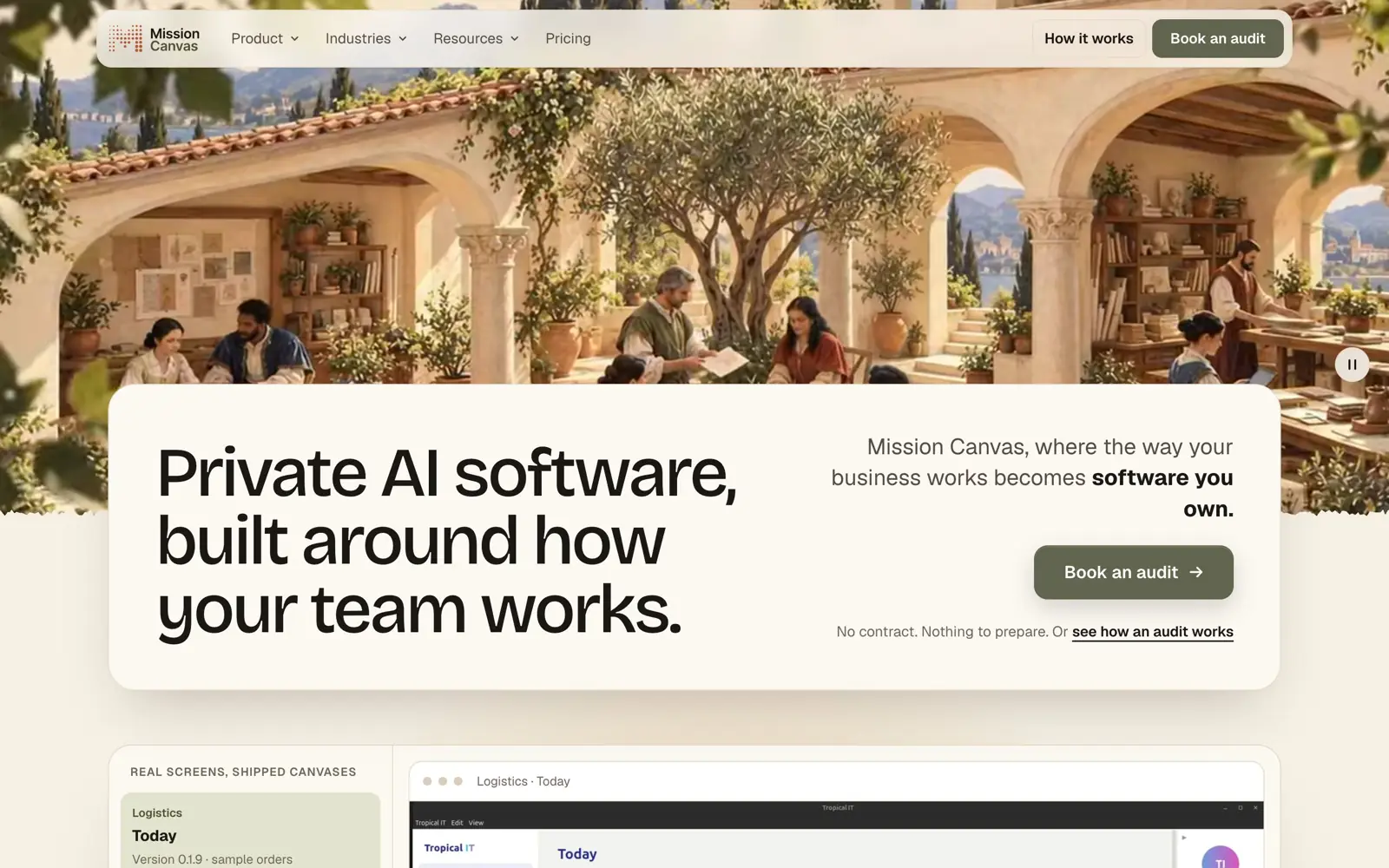
I kept the painting and moved the message. The painting is capped at 60% of the screen, with the headline on a parchment card lifted over its lower edge. The button now ends 586px down, inside the first screen.
Decision: a second homepage
The painting was still costumed figures from five centuries ago. No owner sees themselves in that.
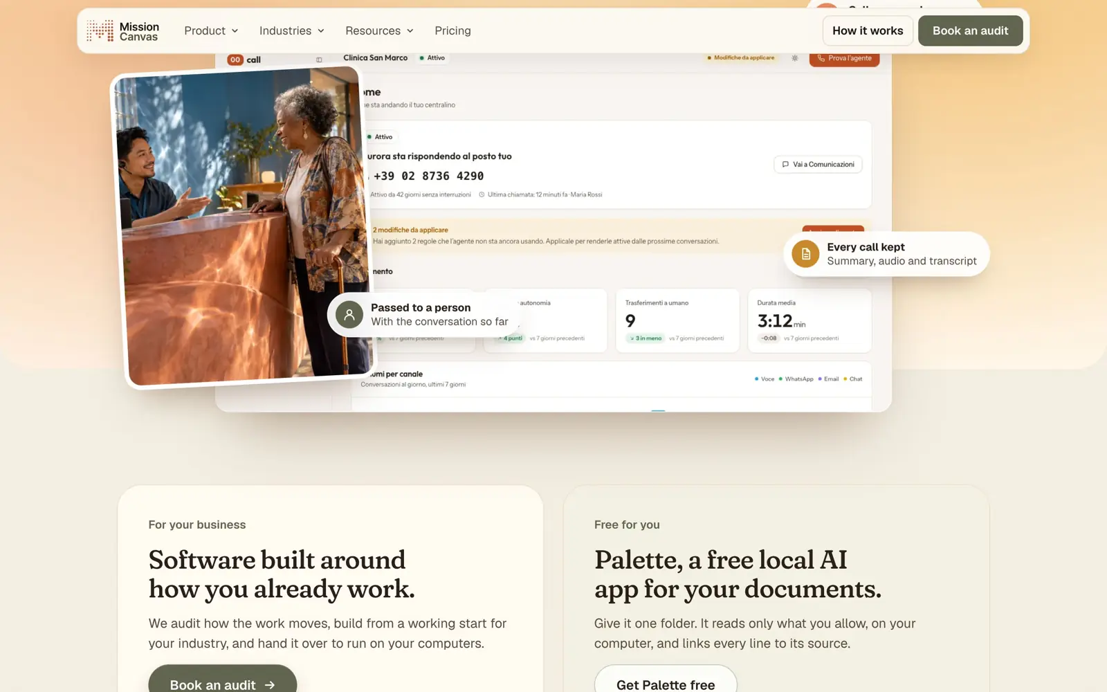
The founders asked for a direction that felt human. Warm daylight took Gusto's layout, a serif headline on a soft gradient with the real product below, and Granola's restraint: real screens, real faces, no glowing orbs.
I built it as a second homepage, not a replacement. A review panel switches between the two on the same address, so the founders compare them with real words and screens. Production ships one.
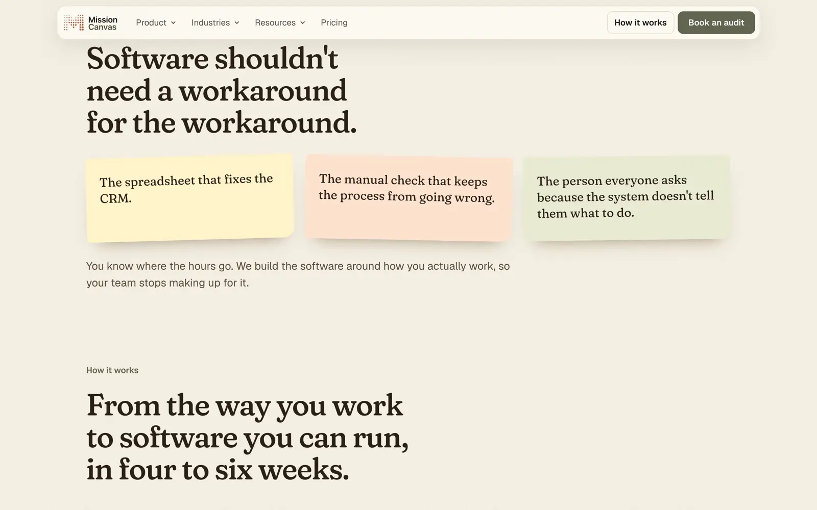
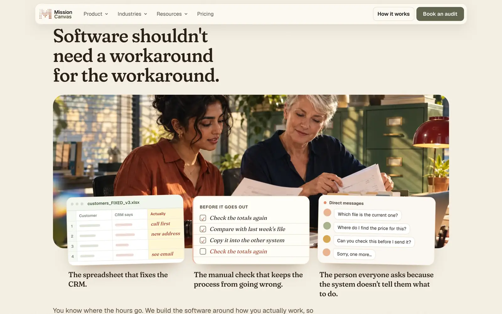
The first Warm draft put three everyday workarounds on sticky notes, which could have been about anything. The second drew the things themselves: a spreadsheet called customers_FIXED_v3.xlsx, a checklist that checks the totals twice, and the questions everyone sends the one person who knows.
Constraint
Nothing on the site gets invented.
No customer has agreed to be named yet, so there are no logos, quotes or metrics, and every gap stays a visible placeholder. The photographs of builders, nurses and teachers are AI-generated, carry no names, and get replaced when a real customer agrees to be shown.
Jason wrote the original copy and a brand brief rewrote it plainer. Every line with a counterpart now carries both versions, and the review panel swaps them in place.
Booking
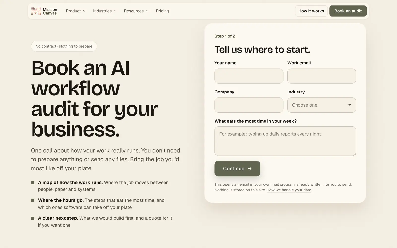
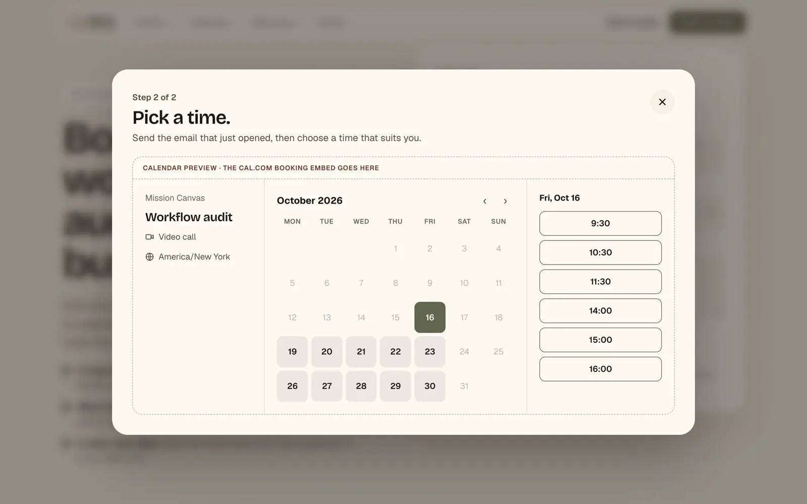
Five fields, then a calendar. The calendar isn't real yet.
The original audit form was a sentence to fill in: "We are ___, in ___. We would replace ___. Reach me at ___." Charming, but it never asked for a name and stopped at composing an email.
The new form asks for what a first call needs: name, work email, company, industry, and what eats the most time in your week. That last one replaced "the system you'd replace", because owners know where their hours go before they know which tool to blame. Team size, price, logos and quotes were cut, since none were confirmed.
It still opens an email. Step two asks the visitor to send it, then shows a calendar marked as a preview until the Cal.com link exists.
Search
Owners ask an assistant before they search, so the site describes itself the same way to both.
Each of the seven industry pages now leads with the phrase an owner would type, such as "Construction daily log and job costing software", and carries service markup. An llms.txt file is generated on every build, with every bracketed placeholder stripped so an assistant never repeats one as fact.
Still open
Nothing has launched, so there are no outcomes: no audits booked, no search impressions. Mical and Jason haven't chosen a homepage. Booking runs through email until the calendar link is live. The hero's front-desk screen is the Italian build, and an English capture is still owed. Every person pictured on the Warm homepage is generated.