PortSight~4 min read
A freight tool that hands you the next move.
A side project built alone, with five operations managers and no metrics.
- Role: Research, product strategy, design, front-end
- Timeline: Side project
- Team: Solo
- Impact: Not measured yet
- Platform: Web
Overview
Freight tools show everything and stay silent on which problem costs the most if you leave it until after lunch.
In freight operations, a missed customs filing is priced, with its own deadline and fine. A team can learn on a Tuesday that a filing is overdue and a port is closed. The systems that track this surface all of it and leave the ranking to the person.
I built PortSight alone, from research through front-end code. The first version monitored well and left a viewer unsure what to do next. The work became four decisions, one per surface, each asking the same question: show the situation, or hand someone the next move.
Worked with: no one on the build; 5 shipping operations managers in testing.
Scope
I owned
- Research with five shipping operations managers over a week, covering both whether the problem was real and how the four pairs of directions performed
- Product strategy and the thesis, which arrived after the decisions rather than before them
- Four A-versus-B direction calls, one per surface, each logged with what was rejected and why
- The design system: tokens, seven shared components, severity tiers, motion timings
- Front-end implementation in React and TypeScript: no engineer on this
- The accessibility and status-indicator pass, and the drift backlog naming what’s still wrong
Research
Five shipping operations managers showed that the problem was real and which directions they reached for.
Over a week, five shipping operations managers saw working prototypes. I used the sessions first to test whether the problem was worth solving and then to watch them use both versions of each surface.
They represent one of three audiences this study names. Nobody in compliance or finance has seen the surfaces built for them.
Port operations
Vessel arrivals, berth assignment, and the question of which disruption to work first.
Compliance and regulatory affairs
Filings against statutory deadlines, where being late is priced rather than inconvenient.
Finance
Exposure across the portfolio, and what any of it means before a board meeting.
Decision: cockpit or queue
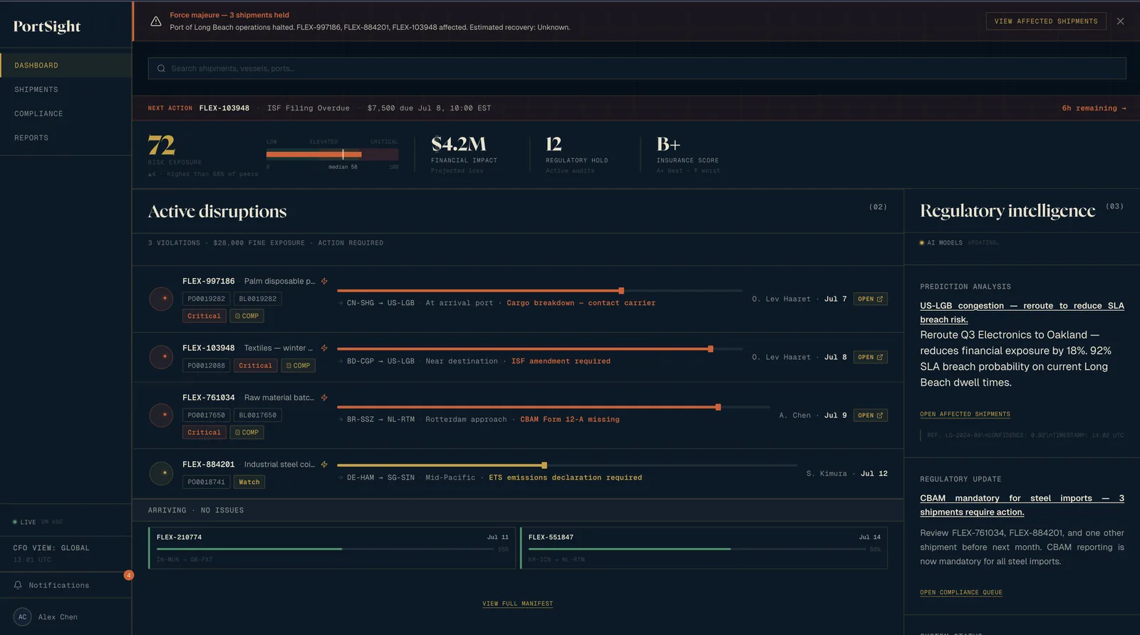
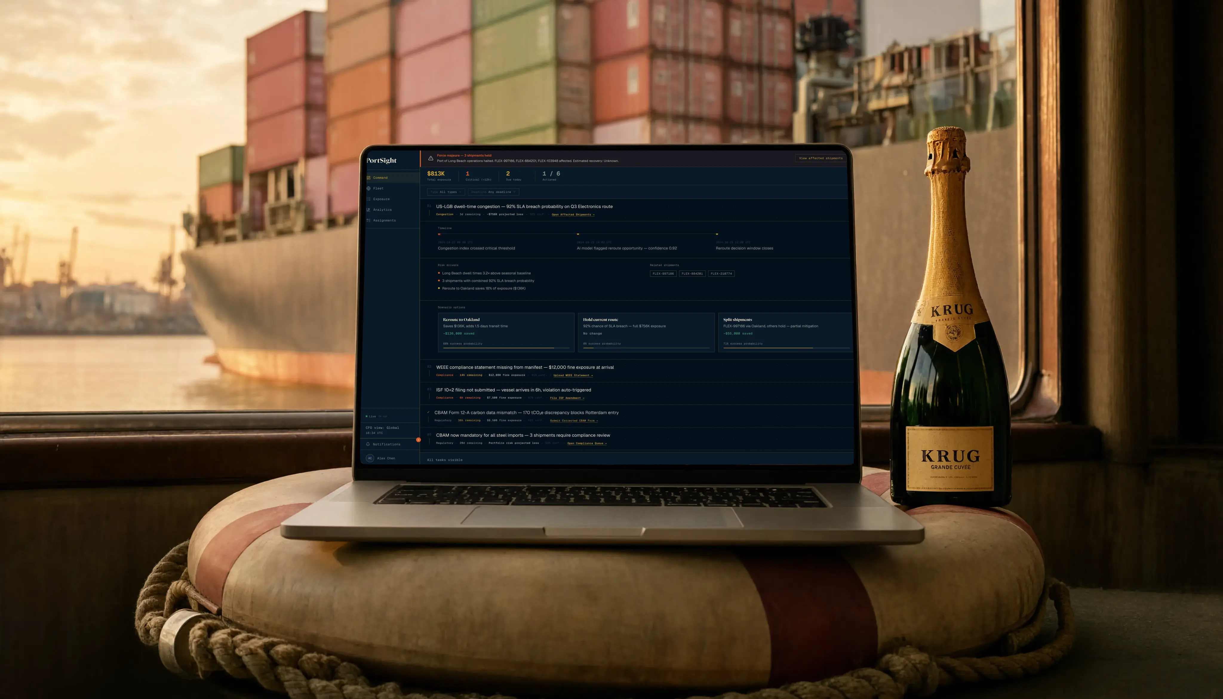
I chose a ranked queue because the cockpit never said which disruption to open first.
I rejected a dense cockpit with a risk score and four KPI blocks. A queue claims a priority, and a wrong first item makes the product confidently wrong. So each row shows confidence beside exposure. Three of the five favored the queue’s ordering, a read from five people and not a measured result.
Decision: the map
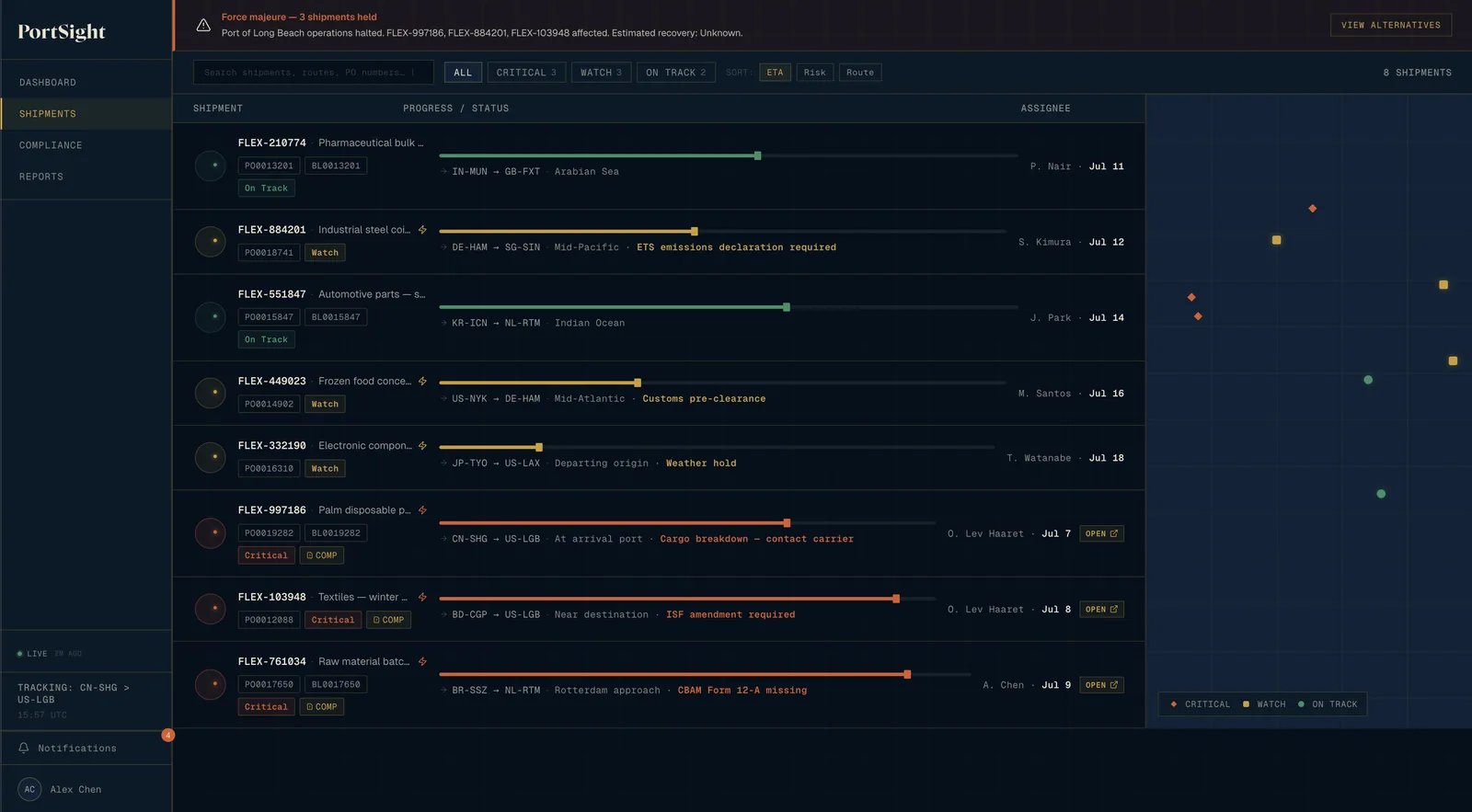
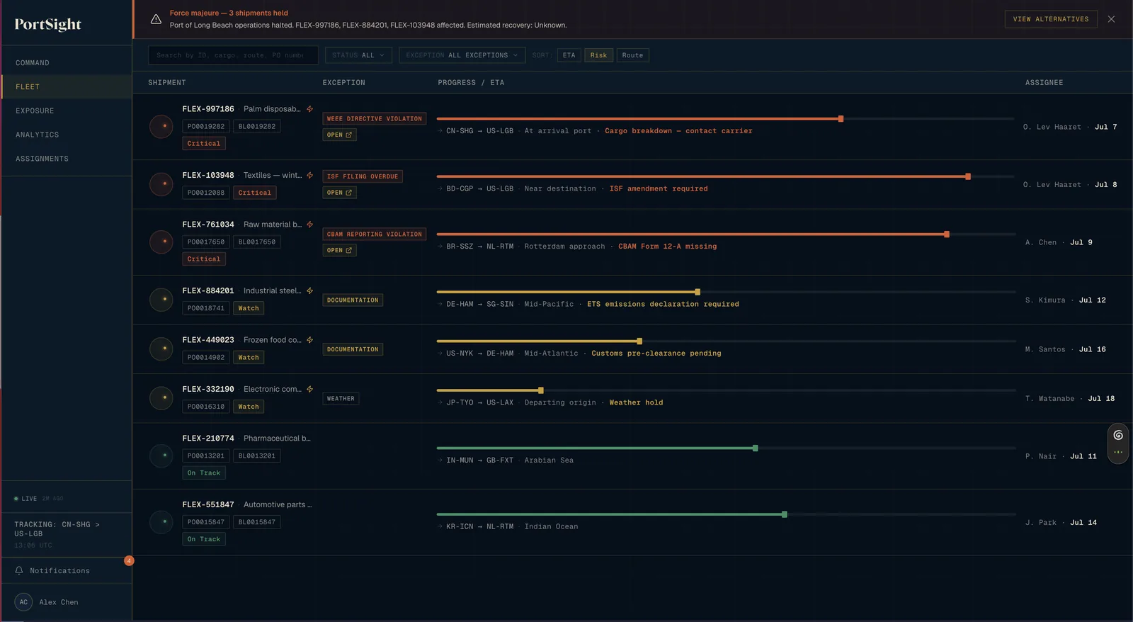
I removed the map, the hardest thing to give up, and rebuilt the list around exceptions.
The map used hardcoded positions with no connection to a vessel-tracking feed. It took a third of the screen and added nothing the list lacked. A manager needs to know a filing expires in six hours, not that a vessel is somewhere in the Indian Ocean. Two of the five said a map gives position rather than priority.
Decision: compliance and reports
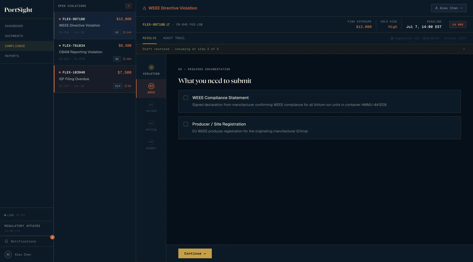
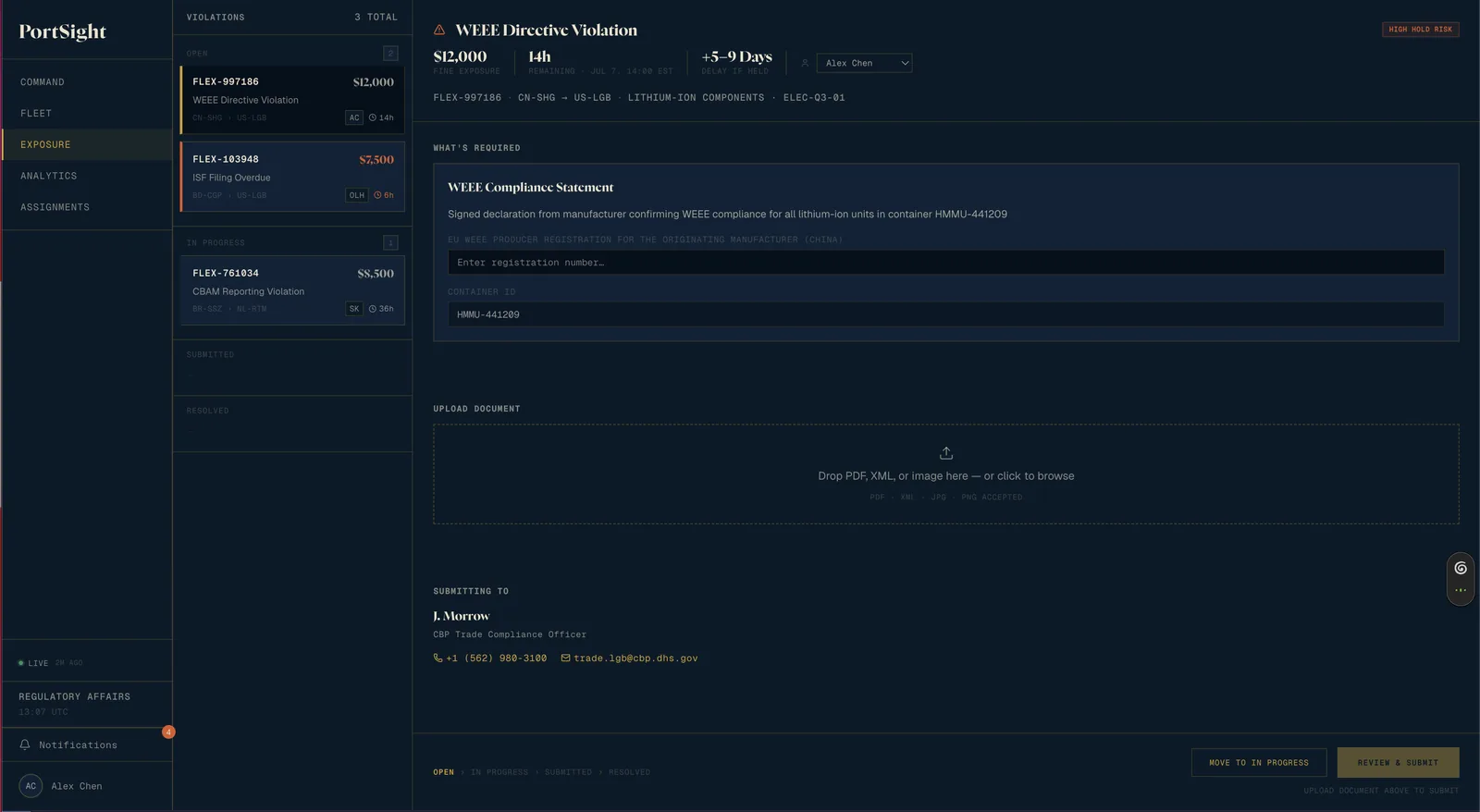
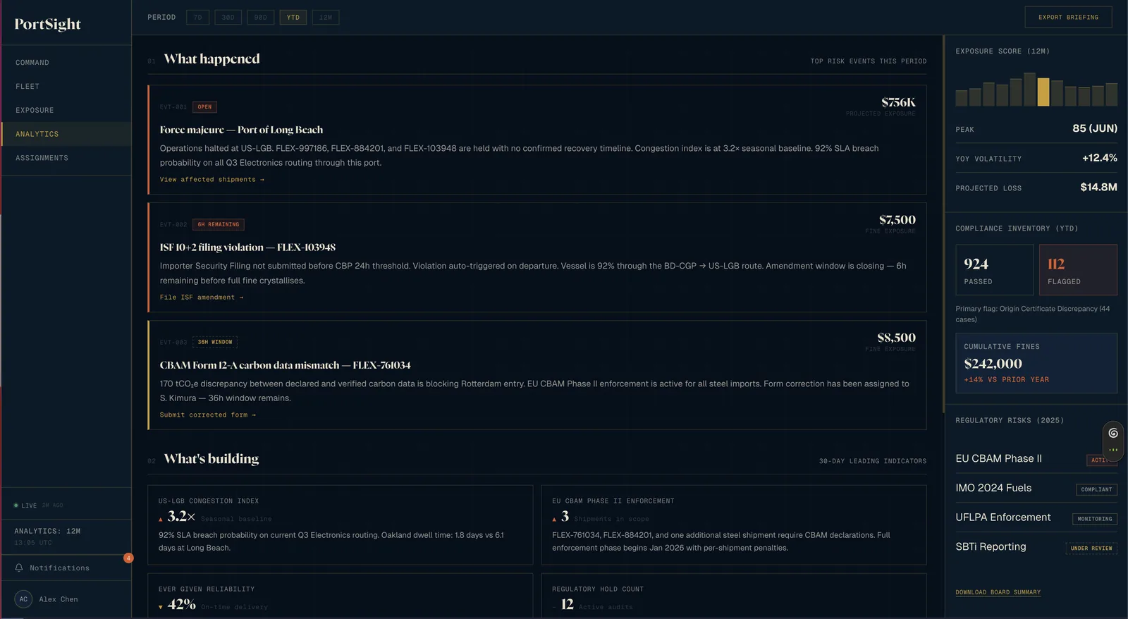
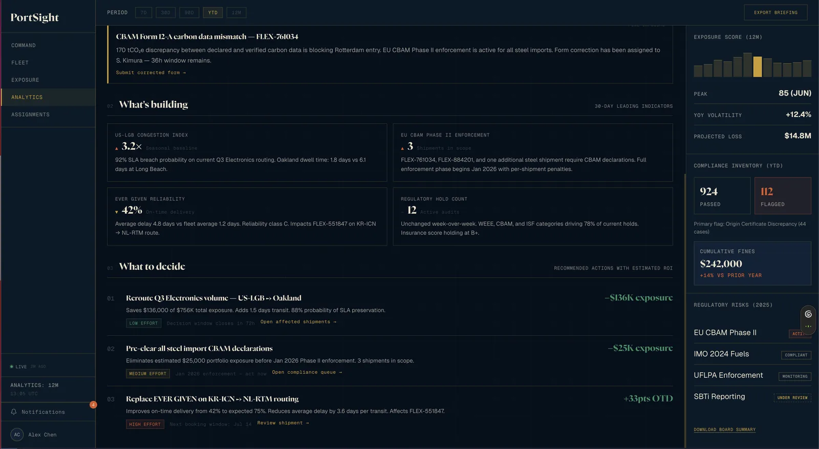
A triage board replaced a five-step wizard, and a written briefing replaced an analytics grid.
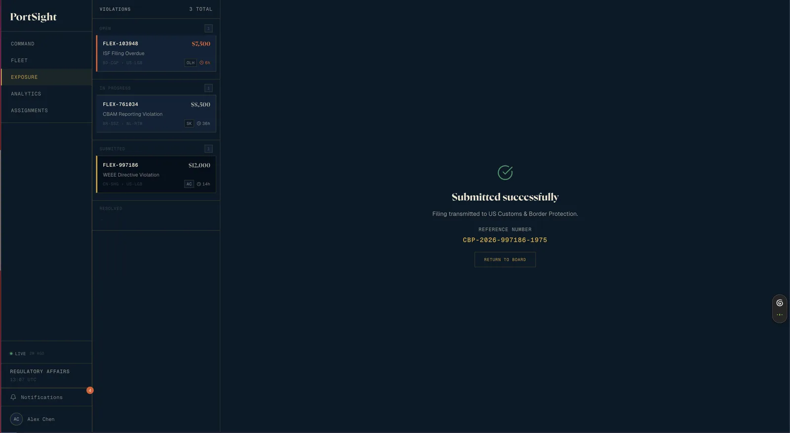
Enforcement can create five to twenty compliance holds at once, and a wizard makes each one travel through five screens. The board shows every violation’s state at once. An incomplete filing is worse than a late one, so the confirmation sheet keeps the full review.
Reports open as a three-part briefing, with each recommendation carrying its arithmetic so readers can reject the recommendation and keep the numbers. Working filters and exports are still needed beneath it.
Scope
One question per screen shipped, and the rejected directions are queued behind the decision layer.
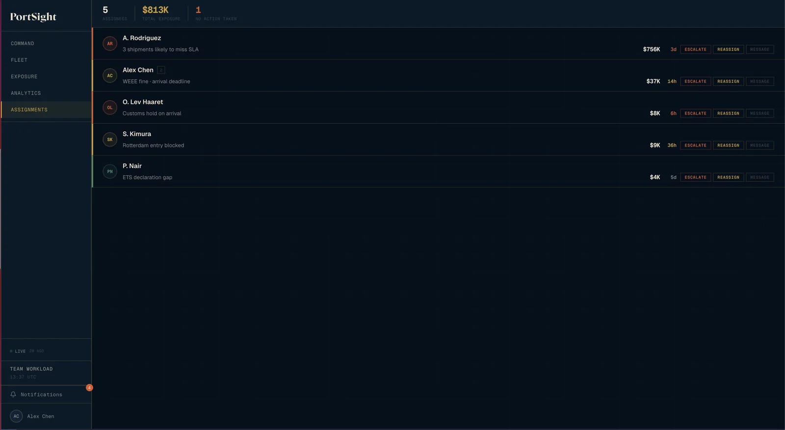
Command asks what to act on now. Fleet asks which shipments are off-plan. Exposure asks which violations to batch. Analytics asks what the risk means. The rejected directions are not wrong. Each needs data fidelity this prototype lacks. Reports is the one surface no participant was asked about.
Results
There are no results, and I will not report the numbers on screen.
The $813K exposure, $14.8M projected loss, and 92% delivery-guarantee breach probability on screen are demo data invented to make the interface legible. Nothing is instrumented.
The thesis arrived after the decisions, and two claims are still mine alone
I wrote “decision support, not monitoring” after four separate calls, and found the pattern only by reading the log back. Nobody doing compliance work has tested that five to twenty simultaneous holds is realistic, or that readers of Reports want a recommendation. An afternoon with a compliance officer could overturn either. Five people in a week can make a direction clear. They cannot show it holds at scale.