Leafsight~8 min read

A proposal had to be done before the next job.

I rebuilt a proposal tool around a ninety-second completion target, for someone standing in a driveway.

  • Role: Product strategy and design
  • Timeline: 6 weeks
  • Team: 1 PM, 1 engineer, me
  • Impact: $300k ARR
  • Platform: iOS, Android
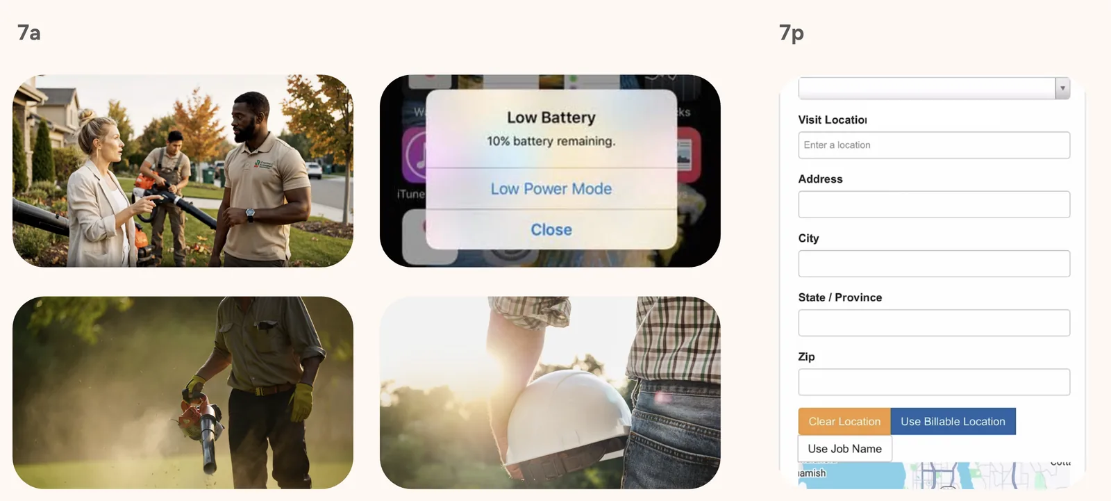
The Leafsight proposal workflow displayed on a laptop at a job site.

Impact

0%

Proposal acceptance

up from 8%

0%

Traffic on mobile after launch

$0k

ARR run-rate

Product figures come from Mixpanel, read over the week after launch. The 70% is mobile’s share of traffic after the mobile launch. The $300k is booked revenue, annualised to a run-rate — it is not extrapolated from the one-week read. Acceptance is measured across roughly 100 proposals, against a user base moving from 20 to 75 accounts. Both are small numbers and the page says so rather than implying a larger base: 38% of about a hundred proposals is a real result on a small denominator, which is a different and more checkable claim than 38% floating free.

The short version

Owner-operators write 4–8 estimates a day from job sites with poor connectivity. The web app they were asked to use was built for a desk. Estimates were abandoned, 18% went out with wrong line items, and acceptance sat at 8%.

For a services business the proposal is the step where work becomes revenue, so an abandoned one is a job that never gets quoted and an 8% acceptance rate is the conversion rate of the whole company. The failure mode was silent: nobody filed a ticket, they went back to paper, and a product with no usage has nothing to sell on.

Six weeks, one PM, one engineer. Rather than speed up the existing flow, I set a single number before any design started — a complete, accurate proposal, sent from anywhere, in under ninety seconds — and then used it as the scope rule. Anything that didn’t fit the budget was cut or demoted, including features owner-operators genuinely want. That was the bet, and it could have lost badly if the wrong things were made optional.

Acceptance reached 38%, 70% of traffic moved to mobile, and the product reached a $300k ARR run-rate across a base moving from 20 to 75 accounts.

What I owned

I owned

  • The ninety-second completion budget, set before any design, and the decision to let it arbitrate scope rather than sit alongside it
  • What the budget cut: photos, notes, tags, and the AI features, with the rule for earning them back
  • Field research: watching estimates get written on job sites rather than in a room
  • Product strategy and design across the six-week build
  • The navigation decision, and the field testing that settled it

Shared with the PM

  • Scope against six weeks and one engineer
  • What got deprioritized, and what went to the roadmap

Problem

Proposals get written in driveways, at the end of the day, on phones. Why was the app built for a desk?

Owner-operators and sales reps complete 4–8 estimates a day, usually on site, usually on a phone, often with a connection that drops mid-form. The existing web app was slow and dense, and it assumed a stable connection and an unhurried user. It got neither.

The result was abandonment rather than complaint. Nobody filed a ticket saying the tool was too slow; they just stopped opening it and went back to writing estimates on paper.

Before

0%

Proposal acceptance

0%

Proposals with incorrect line items

0 mins

Time to create a proposal

A field worker’s day mapped from 7am through the evening, showing when proposals get written.
A day on site, 7am to 7pm. Proposals get written at the end of it, by someone already out of decisions. This is what set the ninety-second target.
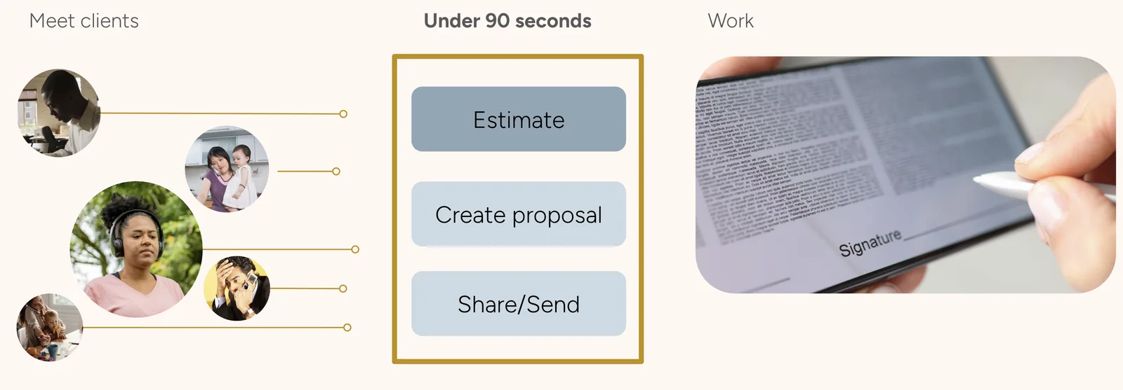
A three-part diagram: on the left, portraits of five clients under the heading Meet clients; in the centre, a highlighted column headed Under 90 seconds containing three stacked steps reading Estimate, Create proposal, and Share/Send; on the right, a photograph of a proposal being signed on a tablet under the heading Work.
Estimate, create, send. Ninety seconds is the budget for all three together, which is why nothing in the shipped flow asks a question that can be answered later.

What was scarce on a job site wasn’t screen size. It was decision capacity.

That distinction decided the project. Read as a screen-size problem, the fix is a responsive layout bolted onto the existing flow, and it is cheap: the same questions, asked in a narrower column. Read as a decision-capacity problem, the fix is asking fewer questions, which is not a layout change at all — it is a scope change, and it costs features.

The person filling this in is on their sixth estimate of the day, standing outside, at the end of a shift, on a connection that drops. Every optional field is a decision they have to make or consciously skip, and both cost the same at that hour. So the design target had to be a duration rather than a layout. A duration is the only version of this the whole team can test against, and the only version that can say no to a feature request on its own.

Ninety seconds sets the scope

What fits in ninety seconds?

I rebuilt the flow around a fixed ninety-second completion-time budget instead of speeding up the existing web flow or adding a mobile view to it. The target removed photos, notes, tags, and AI features that owner-operators eventually want on a proposal; if the wrong parts were optional, the bet would lose badly.

So we shipped the short flow, watched what people stopped to look for, and would add back only what they reached for. Task completion rose from 45% to above 80%, and no cut feature has been requested often enough to return.

Why walk someone through a task they already know?

I chose hub and spoke, with shortcuts to recently used services, over a guided stepper or a single long form. Field workers already knew the task and were repeating it for the sixth time that day, usually with the same services.

Unlike a stepper, hub and spoke doesn’t guarantee that nothing is skipped — a material tradeoff when 18% of proposals already had wrong line items — so the hub shows completion state for every section, keeping missing information visible without enforcing it. Field workers tested all three, error rates fell rather than rose, and they rejected the stepper outright.

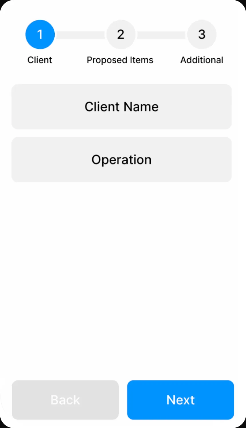
Stepper prototype for proposal creation.
Rejected: stepper. Predictable, and slow on site.
Single-form prototype for proposal creation.
Rejected: single form. Fast to build, heavy to scan.
Hub-and-spoke prototype for proposal creation.
Shipped: hub and spoke.

What we shipped

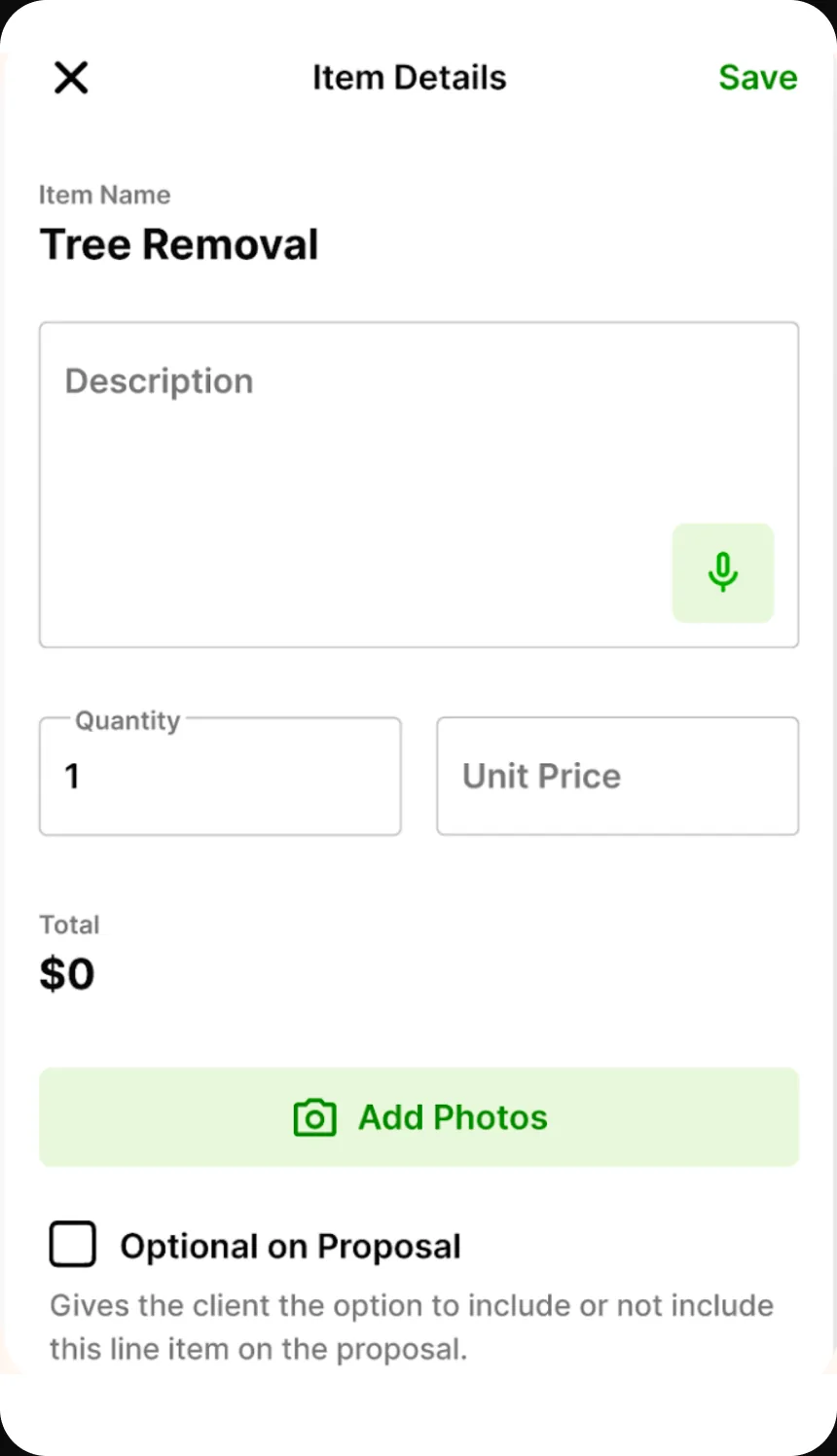
We shipped a mobile-first proposal flow for clients, job-site location, proposal, and item details, with shortcuts to recently used services and completion state on the hub. Notes, photos, tags, and AI features were deprioritized.

I set success before designing: completion under ninety seconds, task completion above 80% from 45%, and return usage within 24 hours above 60%.

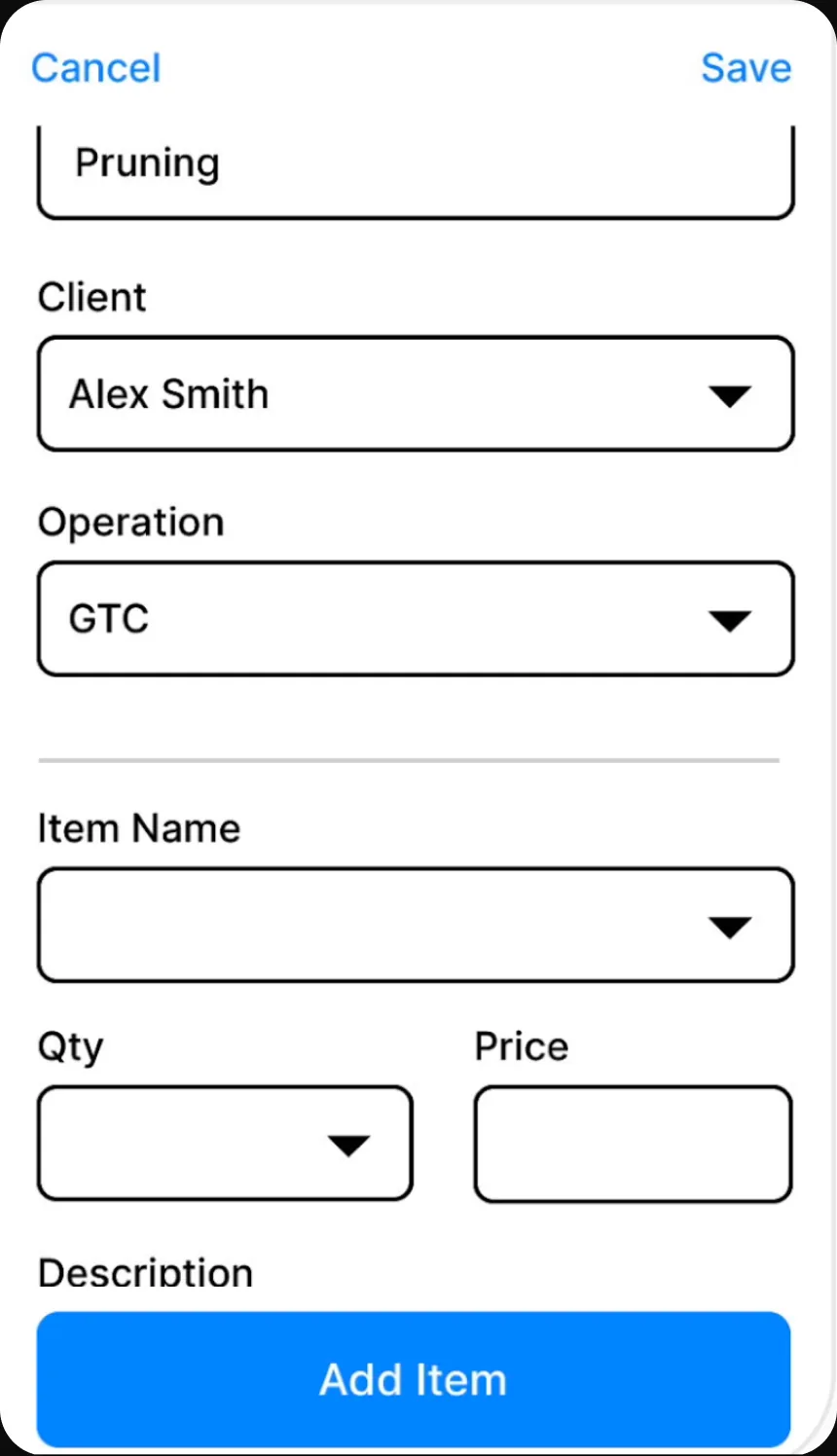
The proposal flow before it was shortened, with many steps.
Before: dense, multi-step, desk-shaped.
The shortened proposal flow after redesign.
After: the same job, reshaped around ninety seconds.
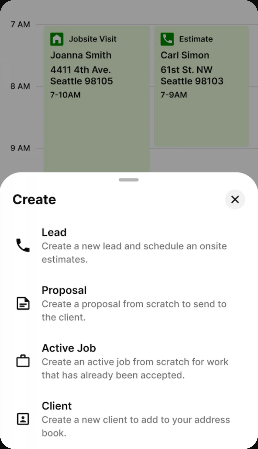
A Create sheet sliding up over the day’s calendar, offering four options: Lead, Proposal, Active Job, and Client, each with a one-line description.
One entry point over the day’s schedule. Four things a rep can start, named for what they are.
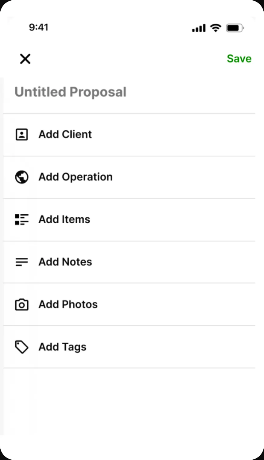
An Untitled Proposal screen with a Save action and a list of fields to fill: Add Client, Add Operation, Add Items, Add Notes, Add Photos, and Add Tags.
The proposal, empty. Every row is optional except the client and the work. The rest can wait for the truck.
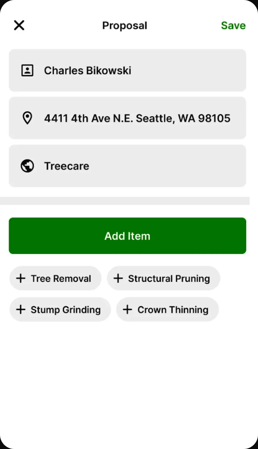
A Proposal screen with the client Charles Bikowski, a Seattle address, and the Treecare operation filled in, above a green Add Item button and four shortcut chips: Tree Removal, Structural Pruning, Stump Grinding, and Crown Thinning.
The shortcuts are the ninety seconds. Four services cover most of what this crew sells, so the common case is a tap. Searching is the exception.
A Select Item picker with a search field and a list of services: Tree Removal, Structural Pruning, Crown Thinning, Crown Reduction, Credit Card Fee, Root Collar Excavation, and Oak Wilt Treatment.
The full catalogue, for the case the shortcuts miss. Searchable, and it is the same list the office priced.
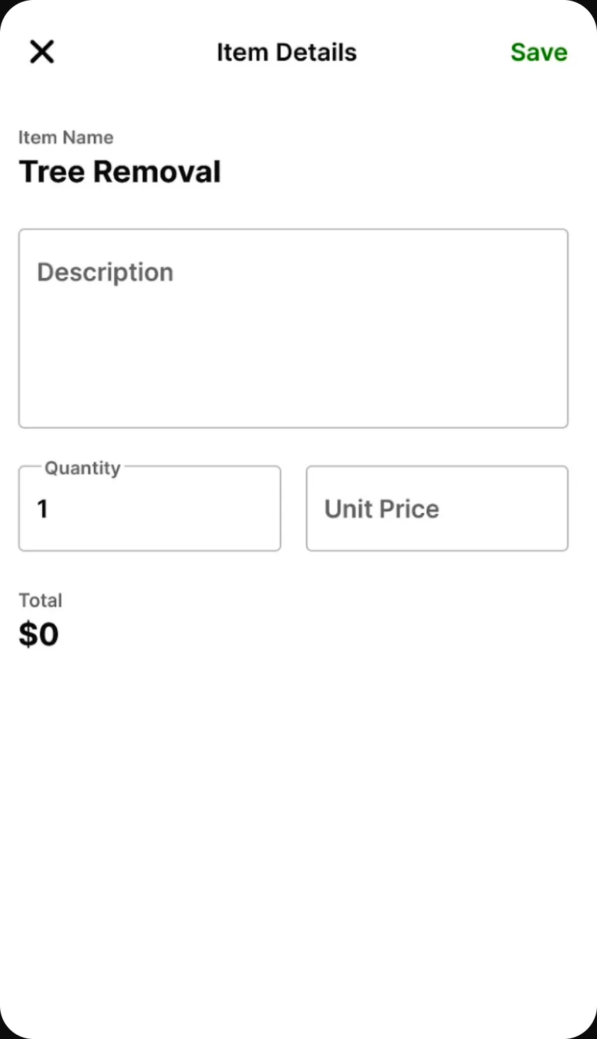
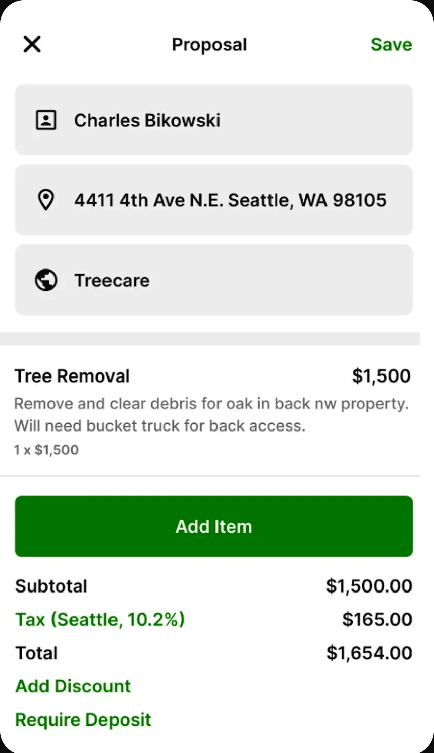
The proposal with a Tree Removal line item at $1,500 and its scope note, followed by a subtotal of $1,500, Seattle tax at 10.2% of $165, a total of $1,654, and links to add a discount or require a deposit.
Tax by jurisdiction, computed rather than remembered. 18% of proposals had incorrect line items before; the available record doesn’t say which items were wrong.
An Untitled Job screen with the same field pattern as the proposal, so Add Client, Add Operation, and Add Items, plus Schedule Job, Add Notes, Add Photos, Add Tags, and Add To-Do List.
An accepted proposal becomes a job on the same shape of screen. Learning the proposal is learning the job.
The proposal form with every action as a row in one list: Add Client, Add Operation, Add Items, Add Notes, Add Photos, Add Tags.
Before: six equal rows. Notes, photos, and tags sit between the rep and the only two fields a proposal actually needs.
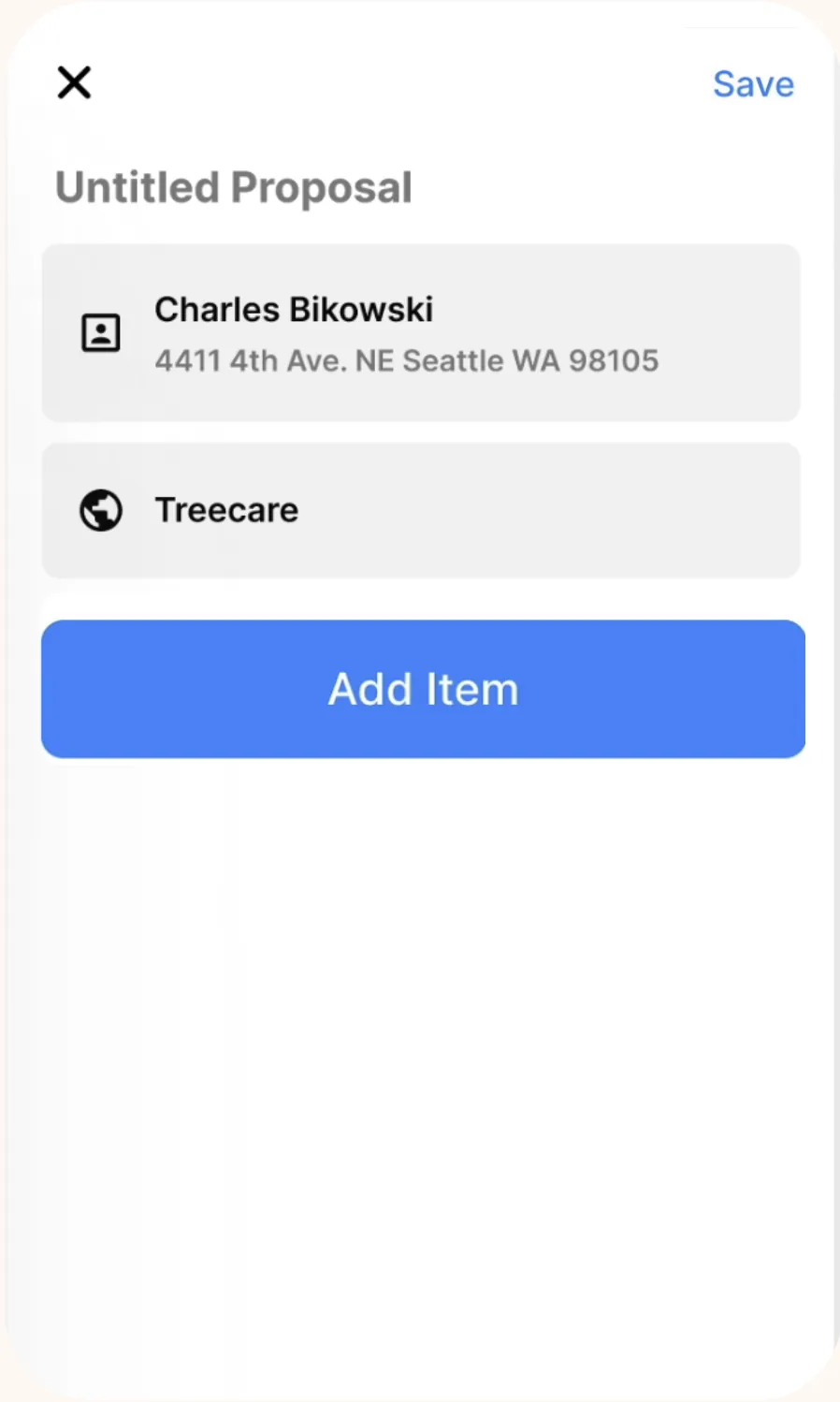
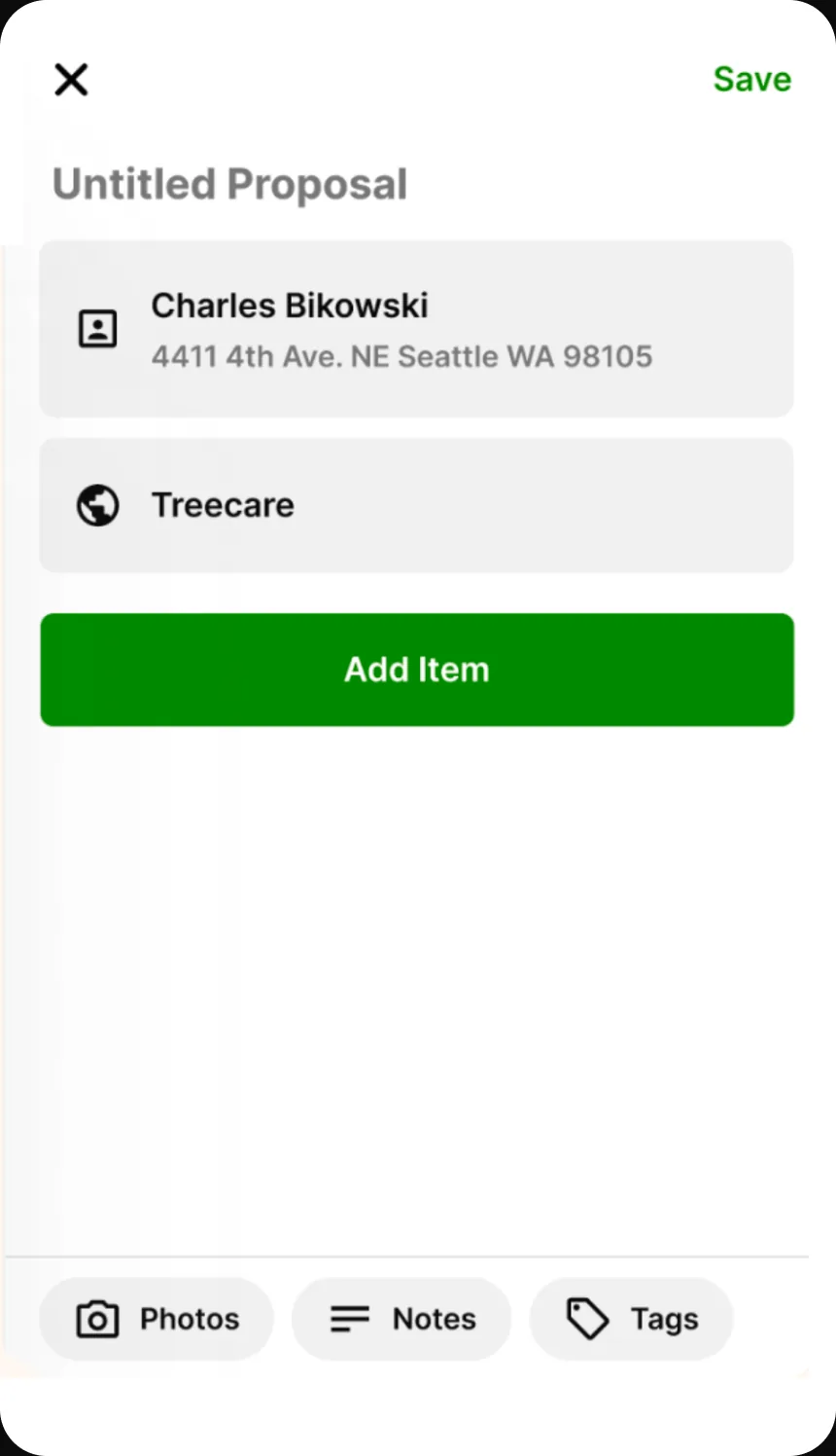
The same proposal form with the client and address merged into a single row above the operation, a full-width Add Item button, and Photos, Notes, and Tags moved to a bar pinned along the bottom of the screen.
After: client and address collapse into one row, Add Item takes the width, and the three secondary actions move to a bar. Demoted, not cut.

Where the product moved

Seventy per cent of traffic moving to mobile is not an adoption statistic, it is the product changing where it lives. The desk version had been the real product with a phone view attached; afterwards the phone was the product, which is what makes the rest of the roadmap answerable — every later feature now has an obvious first question, whether it survives a driveway.

The cut features became a backlog with an entry condition rather than a queue. Nothing came back because it was asked for; it came back if people were observed reaching for it, and no cut feature has yet cleared that bar. That is the piece of process I would take to another team, because it is what stops a scope decision quietly reversing over the following two quarters.

And an accepted proposal became a job on the same shape of screen, so the proposal stopped being a document and became the entry point to the work it describes.

A number set before the design is the cheapest way to settle a scope argument.

Feature arguments are unwinnable in the abstract — photos are obviously valuable, notes are obviously valuable, and everyone advocating for them is right — but against a stated budget they stop being a matter of taste and become arithmetic. The question changes from whether a feature is worth having to what it costs of the ninety, and that question has an answer everyone in the room can check.

What I do differently since: I set the measurable target before design rather than after, and take it from users rather than from the team. This one came from a partner saying he wouldn’t use it if it took more than two minutes; I set the budget tighter than he asked and let it do the arguing.

The honest limit is in the note below. A budget that decides scope also decides who the product is not for, and it makes the exception path expensive by construction. That was the right cost to accept at 4–8 estimates a day, but it is a choice about which customer you are optimising for, not a neutral piece of rigour.

The clean story leaves out the hard cases

Every field quote I collected points the same way. I have no recorded case of someone who preferred the stepper or wanted photos badly enough to stop using the tool. That absence is not evidence that those people weren’t there.

The evidence is also split. The portfolio deck carries 20% user engagement, eight-minute proposal creation, and time-to-value from fourteen minutes to ninety seconds; Mixpanel carries acceptance, line-item errors, and mobile traffic share. Both sets are real, but they were never reconciled into one before-and-after row.

The ninety-second target made notes and photos deliberately expensive. That worked for a single operator writing 4–8 estimates a day; a crew on larger jobs needs them. A fast default holds its value right up until the work gets complex enough that the exception path is the actual job, and I don’t know where that line falls for this crew.
Sam Cusano