Apartment List~3 min read
Rich media arrived as a directive and had to earn the build.
Three weeks, one PM, one engineer, and media partners could not supply.
- Role: Product design and research
- Timeline: 3 weeks
- Team: 1 PM, 1 engineer, me
- Impact: Card-to-move-in 1% → 5%
- Platform: Web
- Platform: iOS, Android
Unit card to move-in
up from 1%
Unit-specific tickets
down from 70%
Both read at three weeks against the pre-launch figures, ahead of the three months Apartment List normally took to report, and both held through to my departure in 2024. The ticket figure is the share of renter tickets that were unit-specific questions, the ones asking which photos showed the apartment rather than the building. Move-in is a completed transaction rather than an intent signal. Still missing: how many cards the conversion rate covers, and the ticket population behind the 70%.
Overview
Nobody asked for rich media, so I first checked whether it was worth building.
Rich media arrived as a directive from the top after partners asked for something competitors had. The listing card converted at 1%. Renters could not tell which photos showed the apartment they were looking at.
Worked with: 1 PM and 1 engineer; Product, Sales, Engineering, and Operations on the alignment concept; 8 people interviewed.
What I owned
I owned
- The research establishing whether rich media was valuable or merely defensible
- The alignment concept used across Product, Sales, Engineering, and Operations
- Three explorations scored on impact, confidence, and ease, and the reasoning that picked one
- The dynamic unit card and the enhanced listing view
- Preference and usability testing
Shared with the PM and engineer
- The performance and accessibility limits that ruled out two of the three directions
Research
The renter problem was real, and partners could not supply apartment-specific media.
The card used building-level media and was static. I interviewed 8 people.
Partners’ internal systems could not produce photos, videos, or 3D tours for individual units. Whatever shipped had to work with media already in the system.
Decision: which direction
The restructured card beat two more ambitious ideas because it was the only one that scored evenly.
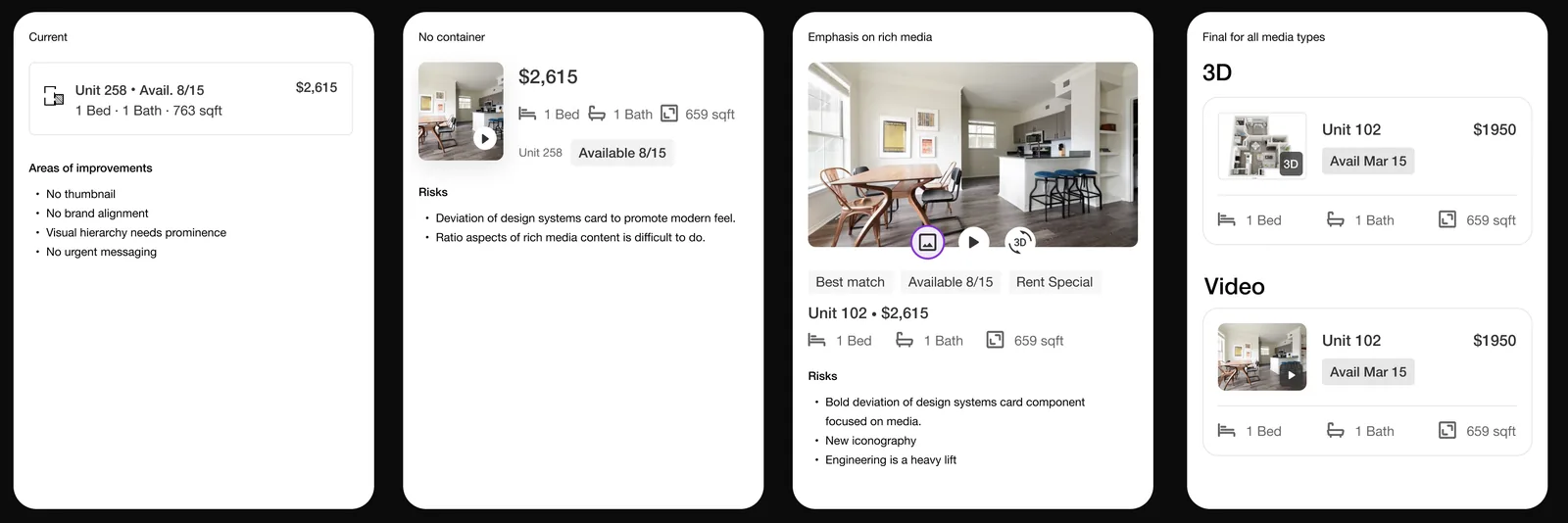
I scored three directions on impact, confidence, and ease. The card scored 4/4/4, a media carousel 4/2/1, and an image-led layout 3/2/1. The carousel was a performance concern and too far from the design system. The image-led layout would have crushed performance and raised accessibility problems.
The card was never tested head to head against the other prototypes. Preference and usability testing checked it against renter priorities.
Redesign
The card now shows media for the unit a renter could rent.
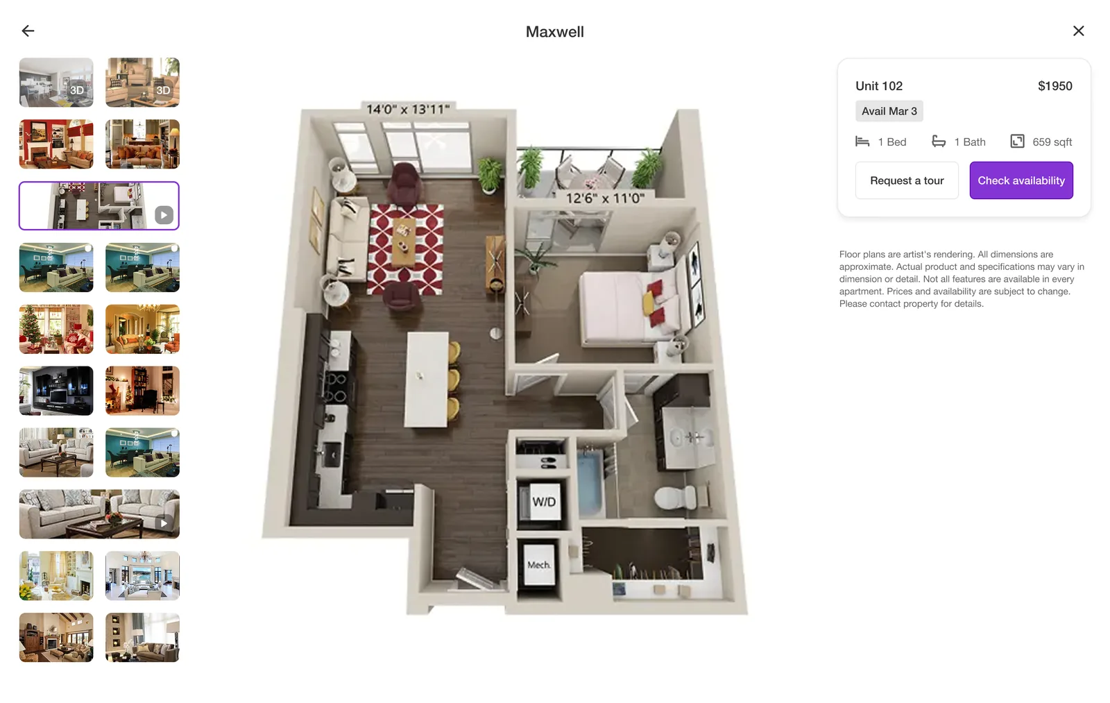
It shows photos of the specific apartment, then floorplans and 3D tours where partners had them. Most listings did not.
Scope
We surfaced existing media and could not control its quality.
Surfacing what already exists means surfacing whatever a partner uploaded. A listing with four dark photos gets the same four, larger and earlier. The feature improves good listings and sharpens bad ones. No version waited for better media. The alternative was showing nothing.
Results
Unit card to move-in rose from 1% to 5%, and unit-specific tickets fell from 70% to 30%.
The research answered the question, and then the roadmap moved on to other pressing priorities
Other pressing priorities took the roadmap. The alignment concept stayed a concept, and further media work did not go ahead. That was a prioritization call.