Apartment List~6 min read

Bulk updates took sixteen hours and mostly failed.

Marketing and operations teams moved property data by hand because the API was too costly or technical to use.

  • Role: Product design and research
  • Timeline: 4 weeks
  • Team: 1 engineer, me
  • Impact: 4k+ runs, 32k+ hours displaced
  • Platform: Web
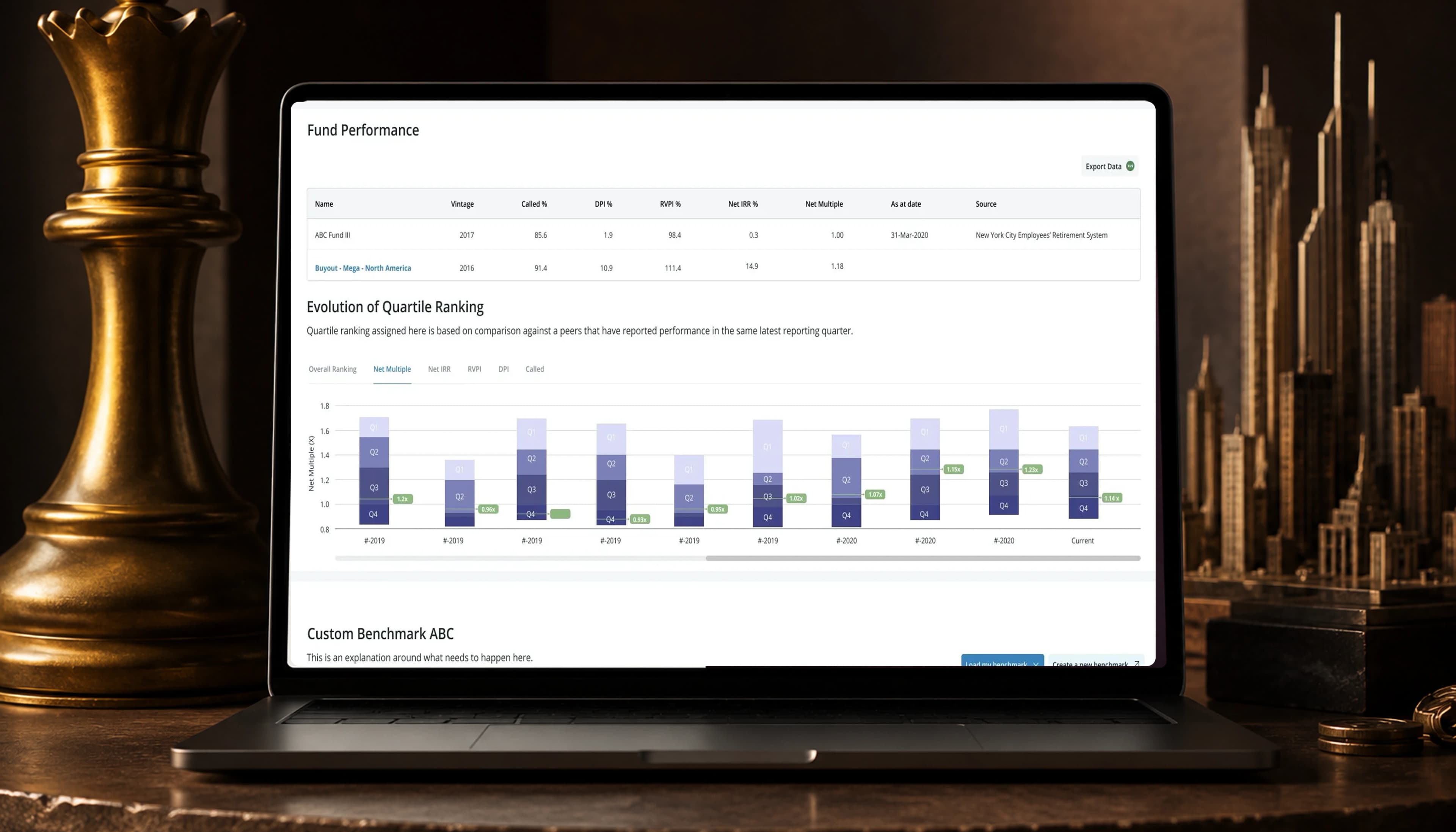
The data flow field-mapping screen displayed on a laptop, beside a towering stack of paper.

Impact

0k+

Flow runs

each replacing an 8–16 hour manual job

0k+

Daily updates

Both figures come from the portfolio deck, against a path that had been an eight-to-sixteen-hour job that nearly always failed at volume. The 4k+ is runs, not configured flows. Each stands in for a path that took eight to sixteen hours and nearly always failed at volume, so the work displaced is somewhere between 32,000 and 64,000 hours — arithmetic on those two figures, and it assumes every run replaces one of those jobs rather than being a re-run of a failed one. The read window matches the other Apartment List work, three weeks against a company reporting cycle of three months. Neither figure has a named source.

Sixteen hours, then a silent failure

Bulk property updates at Apartment List took eight to sixteen hours, and nearly all large uploads failed. The alternative was an API that marketing and operations teams found too costly or technical to adopt, so it was mostly unused.

We shipped a self-serve data flow built around one structural choice. Steps run down the left, with a live preview of what a file becomes on the right. Someone who has watched a sixteen-hour upload fail silently doesn’t need only more speed. They need to see, while configuring it, whether it will work.

What I owned

I owned

  • Research with 10 property marketing and operations managers, read against failure logs
  • The split-panel structure, chosen over wizard steps and an infinite canvas
  • Three navigation patterns built and tested; two failed
  • The mapping model: raw fields to business entities, then how those entities update

Decided with the engineer

  • What the preview could compute in real time, which set how much of the file it could display
  • Which validation ran client-side and which needed the pipeline

The problem

The API worked. The people who needed it could not use it.

An average update took 8 to 16 hours. Nearly all large updates failed outright. For a marketing manager with a spreadsheet from a third-party portal, the API was either too costly to commission or too technical to run.

I interviewed 10 property marketing and operations managers at large property firms, then read the failure logs alongside what they told me. The reported problem and the thing that breaks aren’t always the same.

Could it be efficient?

Make bulk edits without errors.

Could it be flexible?

Handle multiple formats and sources.

Could people trust it?

Give clear feedback and validation.

Trust was why the first two weren’t enough, and it changed the brief. An eight-hour job that fails sounds like a job that should run faster and succeed. That makes it look like an engineering problem, with design as decoration.

But a fast automated import that people can’t inspect recreates the trust problem at higher speed. The dangerous outcome is not a rejected file. It is an accepted one: a successful upload that quietly maps the wrong column to the wrong entity puts bad data in front of renters, and nobody notices until someone complains.

Show the file becoming the thing

A visible configuration and live result

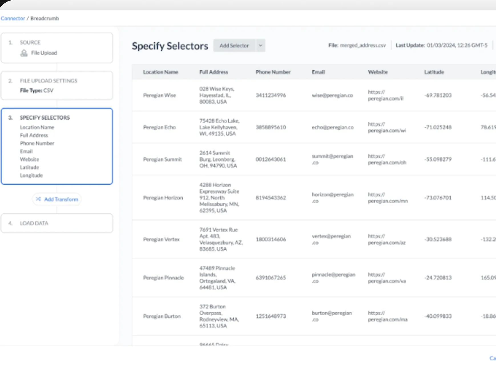
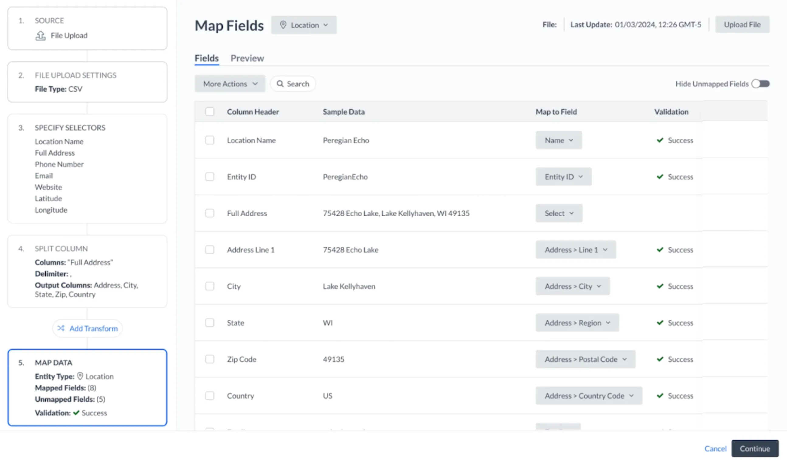
Users had to configure something they couldn’t yet see. Wizard steps hid earlier context, leaving people unsure whether they had broken something two steps back. An infinite canvas showed everything at once; the canvas tool we reviewed was technically powerful but visually hostile to people who didn’t already know what they were looking at. I chose a split panel, keeping steps visible on the left and the active step's live result on the right. A fast preview that was subtly wrong would create confidence rather than earn it, so it covered both mapping stages: raw fields resolving into business entities, then models determining how those entities update. Errors became visible when introduced rather than at the end. It shipped with the existing design system and no new components; the structure did the work visual novelty couldn’t.

The Specify Selectors step. The four-step rail sits on the left with the active step outlined; on the right, a live table of the uploaded CSV showing location name, full address, phone number, email, website, latitude and longitude for each row.
The active step on the left, what the file currently becomes on the right. An error shows up where it is introduced rather than at the end of the run.
The Map Fields step. A five-step rail runs down the left — source, file upload settings, specify selectors, split column, map data — beside a table pairing every column header in the uploaded file with the field it maps to, each row carrying its own validation result.
The second mapping stage: every column in the file paired with the field it becomes, and validated row by row. This is where a wrong column would otherwise pass silently.

Two navigation patterns lost

Navigation that recedes

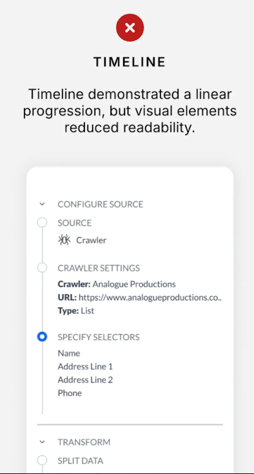
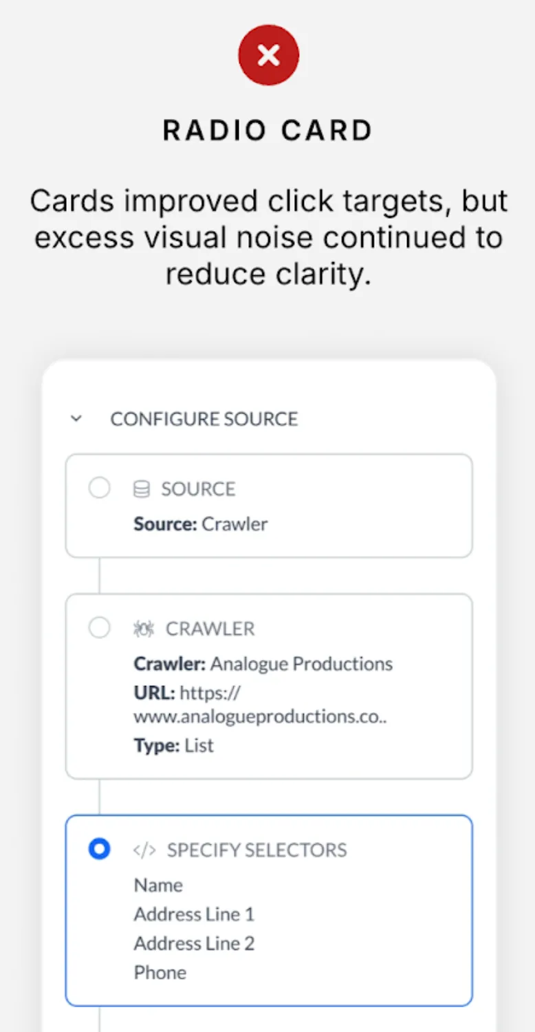
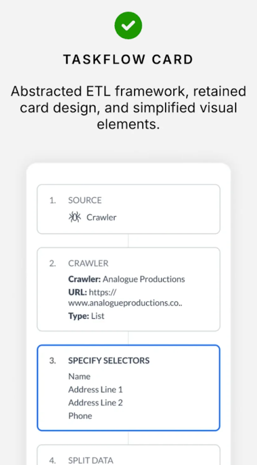
A timeline with connectors and status was linear and visually clear, but its labels, indicators, and connector lines competed for attention; users read the chrome instead of the configuration. Radio cards improved click targets but added affordance and density at once, and failed worse. I stripped navigation back to plain numbered cards with a bold label, supporting detail, a clean boundary, and no status icons. The plainest option risked looking unfinished in review, so the labels abstracted the framework: Source, Crawl, and Specify Selectors read as a sequence of decisions. Nobody had to understand the pipeline before they could start. Testing settled the choice twice with immediate feedback. In a multi-step configuration flow, navigation is infrastructure, not content, and must recede from the task.

Rejected, marked with a red cross. Titled Timeline, over the verdict: timeline demonstrated a linear progression, but visual elements reduced readability. Beneath it the configuration steps run down a connector line with status dots and expandable section headers.
Rejected, marked with a red cross. Titled Radio Card, over the verdict: cards improved click targets, but excess visual noise continued to reduce clarity. Beneath it each step sits in a bordered card with a radio button and an icon beside its label.
Shipped, marked with a green tick. Titled Taskflow Card, over the verdict: abstracted ETL framework, retained card design, and simplified visual elements. Beneath it each step is a plain numbered card with a bold label and its settings underneath, carrying no status icons and no connector line.

The overlay covered the thing it was explaining

Where should a transform live?

Transforms — splitting a column, trimming whitespace, mapping a field — had to be configured somewhere, and the obvious place was a modal over the flow. It had room for settings and its own preview, and it kept the transform's complexity out of the main view.

It also covered the preview it was explaining. A transform is a claim about what a column becomes, and the only way to check that claim is to watch the rows change; an overlay put its own copy of the preview on top of the one already on screen, so the same work existed twice and the user had to decide which to trust. I put transforms inline in the flow instead, as another numbered card between the steps around them, configured in place with the one preview updating behind. A split column reads as a step in the sequence rather than as a detour out of it.

The cost is that a long transform chain makes a long column, and nothing collapses it yet.
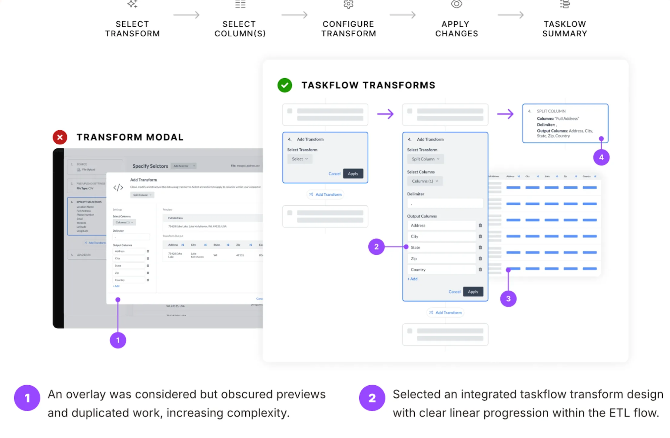
Two options side by side. On the left, marked with a red cross, a transform modal sits over the configuration flow with its own settings and preview panes. On the right, marked with a green tick, the same transform runs inline as a numbered card in the sequence, its output columns feeding the table beside it.
The overlay carried a second preview; inline carries none, because the one already on screen is the answer.

What shipped?

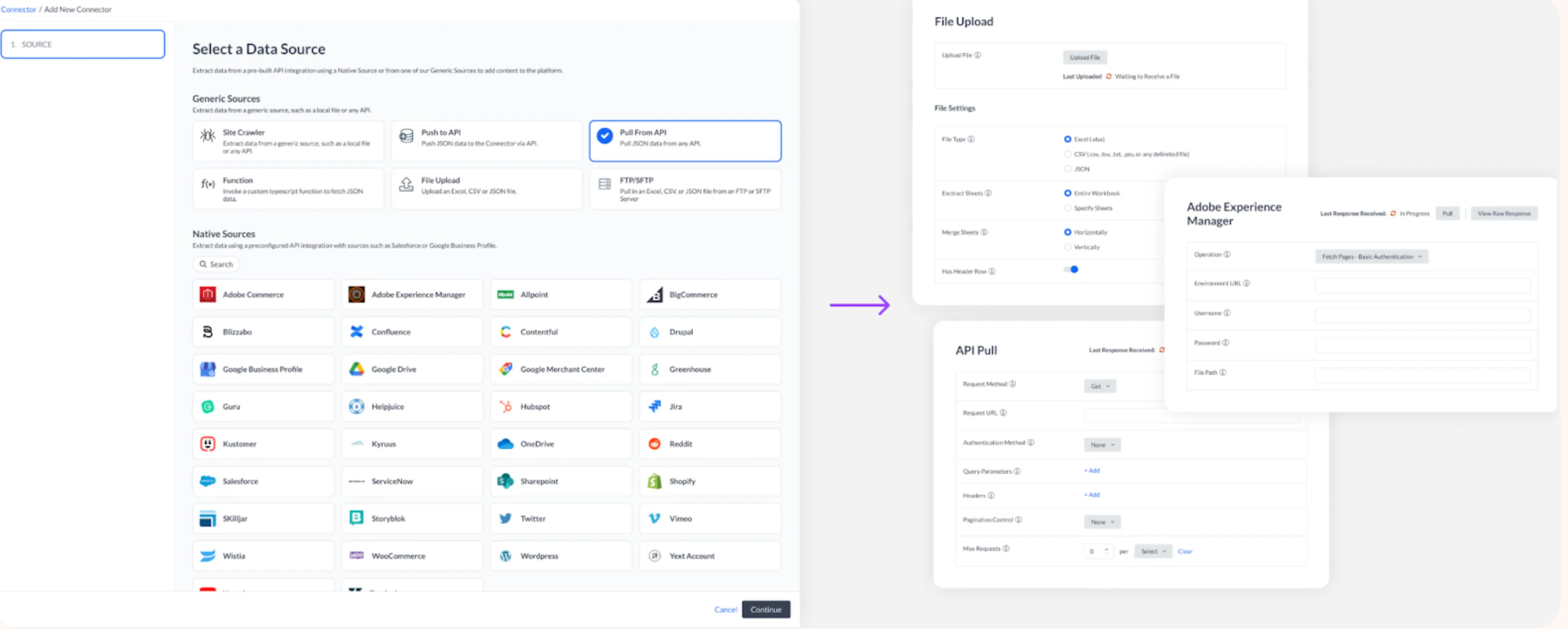
Three parts shipped: ingestion from CRM, spreadsheets, and third-party portals; transformation and mapping with a real-time preview, where raw fields resolve into business entities and models determine how those entities update; and monitoring and compliance across the flow.

The Add New Connector step. Generic sources — site crawler, push to API, pull from API, function, file upload, FTP or SFTP — sit above a grid of prebuilt native sources including Salesforce, Sharepoint, Google Drive and Shopify. To the right, the file upload settings and API pull configuration panels.
The first of the three parts: one path in for a CRM, a spreadsheet, or a third-party portal.

The prettier versions lost

The timeline and radio card both looked better than what shipped, and both lost. I couldn’t see why from the designs. Testing could, and the feedback was blunt enough that there was little to interpret: twice, I mistook an interesting navigation element for a helpful one. The version that worked had the least to look at.

Users caught those failures, but I can’t show anyone disagreeing with me. The split panel went in without opposition, so nobody stress-tested that structural decision with a reason to break it. It probably deserved the same scrutiny the navigation patterns got, and it never had it.

Sam Cusano