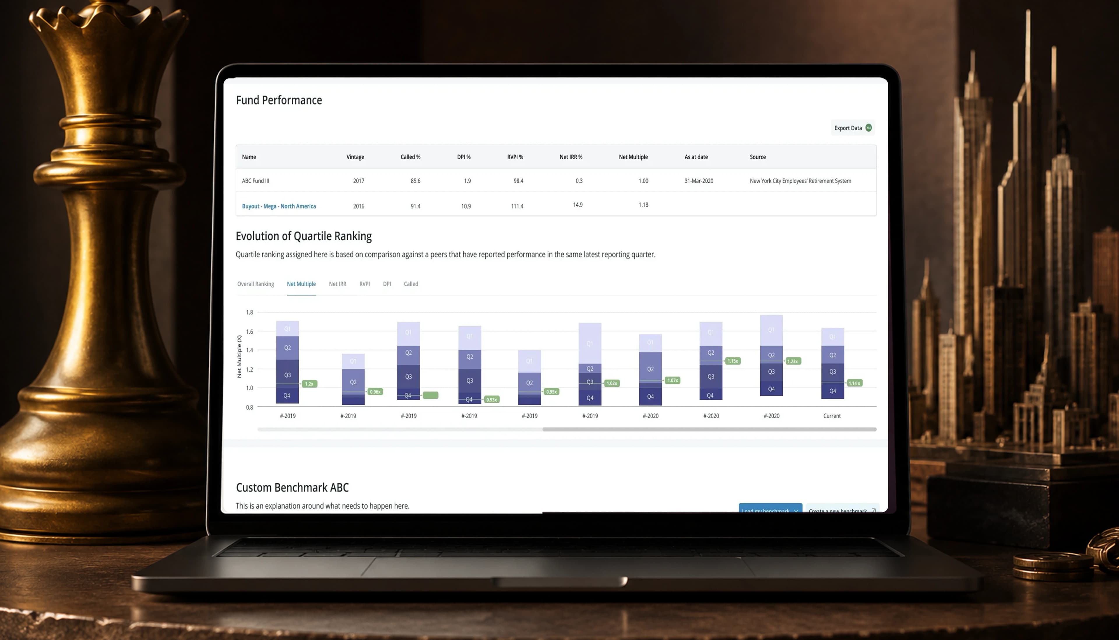
Preqin~3 min read
An ESG score that meant nothing to the fund reading it.
Four weeks, one PM, one engineer, and two follow-on experiments that both failed.
- Role: Product strategy, design, and research
- Timeline: 4 weeks
- Team: 1 PM, 1 engineer, me (plus investors and customer service)
- Impact: 7 contracts, ~$560k of contract value
- Platform: Web
Contracts closed
~$560k of contract value the modules contributed to
Pre-sales calls
Engagement
Contracts and pre-sales calls are commercial outcomes the sales team can verify against its records, counted over the two weeks after launch. Seven contracts at a pilot account value of about $80,000 comes to roughly $560k. A pilot group is not a random sample of the market, and the modules contributed to those subscriptions rather than constituting them, so read $560k as the contract value this work contributed to. Separately, 80% of survey respondents marked the modules very helpful. That is self-reported. Still missing: what the 60% engagement measures and across how many accounts.
Overview
Nobody could say what an ESG score meant for their fund, which made it hard to demo and hard to charge for.
Preqin was opening a new product line selling ESG data into private markets, presented as a static snapshot. Limited partners worried about greenwashing. General partners wanted to know what their peers disclosed.
Worked with: 1 PM, 1 engineer, investors, and customer service; 6 directors interviewed.
What I owned
I owned
- Product strategy, including the read that an uninterpretable score was a commercial problem before it was a usability one
- Three module versions and the reasoning behind each change
- Both follow-on experiments, the decision to build them, and the read on why they failed
- User research with both user types
- Components contributed back to the design system
Decided with others
- Feature sequencing, scored with the PM rather than set by me alone
- What the underlying ESG dataset could support, with engineering
Research
Suspicion and benchmarking turned out to be the same question.
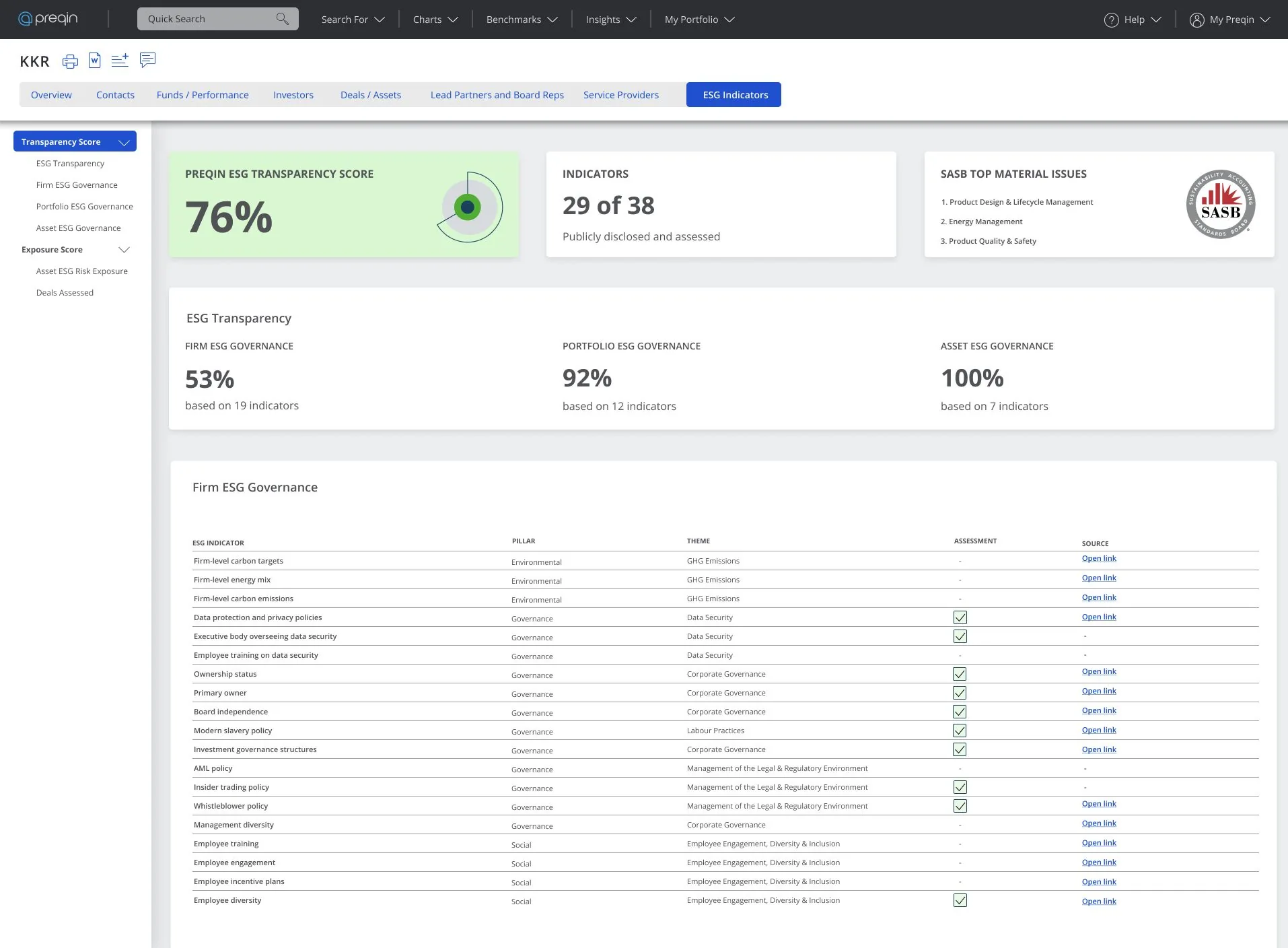
I interviewed 6 directors. One user is trying to catch a fund overstating itself, and the other is comparing. Both need the number against a relevant peer set, with the direction it has been moving. No data was missing. The work was moving from a snapshot to momentum and specific gaps.
Decision: heatmaps over tables
Three module versions failed the same question in different ways: where do I look first?
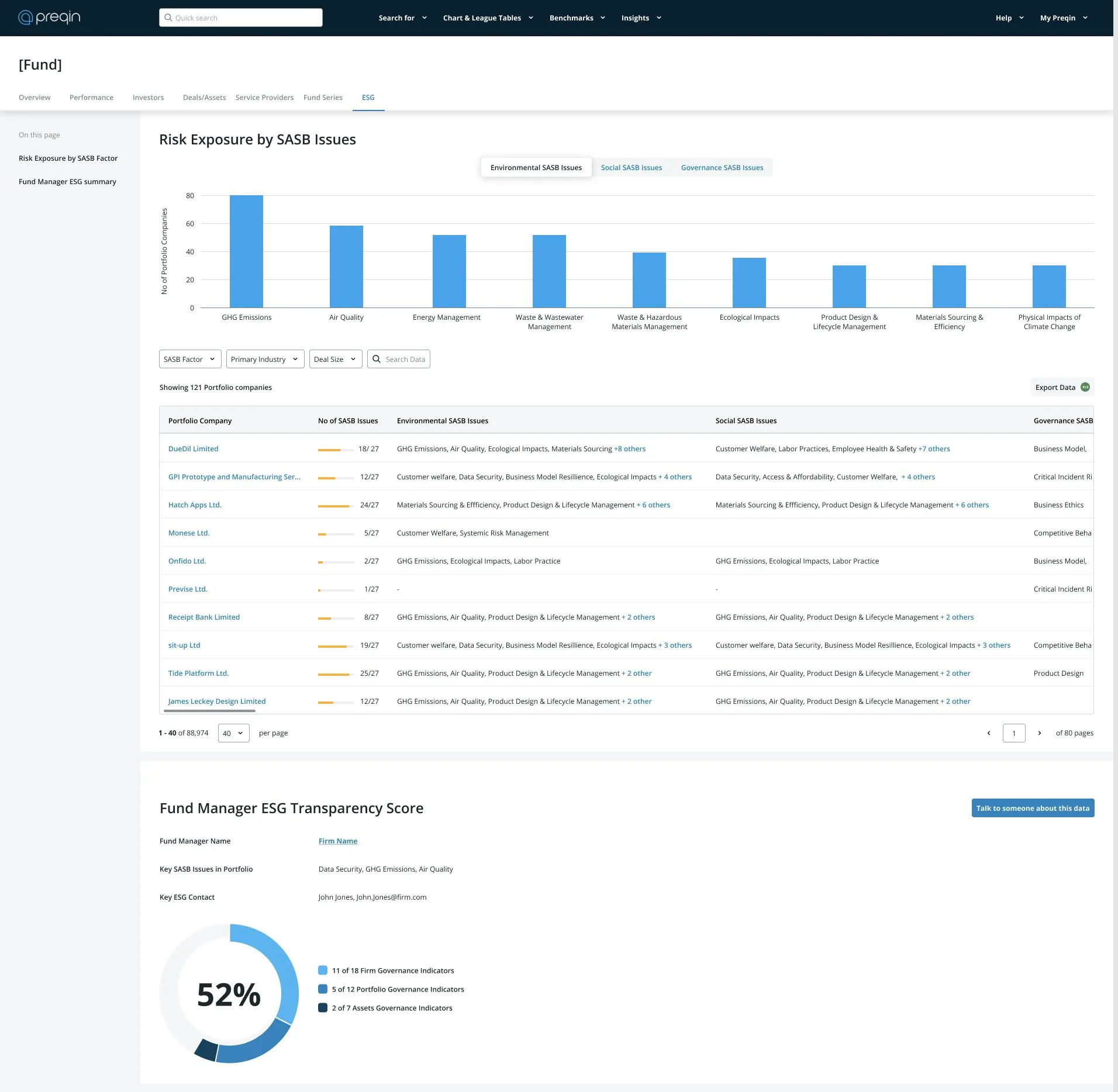
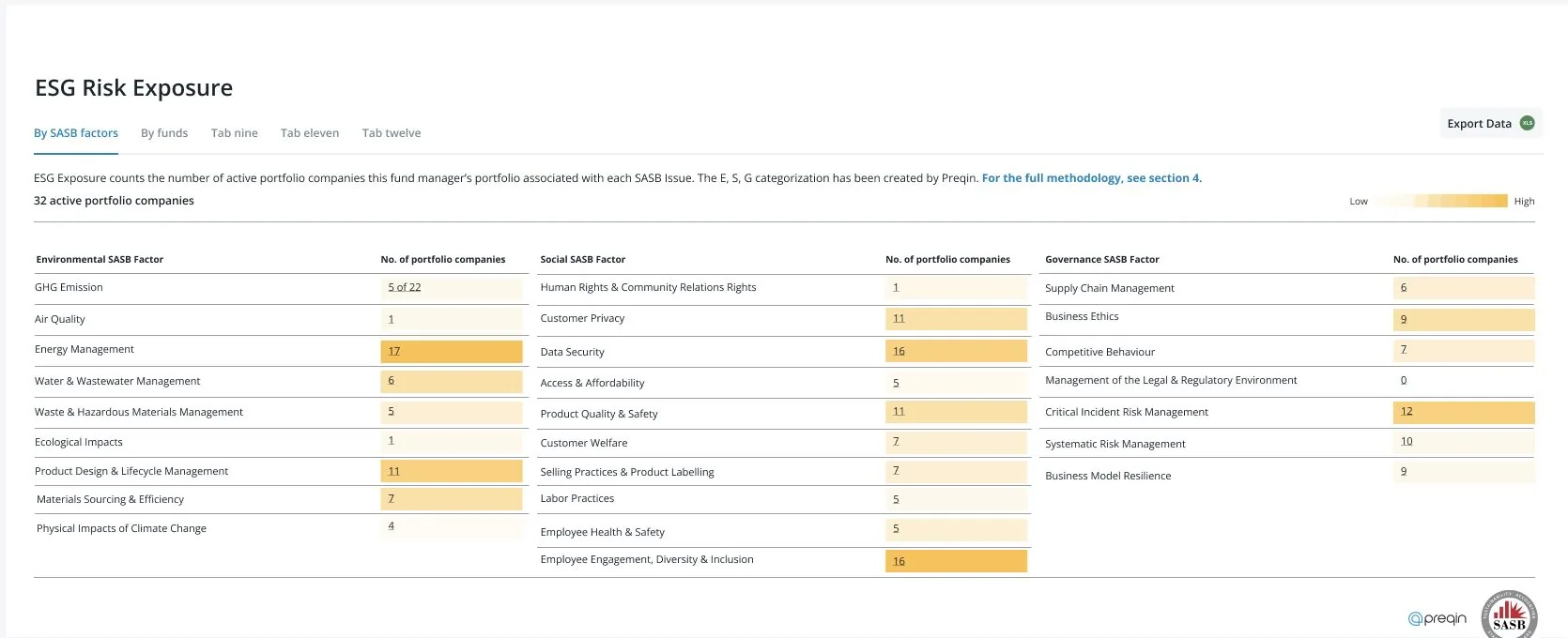
Version one used tables. They gave exact values and no priority. Version two showed risk across its real dimensions, with everything visible and nothing ranked. Version three used heatmaps to show where to look.
A heatmap does not show how much, and these users need exact figures for diligence. So the exact count stays in every cell.
Decision: preparation tools
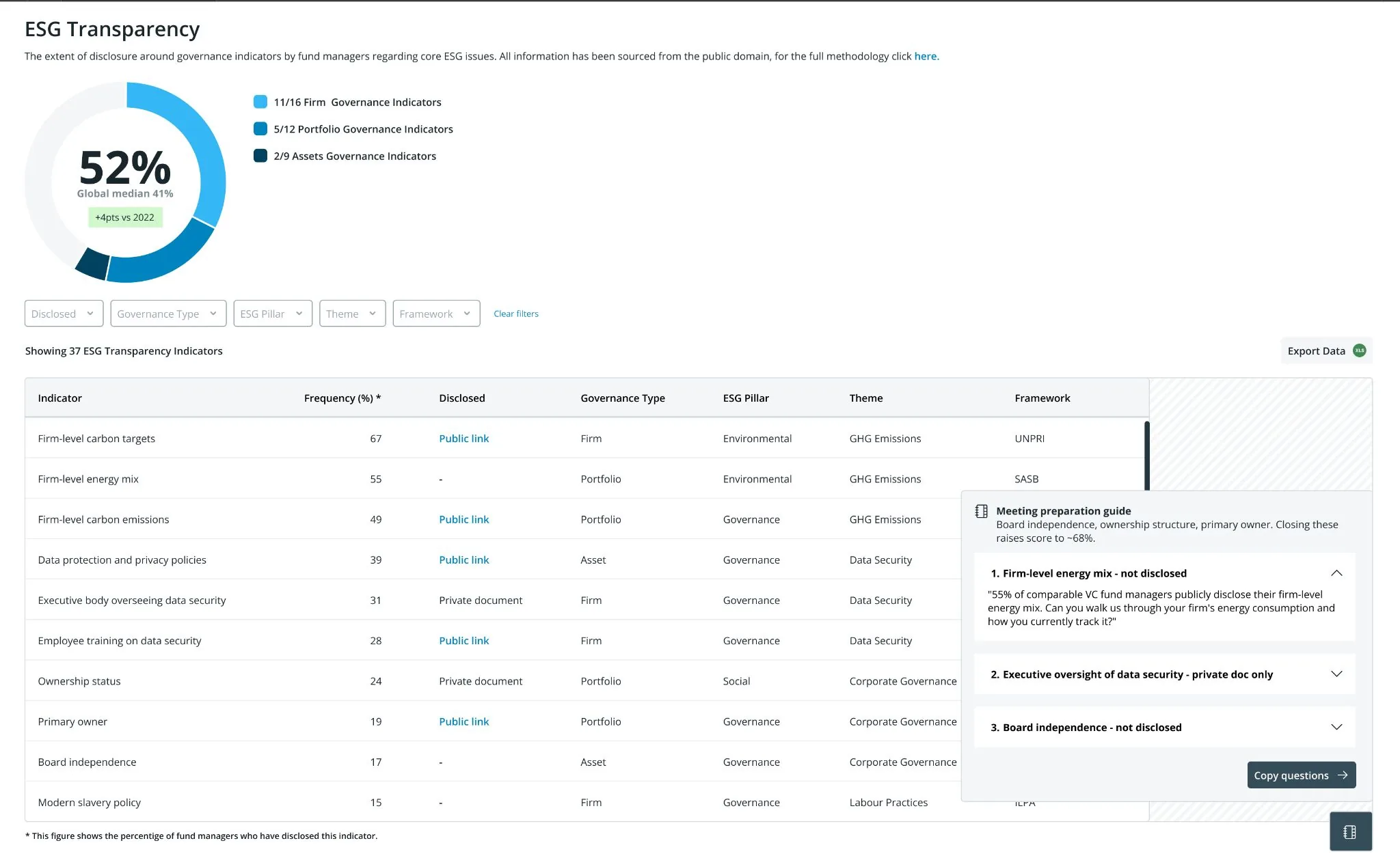
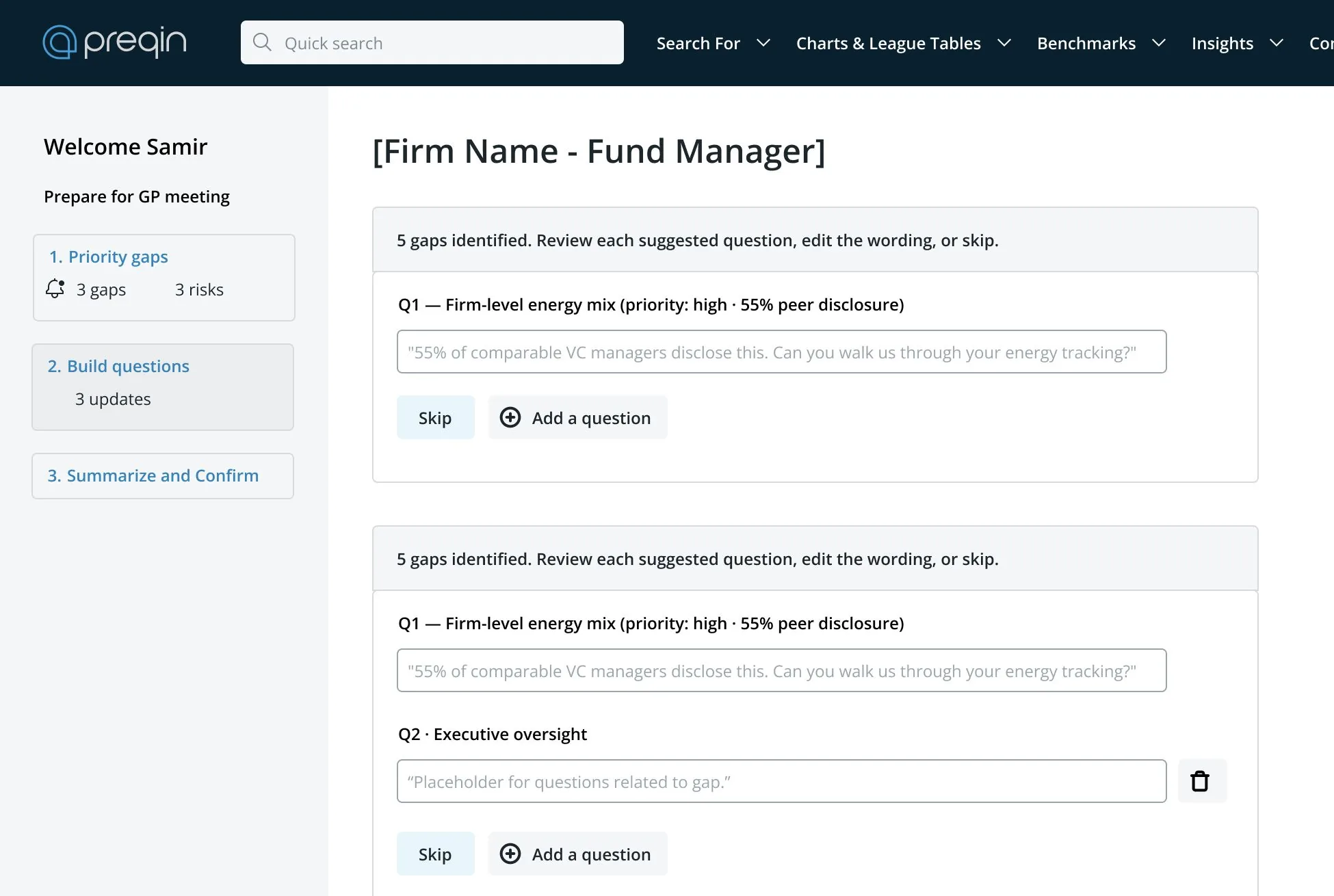
I built a drawer and a wizard to help investors prepare questions, and both failed.
Gap analysis identified what to ask about and stopped, so every investor rebuilt the same brief by hand. The drawer put questions beside their gaps. The wizard walked through priority gaps and exported a PDF.
People could operate both. They rejected the idea underneath. Limited partners wanted their own thinking confirmed, and a finished brief took away the part they were paying for.
Scope
The heatmap module shipped, and nothing that recommended questions did.
Identifying a gap is evidence. Recommending questions is advice. These customers were buying something to check their reasoning against, not advice.
Results
Seven contracts closed and 50+ pre-sales calls came in.
I ran the right method against the wrong question, twice
Both follow-ons passed usability testing, which asks whether someone can do the task and never whether they want it done for them. Testing the changed positioning first would have been cheaper. I know two points on the wrong side of the line between evidence and advice, and not where it sits. Nobody revisited it while I was there.