Tablet Command~4 min read
A second look at an incident command website, built for the people on the fireground.
Unsolicited, solo, with two visual directions on one prototype. I recommend the approachable one.
- Role: Audit, art direction, and design
- Timeline: Side project
- Team: Solo
- Impact: Not measured yet
- Platform: Web
Overview
I redesigned an incident command website, unasked, so it would feel at home on the fireground.
Tablet Command makes incident command software for fire and EMS. Its site follows the usual business-software playbook. I sent the president and the VP a prototype with no pitch attached. It has two visual directions on one toggle, drawn from command boards, apparatus, thermal imaging, maps, radio traffic, and timestamps.
Claude built it, ChatGPT and Reve explored images, and Google Flow explored image direction and animation. No one else worked on it.
What I owned
I owned
- The audit of the live site
- A brand system and two directions, Current and Radical
- The prototype, with a draggable board
- The recommendation
Audit
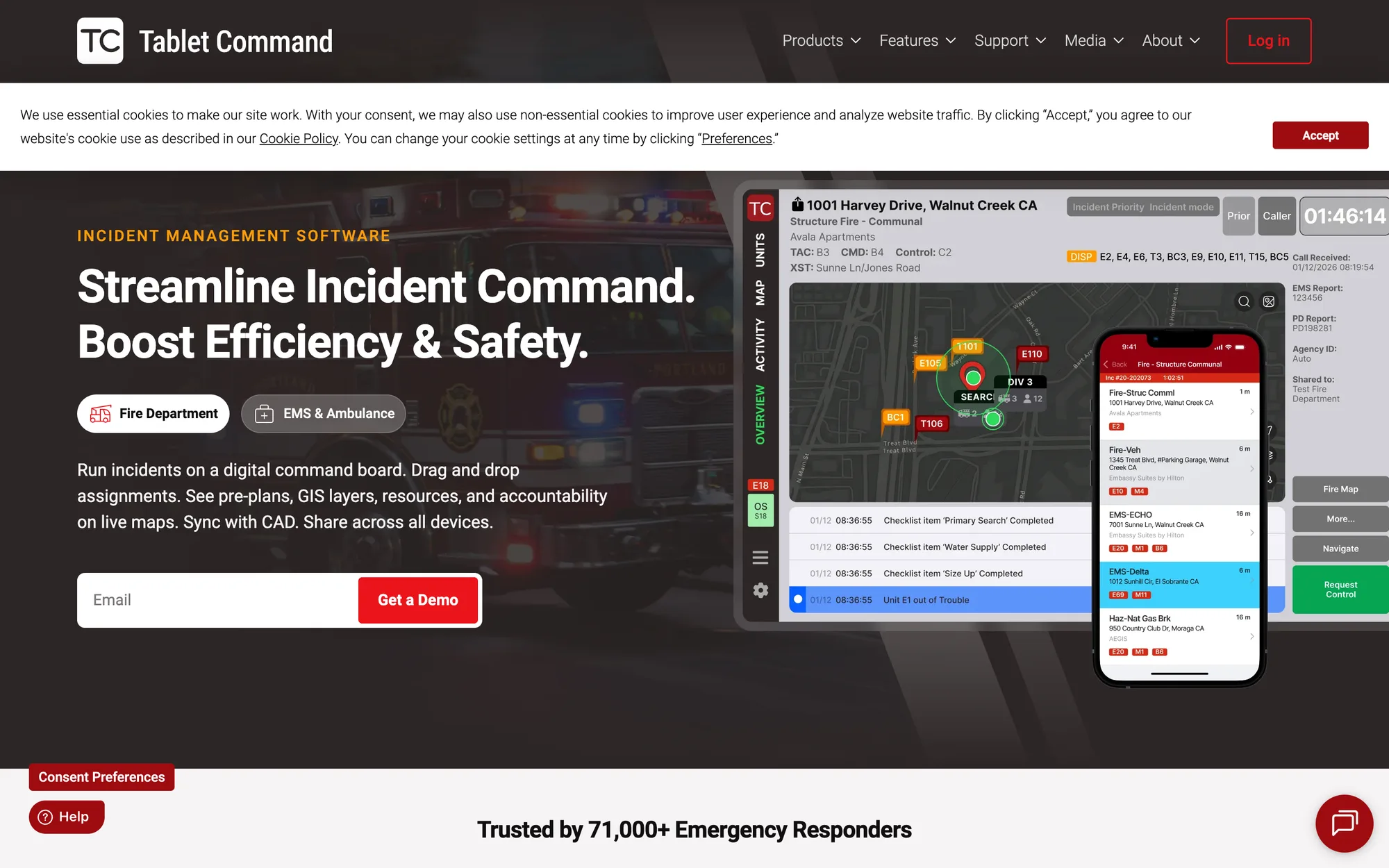
The live site is specific in its body copy and generic in its headline.
Basis: the page as served on 6 October 2026. The headline, “Streamline Incident Command. Boost Efficiency & Safety.”, could sit on any software. The sentence a chief can picture comes second: “Run incidents on a digital command board. Drag and drop assignments.” “Get a Demo” appears seven times, and “Auto-log and timestamp” closes three of four feature blocks. The figures, 71,000+ responders, 250,000+ incidents, and alerts 30–60 seconds earlier, carry no basis line. The strongest asset is the product screenshot of a real incident. The brand around it says less.
Research
I borrowed from what the fireground already looks like.
Timestamps and unit tags are set in the board’s own monospace. A thermal-camera treatment stands in for photographs of incidents, so no one in frame needs to sign a release.
Decision: two directions
I built two directions on one prototype so the difference could be seen, not argued.
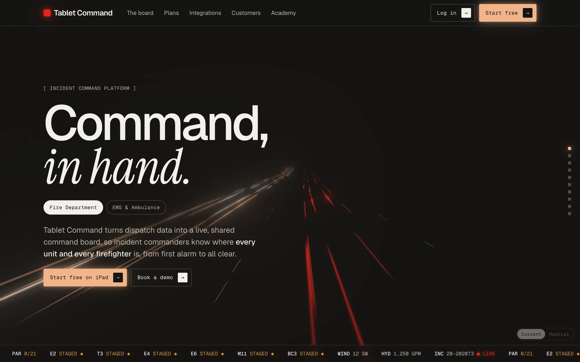
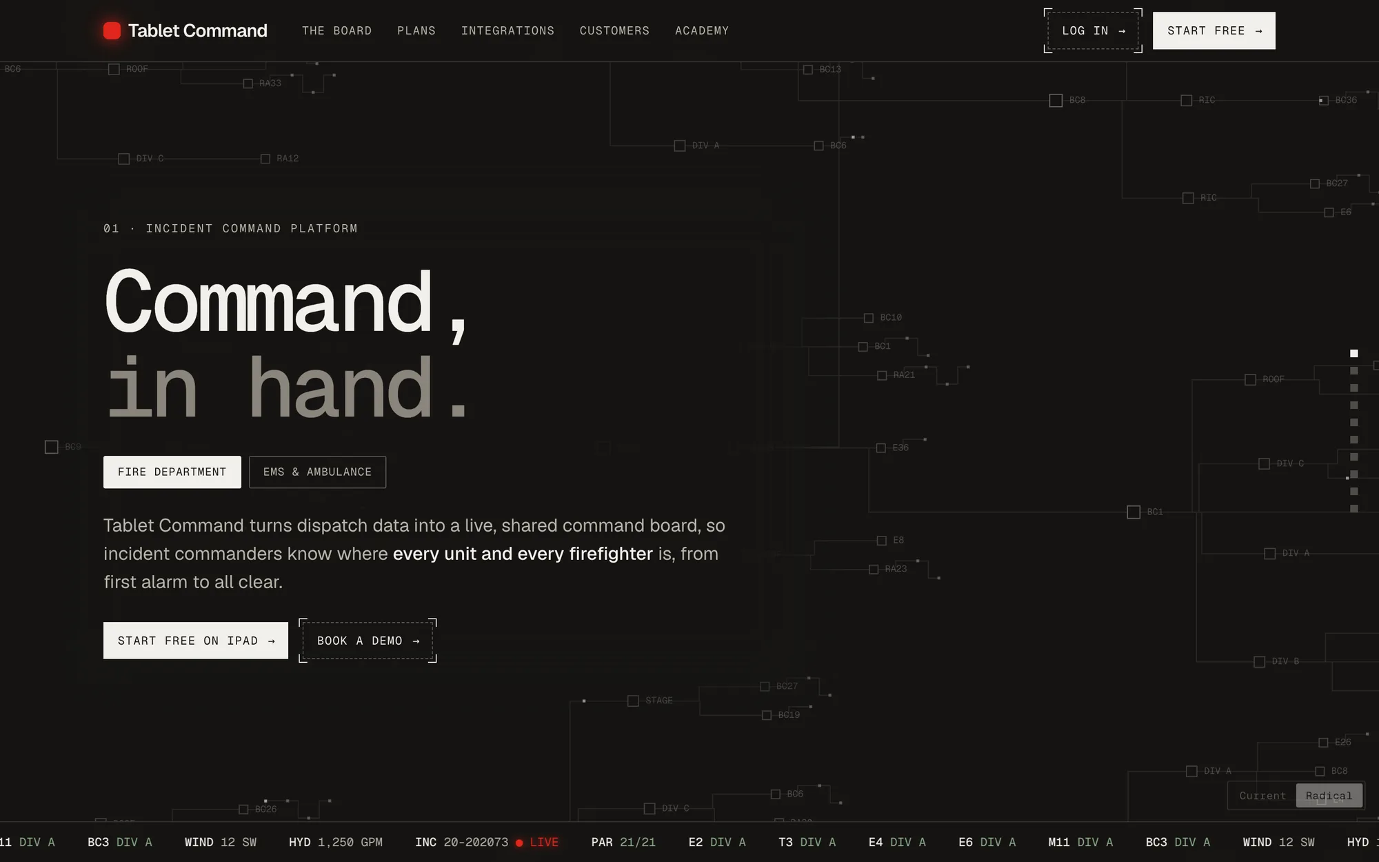
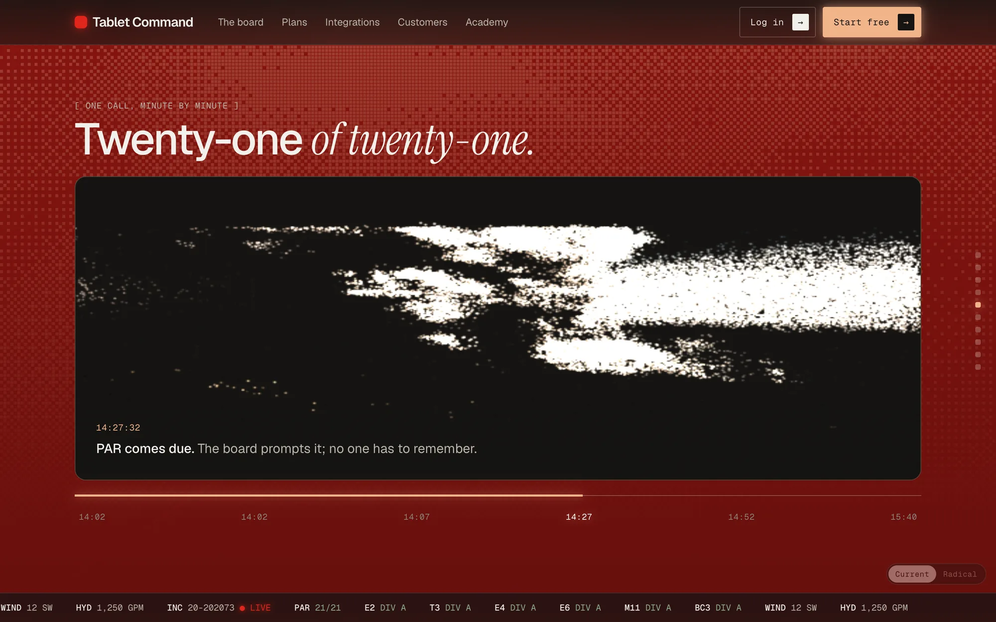
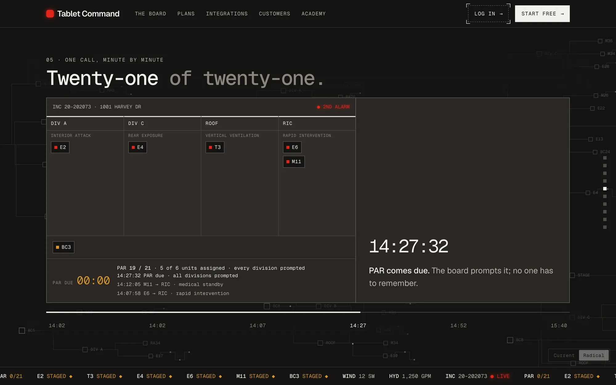
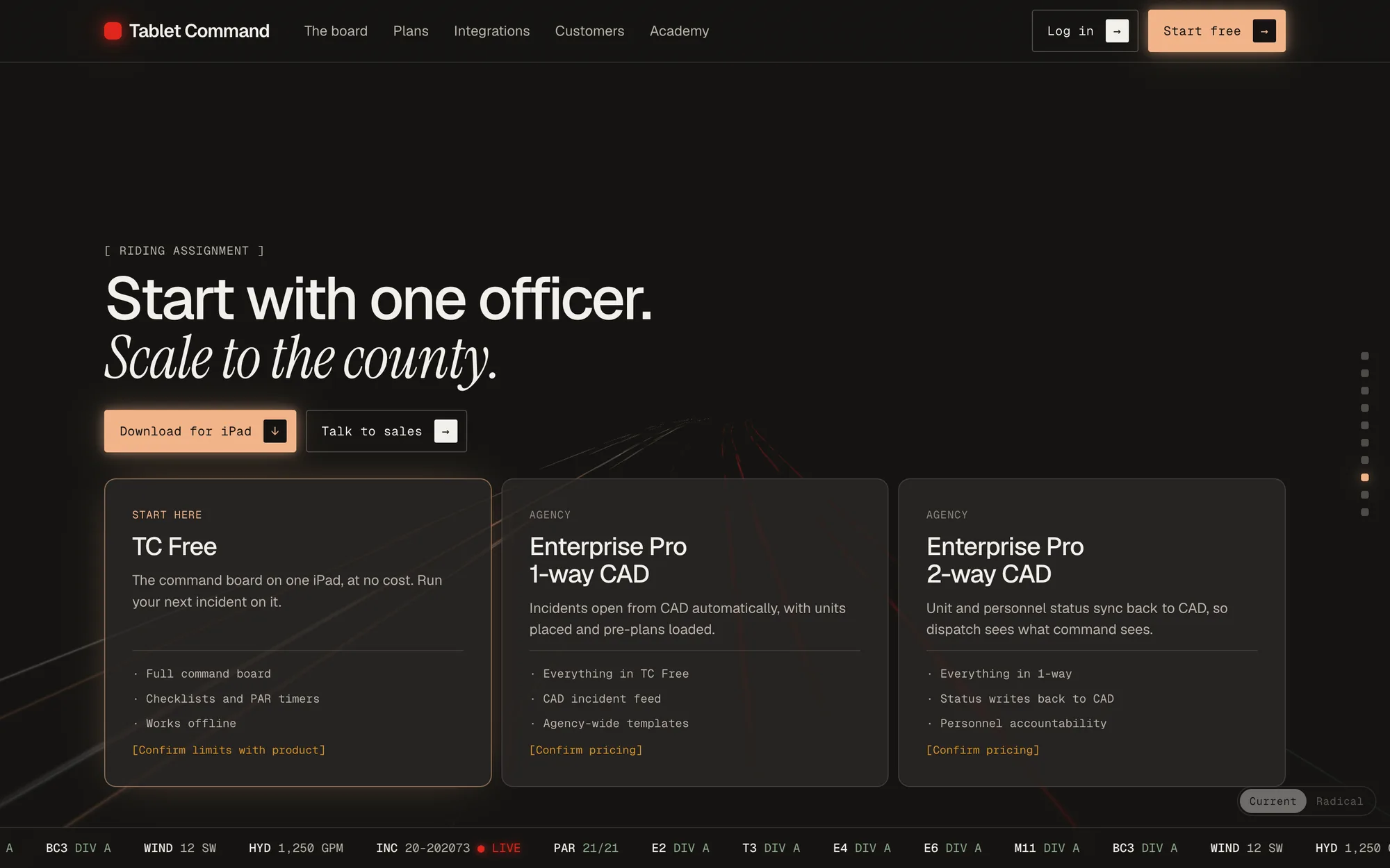
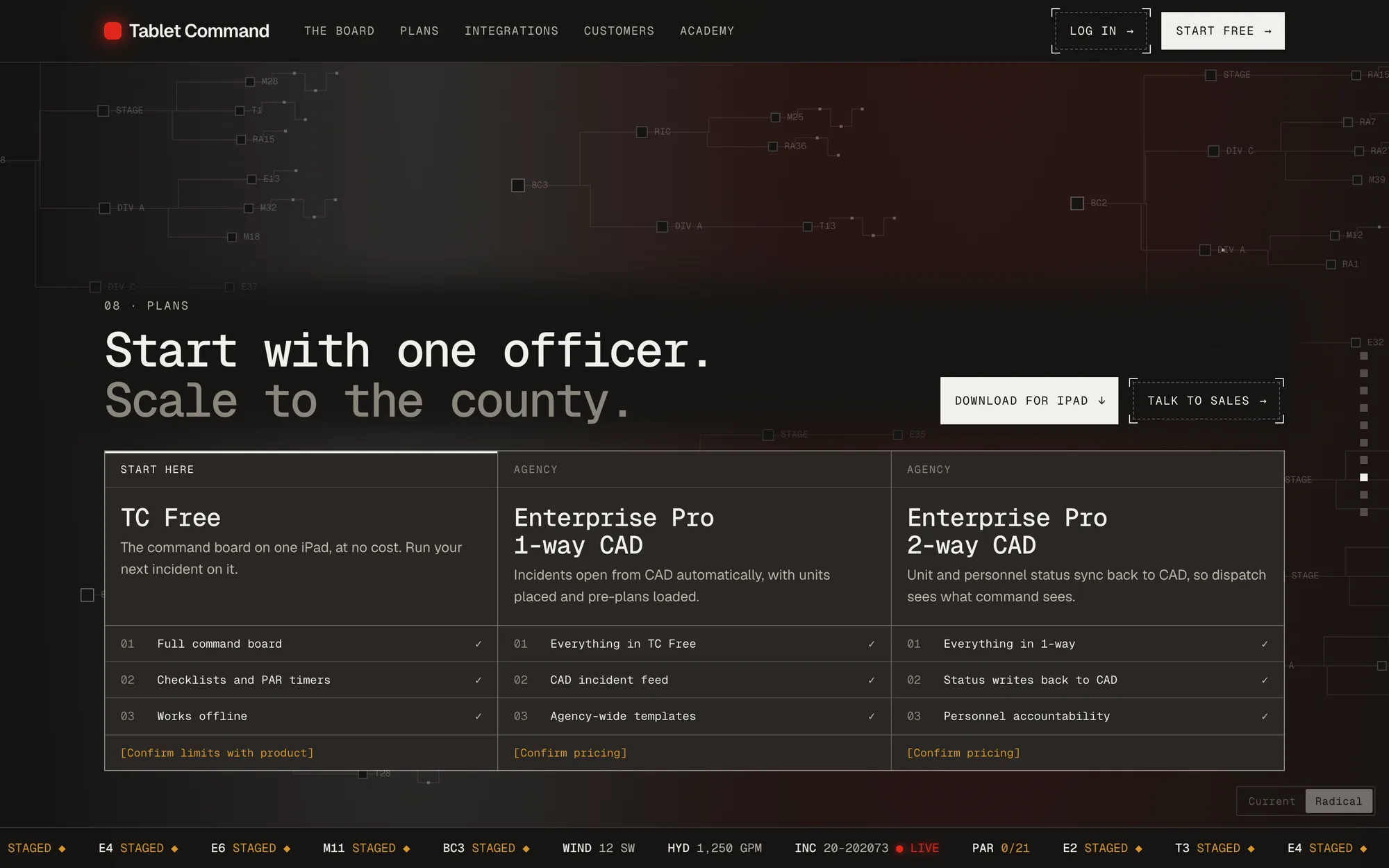
Current is warm: a large sans with a serif italic, one peach accent, rounded cards, and light trails down a road. Radical uses the board’s own language: monospace headlines, square corners, hairlines, and a faint graph of units behind every section. In Radical, red, amber, and green appear only where they mean live, staged, or accounted for. Both share the same copy and board.
Decision: Current
I recommend Current, because it is more approachable.
The person who runs the board and the person who approves its budget are not always the same. A chief or purchaser may see this page first, and Current reads as a company they could call. Radical reads as a console, which suits the user and is colder for the buyer. That is my judgement, and I have not tested it with either.
Two flaws show in the screenshots. Radical’s monospaced comma leaves a gap, so the headline reads “Command , in hand.” Its unit graph competes with the hero.
Radical has one idea I would carry back into Current: colour that only means what it means on a board. Current’s peach accent is decoration.
Copy
I moved the outcome ahead of the features.
The hero leads with the outcome: a shared board so commanders “know where every unit and every firefighter is, from first alarm to all clear.” The feature blocks become one timeline, “One call, minute by minute.” The free tier moves up to the plans section, “Start with one officer. Scale to the county.” On the live site it sits in the Support menu.
The demo board is something you pick up. A release is the only commit, so a sloppy drop never un-assigns a unit. Keyboard users move units with the arrow keys.
Results
There are no results to report. The prototype has been viewed, and nobody has replied.
Vercel Analytics shows views of the prototype after I sent it. I read that as the president and the team looking, but analytics cannot say who. I have not shown it to anyone who uses the board.
The prototype states things I could not check
“Works offline”, “Signal required: 0 bars”, and the plan limits are not in the live homepage copy, and the pricing cards carry “[Confirm pricing]” markers. I reworded the alert claim from “earlier than traditional station alerts” to “before station tones”. The 71,000+ and 250,000+ figures are the company’s, and the timeline is a composite incident. Until someone at Tablet Command checks them, these are my wording of their product.