Two Sons Taiwanese Food~4 min read
A brand concept built to see how far an LLM could be pushed.
Self-initiated, unsolicited, built alone, with AI tools making the illustrations.
- Role: Art direction and design
- Timeline: Side project
- Team: Solo
- Impact: Not measured yet
- Platform: Web
Overview
I built two brand directions for a Taiwanese food business to see how far an LLM could be pushed into a creative visual brand.
Two Sons Taiwanese Food is named for the owners’ two sons, who grew up in Minnesota. After seeing a LinkedIn post about the launch, I sent the team a website concept with no pitch or expectation attached. I made it because I enjoy Taiwanese food and wanted the brand to feel more expressive.
The real question was about the tool. I used three AI tools. Claude captured early information architecture and content hierarchy, Reve explored illustration styles, and ChatGPT made the badges. Figma gave me a sense of how the culture could be evoked.
Worked with: no one; this was self-initiated and unsolicited.
What I owned
I owned
- The question and the brief
- Research into three food brands
- The palette, from Taiwan and Minnesota
- The illustration direction and the badge prompts
- design.md, the harness
- Two directions, Everyday and Loud, and the prototype
Research
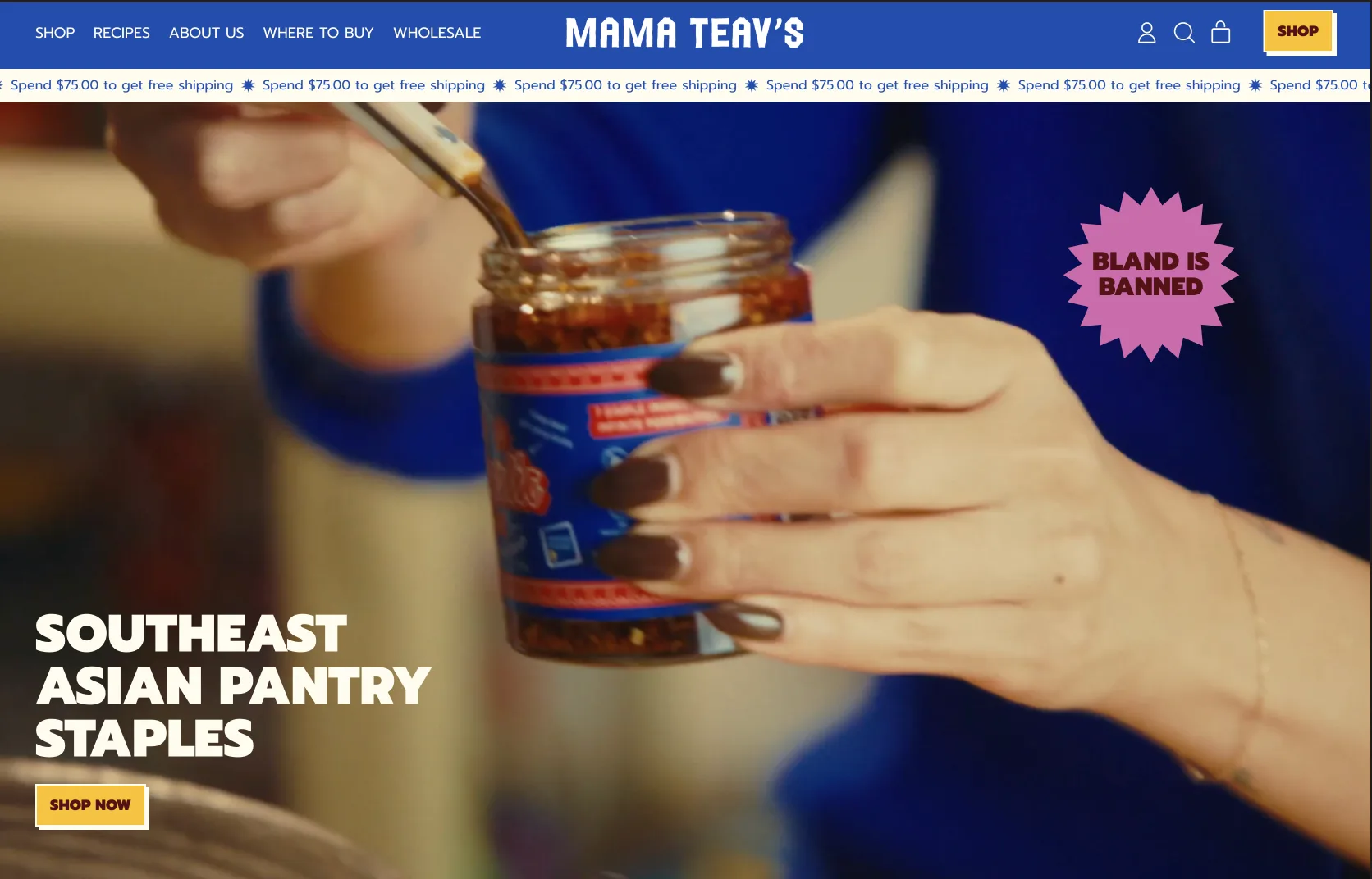
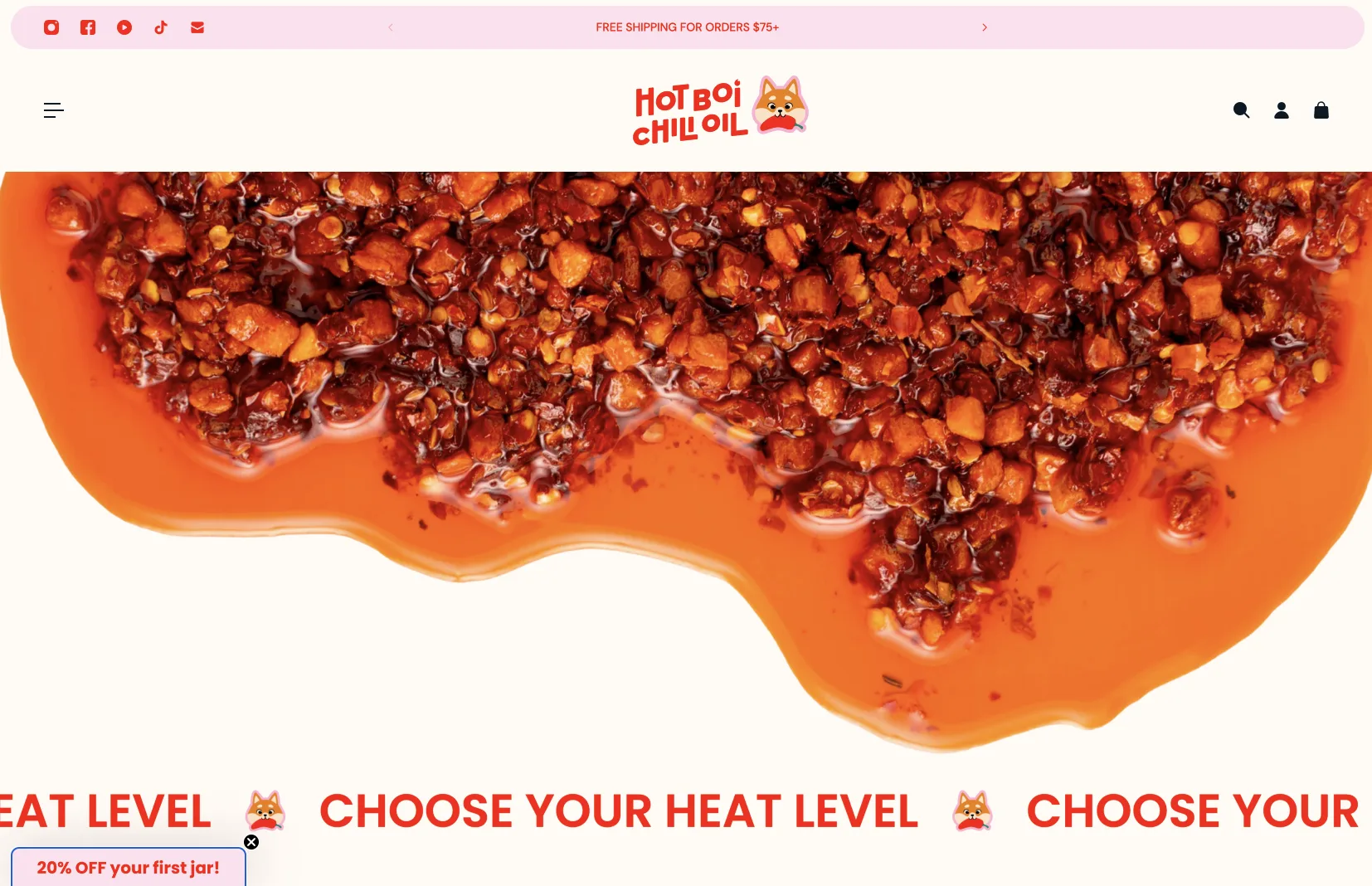
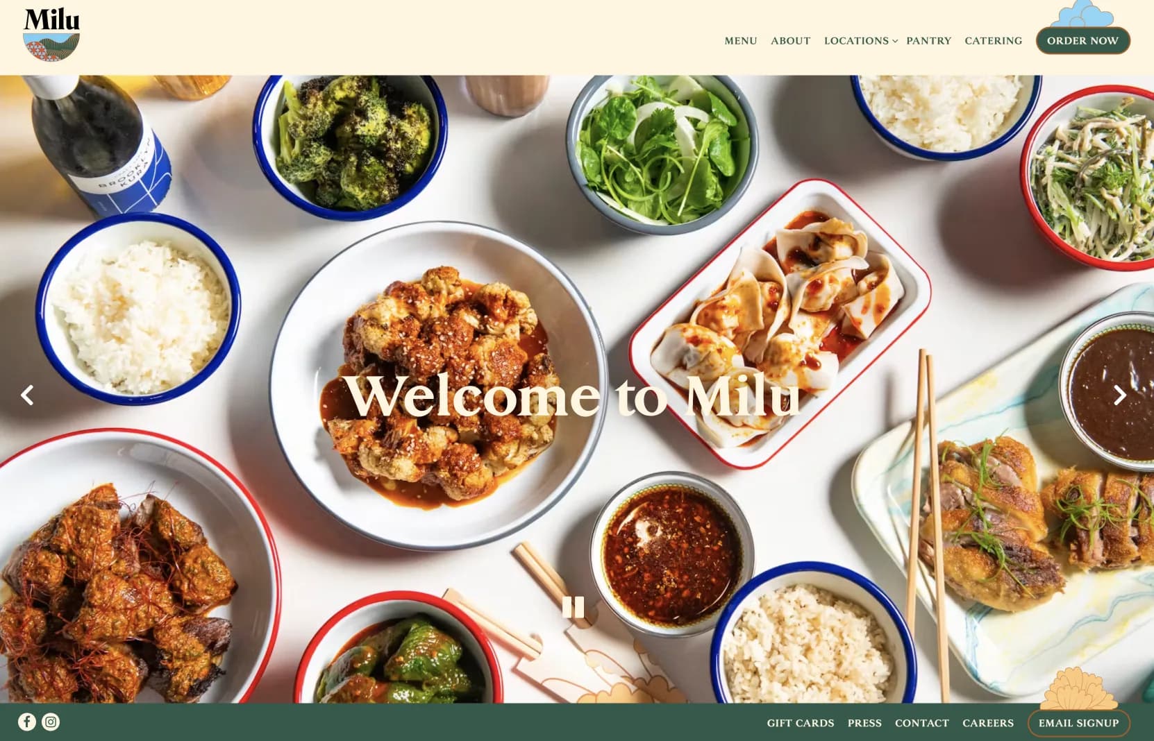
I looked at how three food brands present themselves before choosing a direction.
Mama Teav’s uses saturated blue, yellow, and pink, with a sticker reading Bland is Banned. Hot Boi Chili Oil sits on cream in red and orange, with a dog mascot. Milu uses warm cream, a serif wordmark, and overhead photos of food in enamel bowls.
Decision: a harness
I wrote a design.md harness so the models would not drift from the brand.
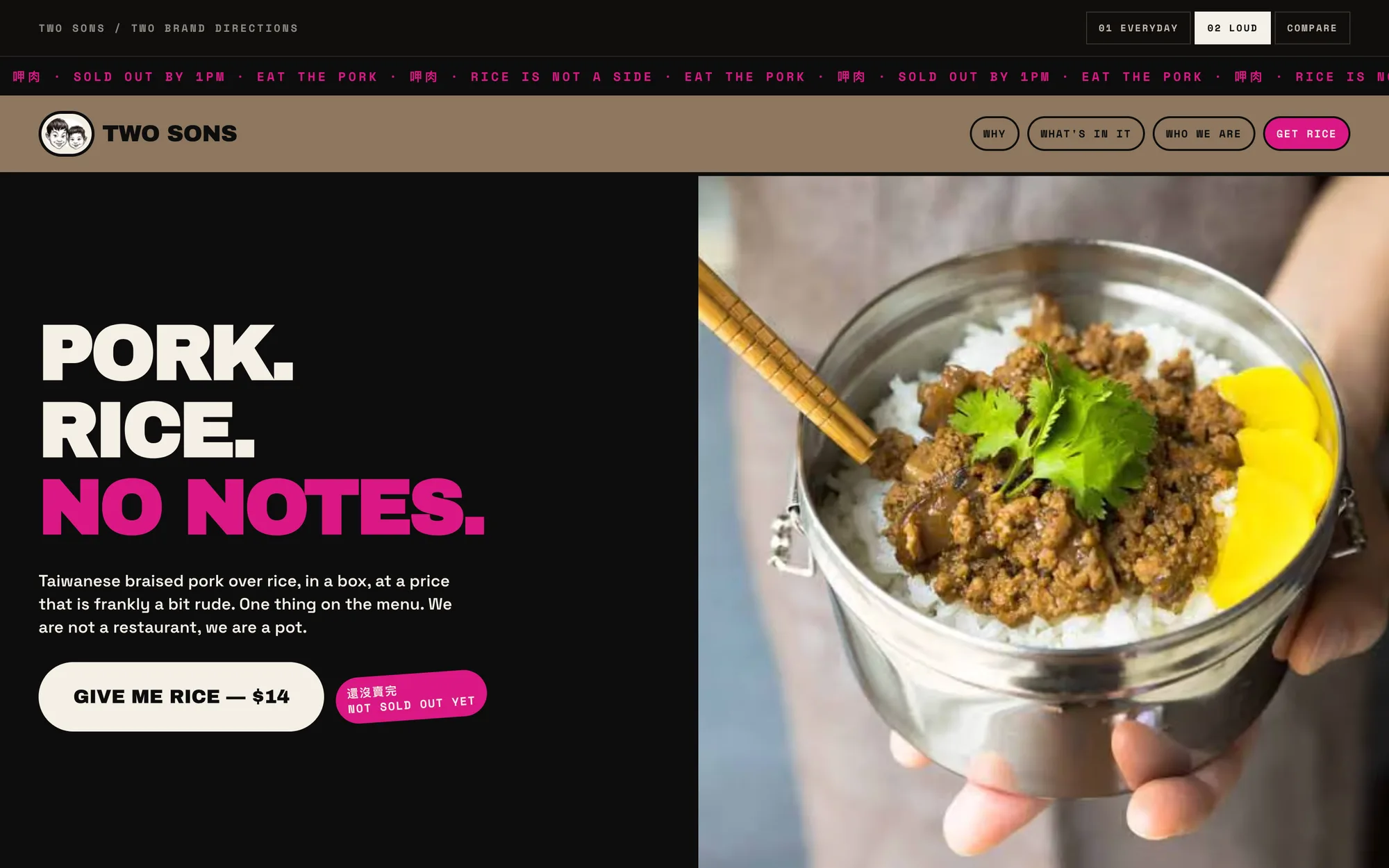
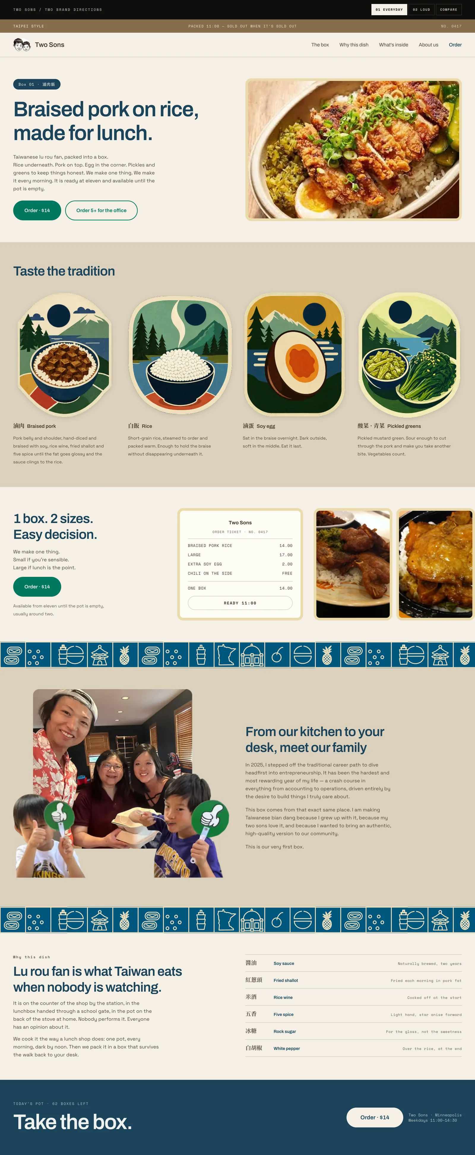
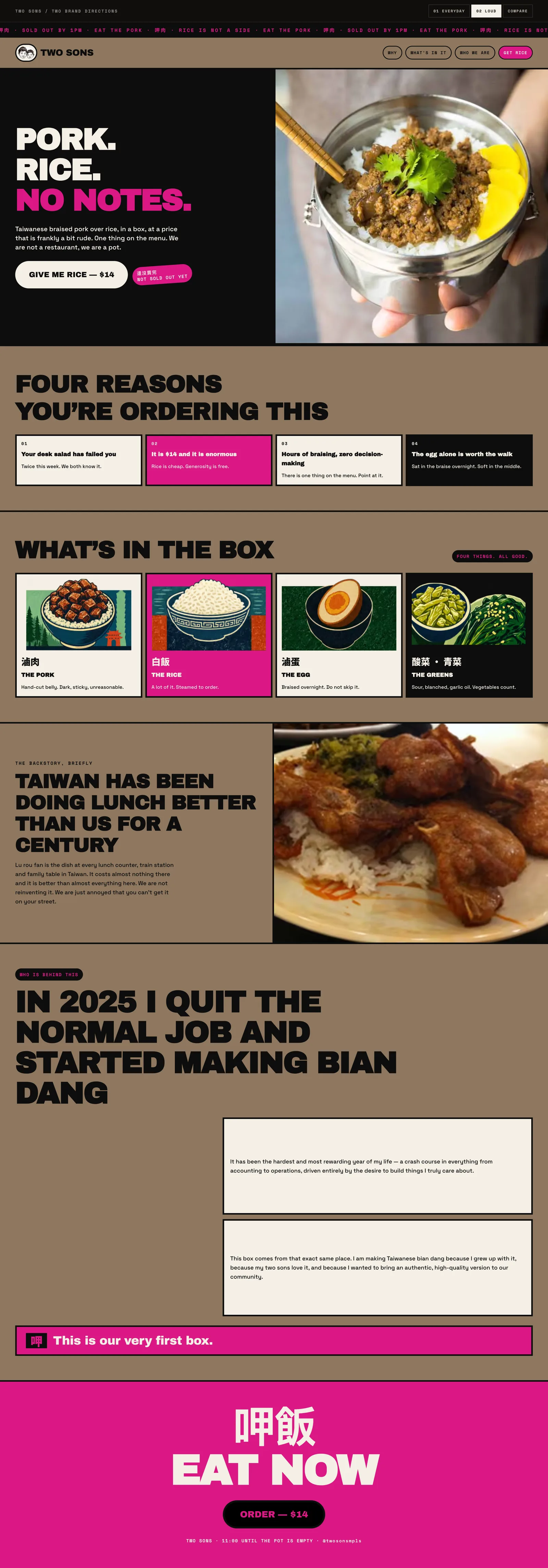
design.md held inspirations from DTC brands, copy constraints, and tone and voice. Loud’s jokes had to come from lunch and from the pot, never from slang, and its hero says we are not a restaurant, we are a pot. Everyday had to use commerce graphics such as tickets and stamps, and it carries an order-ticket module.
Drift still happened, twice. ChatGPT went cartoon and missed the lighting and color scheme I wanted, so I switched tools. Everyday first came out barebones, so I iterated on its copy and designed more of it in Figma. When the copy drifted, I tightened design.md.
Palette
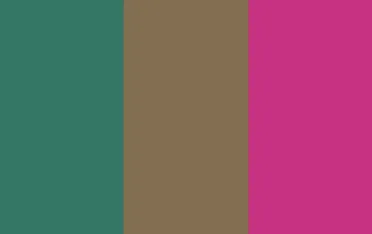
The palette came from the two places the family belongs to: Taiwan and Minnesota.
I built one color set for Minnesota and one for Taiwan, so the brand carries where the family comes from and where they live now. Loud puts the magenta on its largest type, and Everyday uses the green on its order buttons.

Illustration
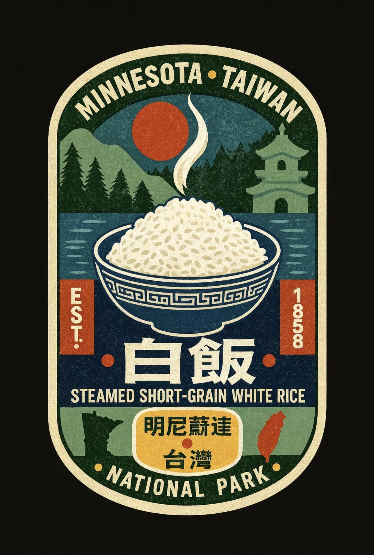
Illustrations carried the Taiwanese culture, and ChatGPT made the badges.
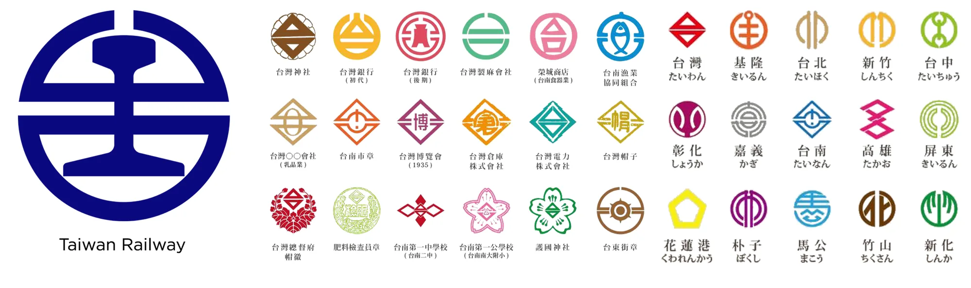
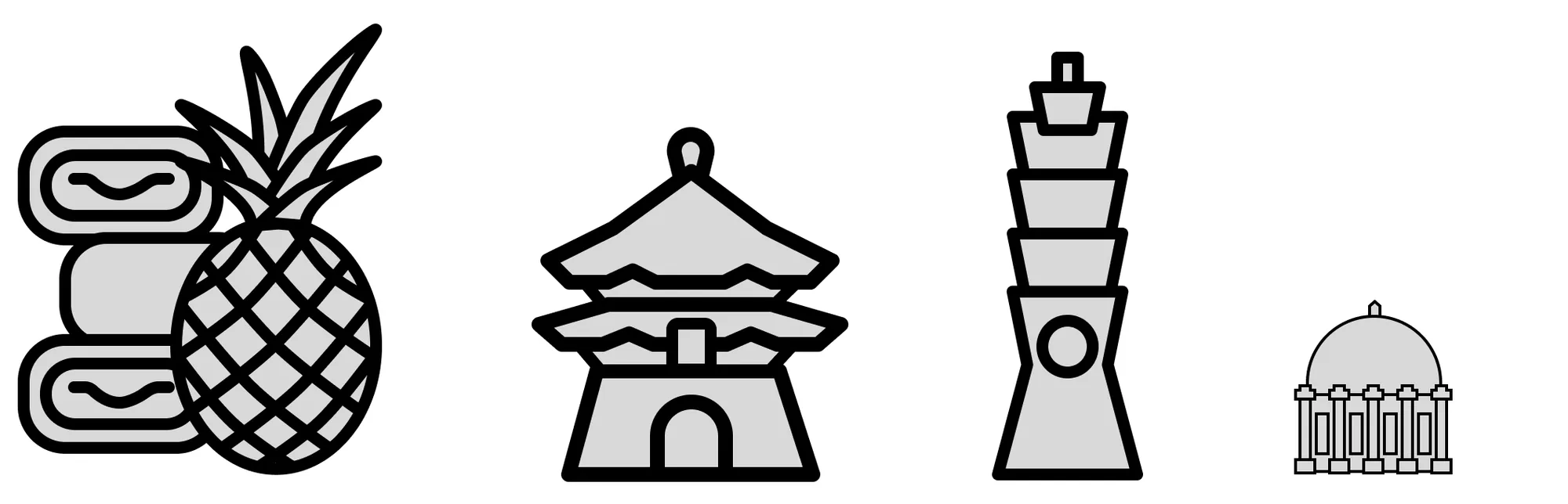
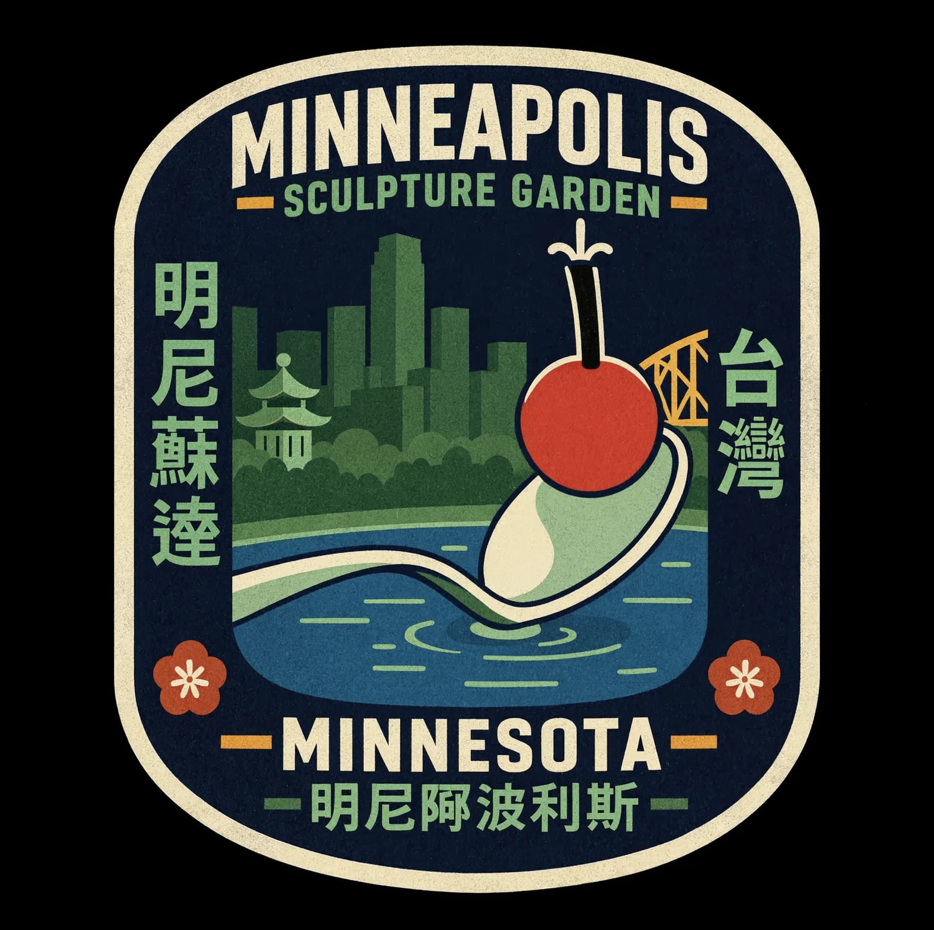
I wanted to pay tribute to the culture through illustration. I started from Taiwan Railway’s logo and a set of Taiwanese emblems, then made an icon set in one outline style. ChatGPT generated the badges, which join the two places: one frames a Minneapolis skyline, a pagoda, and the Sculpture Garden’s spoon and cherry, and the other sets a bowl of rice between pine forest and mountains.
Decision: illustration style
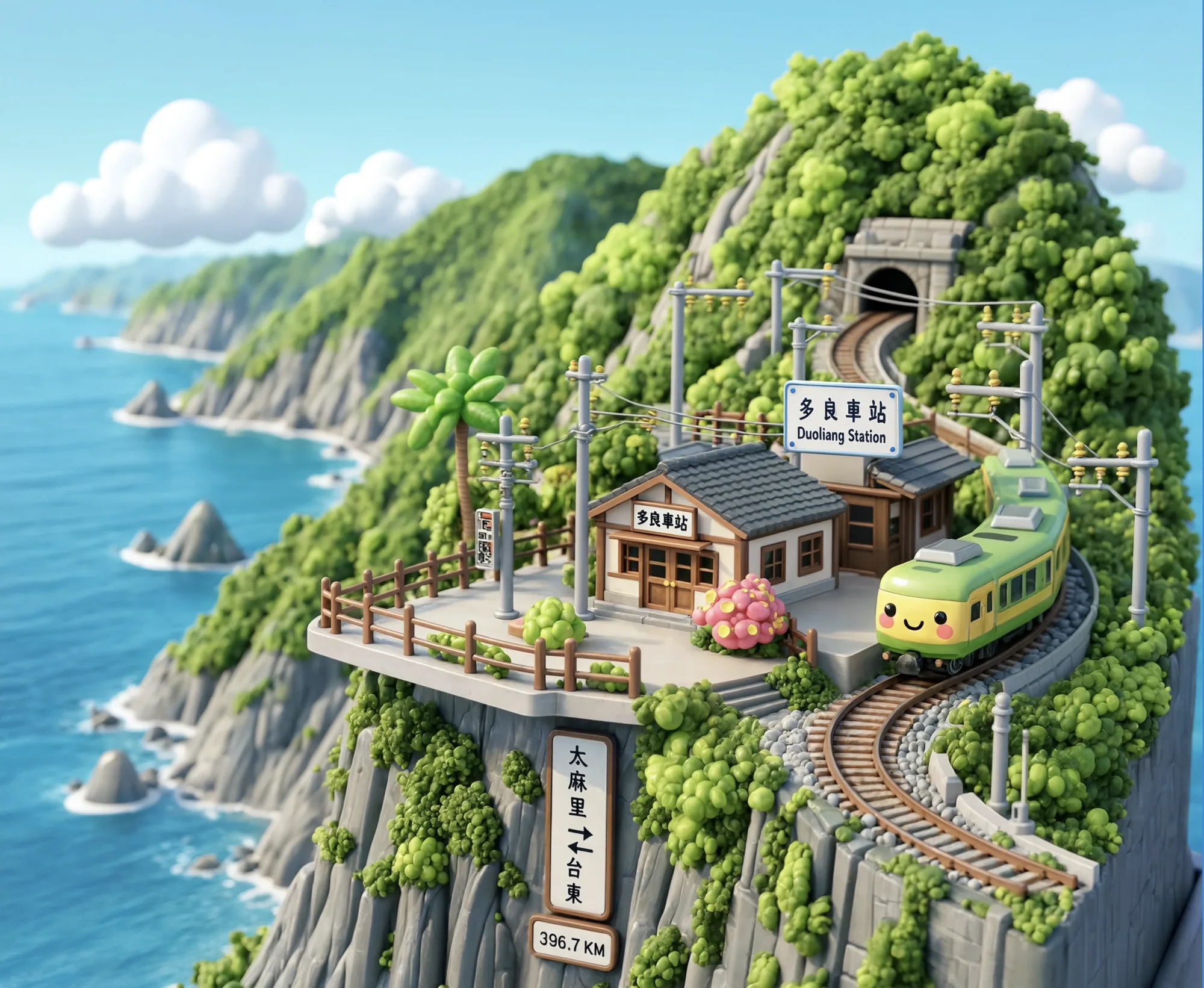
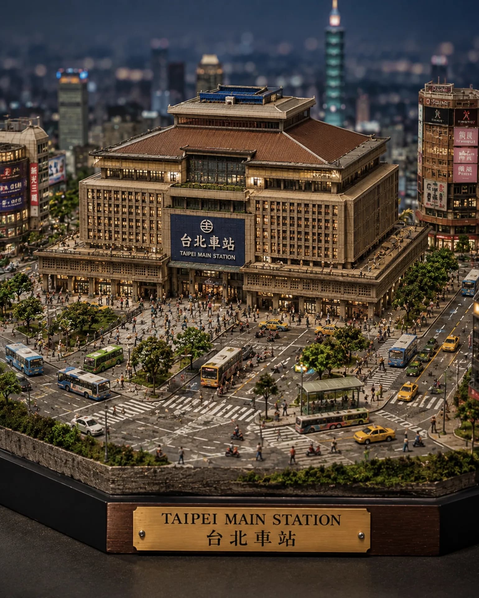
I rejected 3D diorama illustration, because it lacked the approachability a direct to consumer site needs.
Reve explored styles for me, including 3D dioramas in a cartoon version and a photographic one. They did not give the approachability I would expect from a direct to consumer site.
Decision: two directions
I built two directions on the same content, because the aim was to spark ideas.
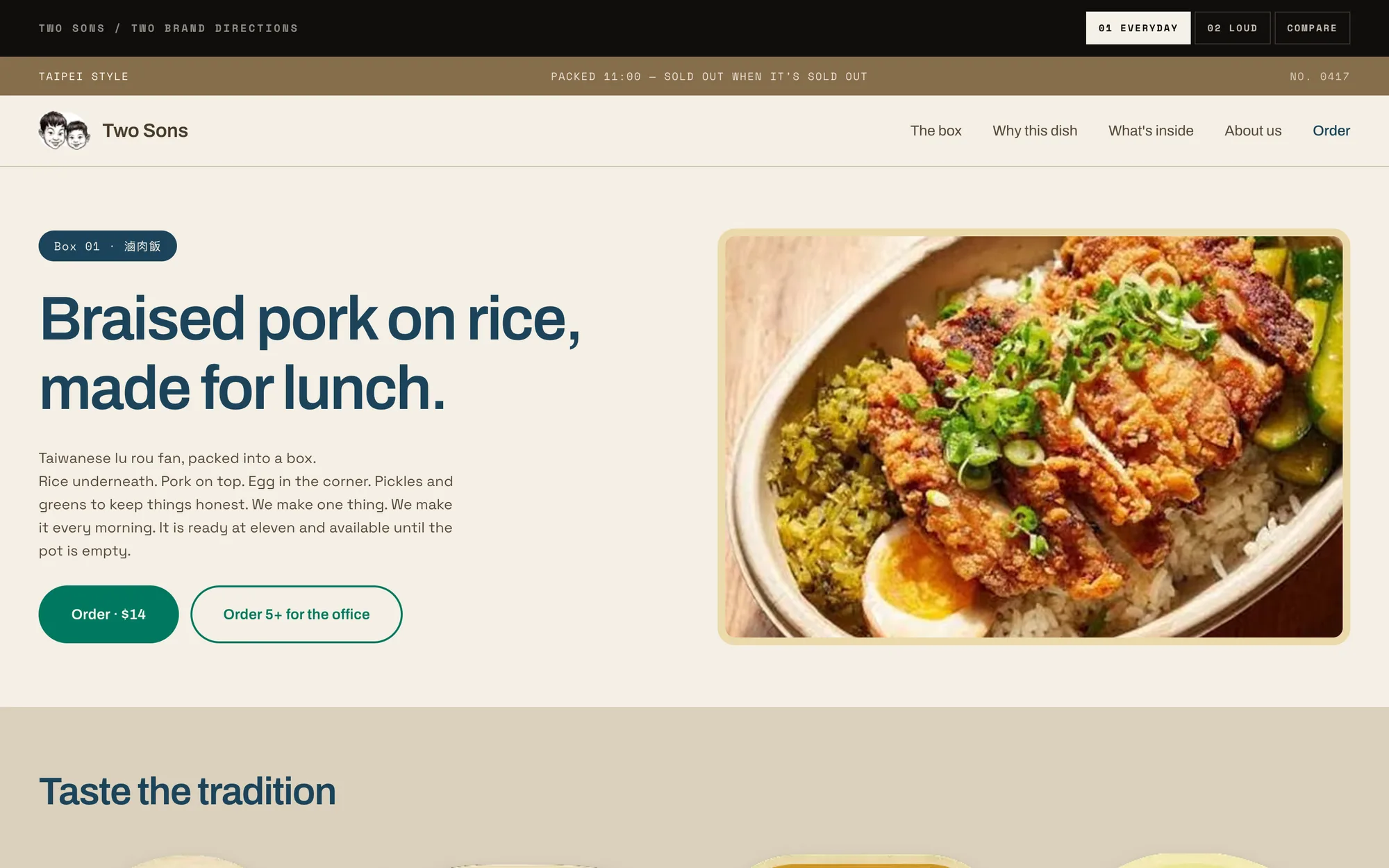
Everyday is understated and leans on culture reference: sand and cream bands, plain copy, and an illustrated badge for each ingredient. Loud is built for direct to consumer selling, with a blunt headline, a ticker, and magenta on black, and the copy, messaging, and palette do the work.
The prototype’s compare page scores the two and suggests mixing them. I have not tested that scoring with the team or with customers.
Scope
Two directions, a compare page, and a set of illustrations exist as a live prototype.
The food and family photography is real, and the illustrations are generated.
Results
There are no results to report, because the aim was to learn how far an LLM can be pushed.
I sent the concept with no pitch or expectation attached. The team did not reply.
The illustrations came from AI tools, which makes them a test of the tools and a draft of a brand
The badges were generated with ChatGPT and the style explorations with Reve. No one has checked the Chinese text on the badges. I do not know whether it reads correctly.